Skip to content

Brand Identity

Brand Identity

Minas Gerais, Brazil | 2024 | family-owned company

When Móveis HT approached The Copper Portico, they presented us with a unique challenge: to elevate a brand rich in tradition and craftsmanship to resonate with a modern audience. Our task was not just to refresh a logo or tweak a color palette, but to weave the story of a family legacy into a brand identity that would speak across continents.

Understanding the Heart of Móveis HT

Our journey with Móveis HT began not with sketches and color swatches, but with listening. We delved deep into the essence of Móveis HT – their roots in the rich soil of Minas Gerais, the legacy of Luiz José de Resende, and their commitment to quality and sustainability. This understanding was crucial in shaping our strategy.

The Copper Portico’s Creative Alchemy

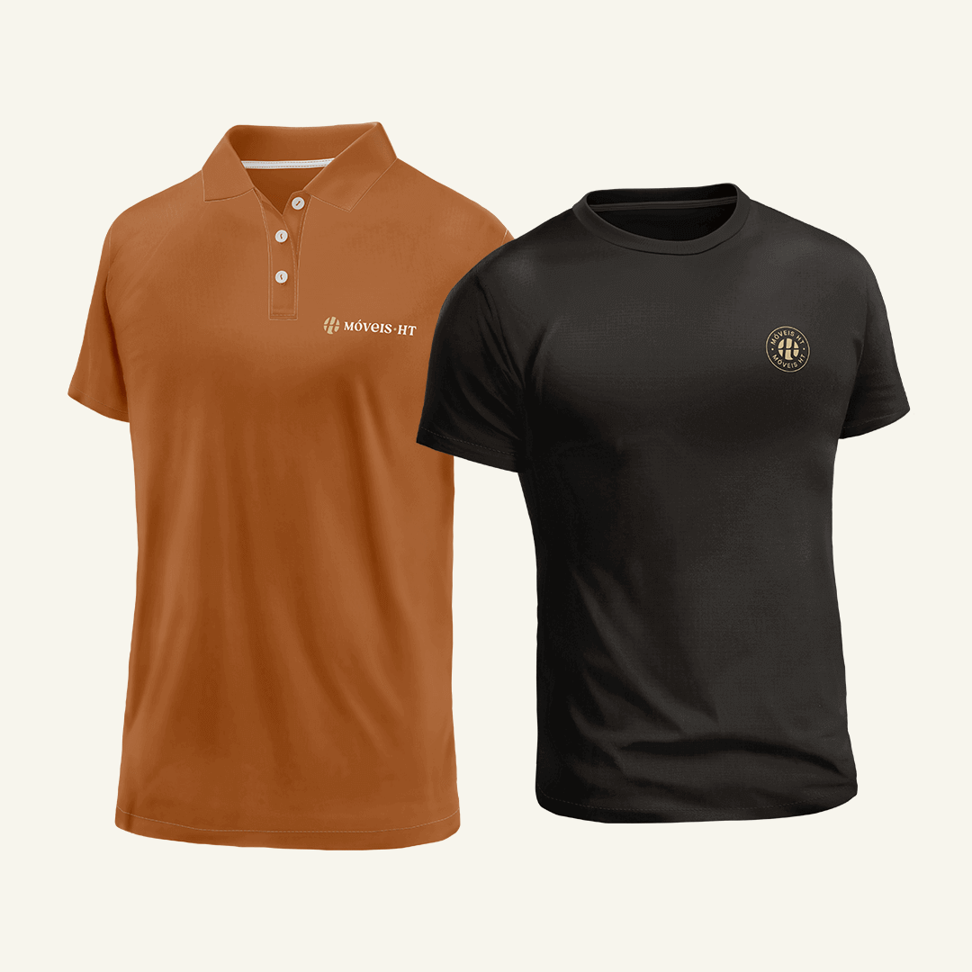
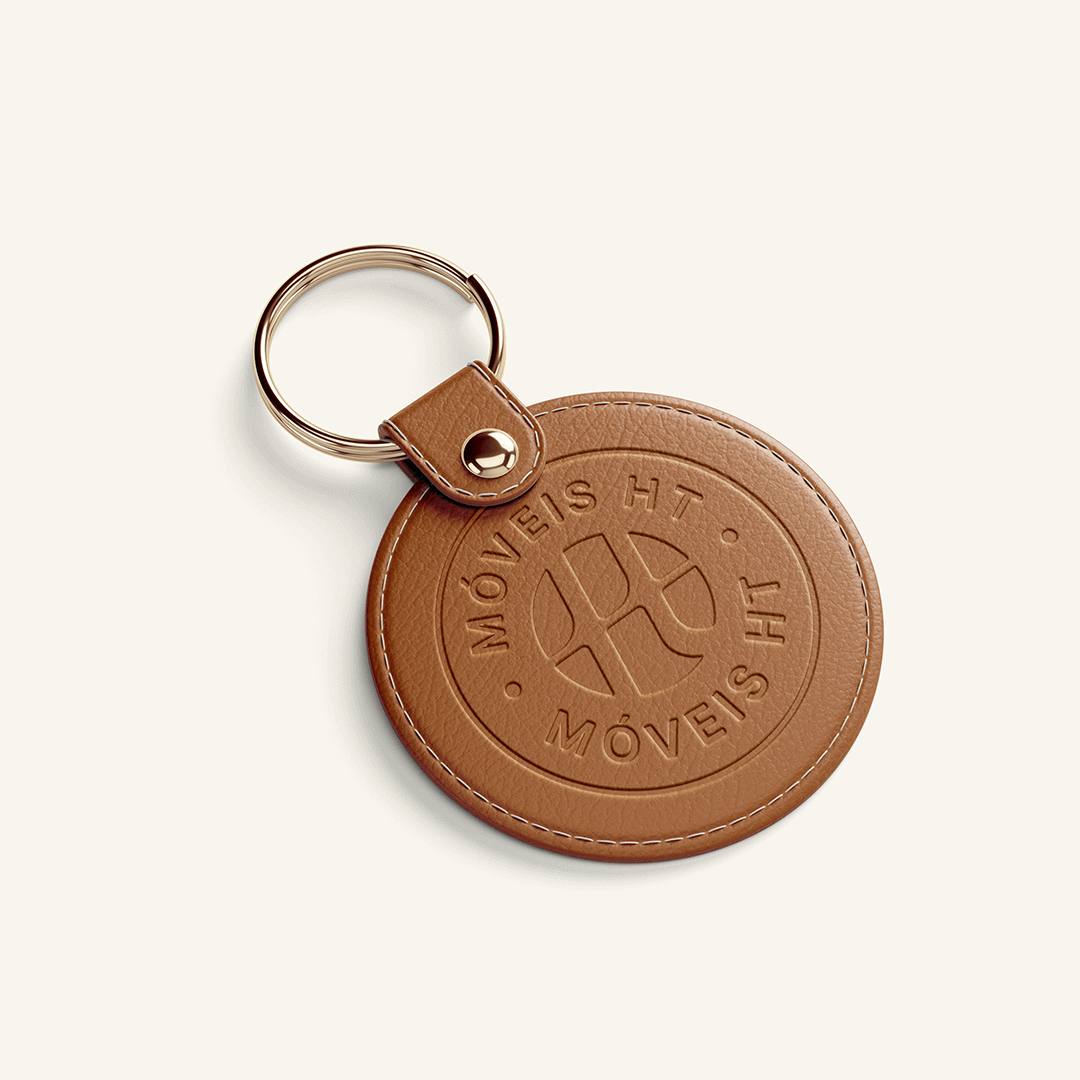
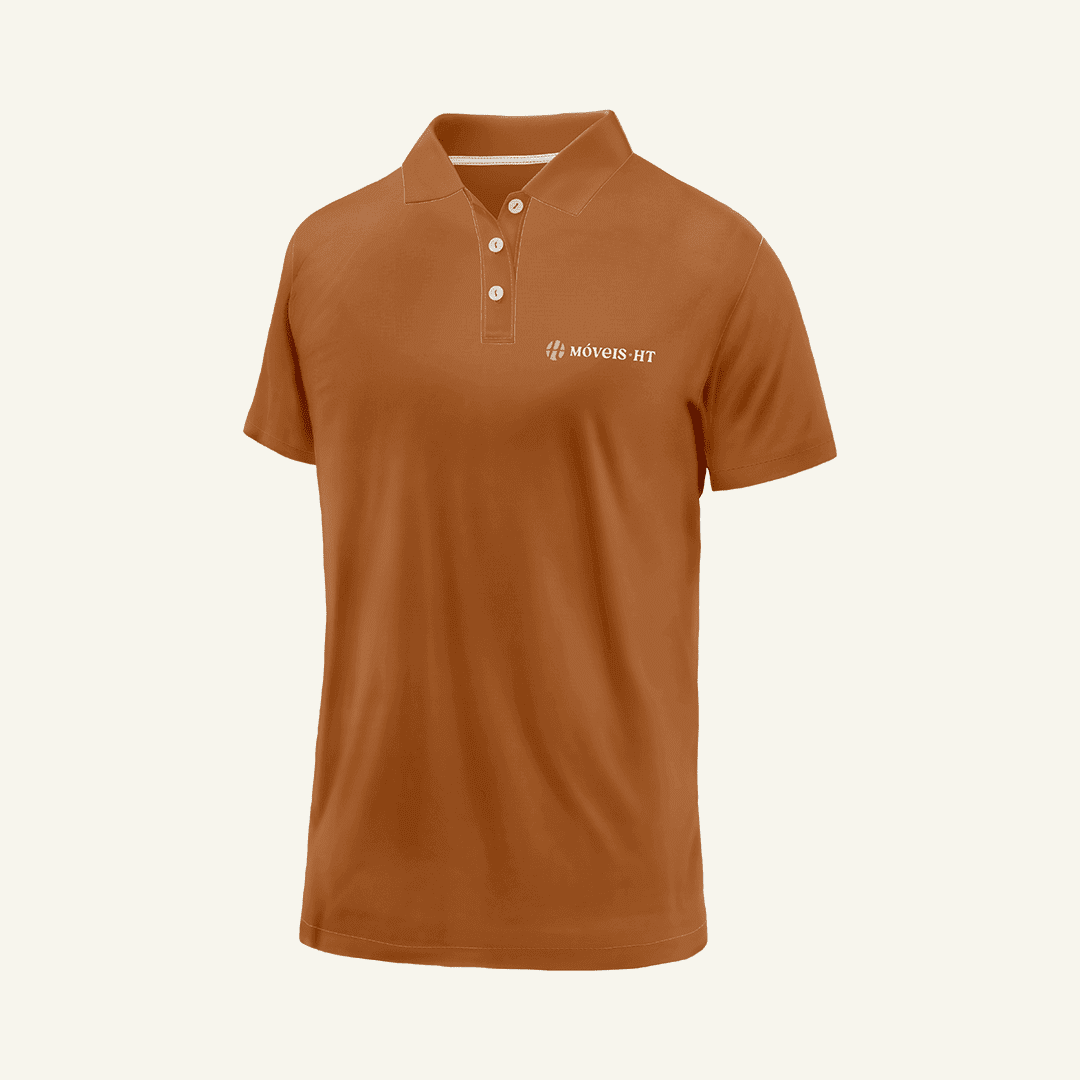
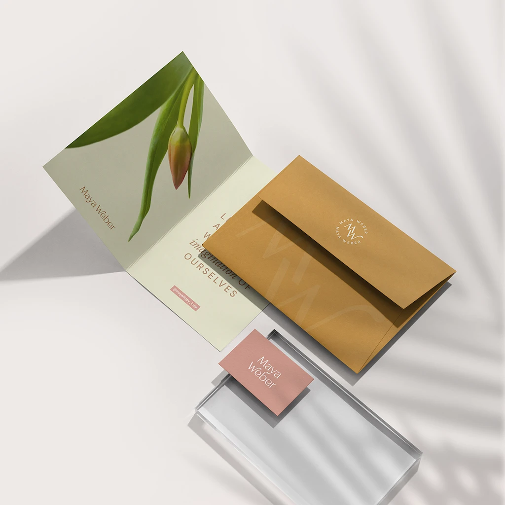
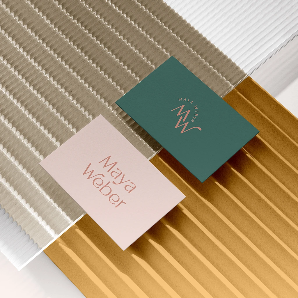
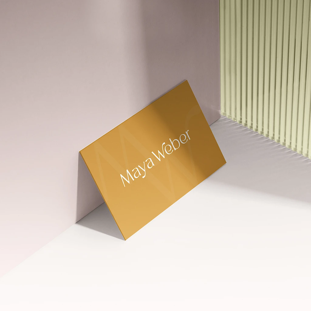
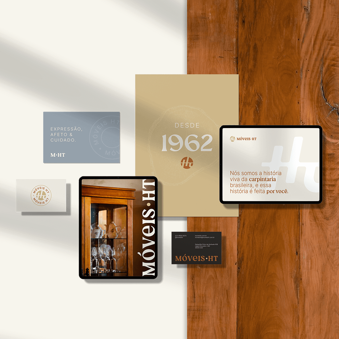
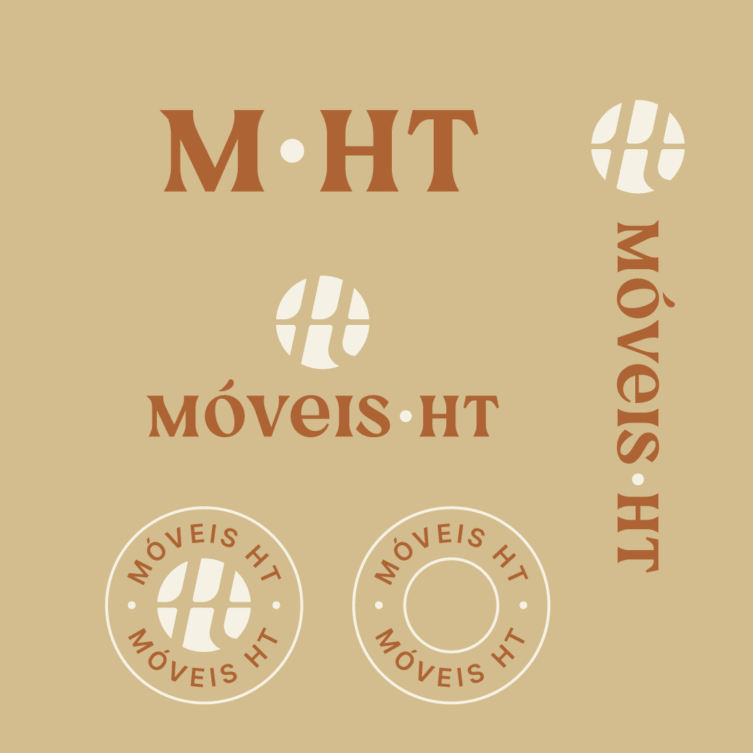
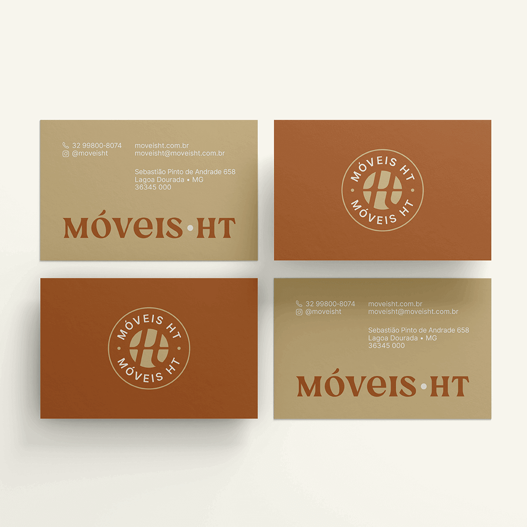
The transformation required a delicate balance. Our design team envisioned a logo that was a modern nod to the past – a sleek, abstract interpretation of the initials “HT,” infused with the warmth and tradition of Minas Gerais. It wasn’t just a logo; it was a symbol of evolution.

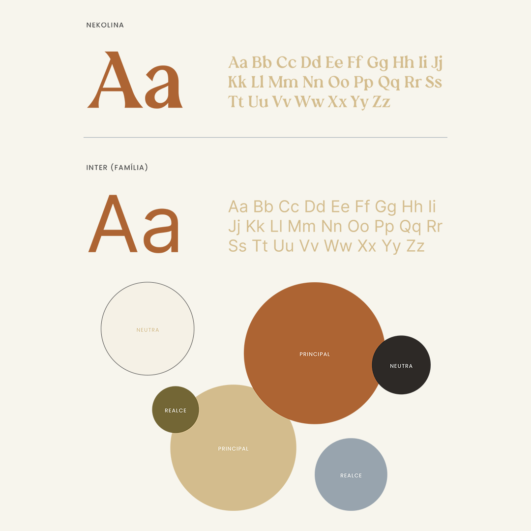
In choosing the color palette, we sought to encapsulate the essence of Móveis HT’s heritage. The earthy browns and vibrant greens and blues were more than just colors – they were a narrative in themselves, telling a story of warmth, trust, and nature.

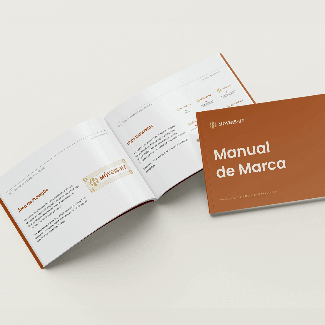
Typography was another critical element. We selected fonts that were clear and legible yet carried the weight of tradition. This choice ensured that Móveis HT’s message was not lost in translation, whether in print or digital.

Addressing Customer Pain Points

Our strategy extended beyond aesthetics. We knew Móveis HT’s audience faced dilemmas – from the high cost of quality furniture to concerns about sustainability. Our marketing strategy addressed these pain points head-on, showcasing Móveis HT’s commitment to quality, durability, and environmental responsibility.

The Result: A Brand Reborn

The transformation of Móveis HT by The Copper Portico was more than a rebranding; it was a renaissance. The new brand identity resonated with customers, old and new, as a symbol of both tradition and innovation. It wasn’t just about selling furniture; it was about selling a story – a story of a home, heritage, and heart.

Why The Copper Portico?

This case study isn’t just about Móveis HT’s journey; it’s a testament to what The Copper Portico can achieve. We don’t just see a brand; we see a legacy waiting to be unveiled. Our approach is meticulous, our creativity boundless, and our strategies tailored to echo the voices of the brands we elevate.

When you partner with us, you’re not just getting a branding agency; you’re gaining a collaborator in crafting your legacy. Whether it’s reimagining a logo or redefining a brand’s narrative, our mission is to tell your story in a way that resonates with the world.

Brand Identity

miami, US | 2021 | women-led community

When the Anima Collective set out to reinvent themselves, they turned to The Copper Portico. The task was clear: revamp the brand to better reflect its mission and energy. Together, we brainstormed their new name and infused their values into a brand image that would resonate with their audience.

The Brand Reimagined

The Anima Collective’s new logo needed to be more than just aesthetically pleasing—it had to tell a story. We delivered with a design that captured both mystique and clarity, blending art deco flair with bold, modern shapes. The logo’s interlocking ‘A’s form a diamond, symbolizing growth and strength, with a subtle nod to the collective’s feminine roots.

A Colorful Conversation

Our chosen color palette wasn’t just about looking good—it was about feeling right. Dark greens and golds mixed with deep magentas and lilacs give the Anima Collective a distinct energy that’s inviting and powerful.

Speaking through Typography

We selected Mialgor for its modern edge, bringing a sense of stability and confidence to headings and key messages. For the finer details, we picked fonts that ensured every word on their website and printed materials was easy to read and impactful.

Designing an Online Home

Our work extended into the digital realm, where we crafted the web pages for The Anima Collective. Every page reflects their renewed brand, with intuitive navigation and engaging layouts that draw visitors into the Anima experience.

Imagery that Connects

The images we selected for Anima’s brand and website aren’t just placeholders—they’re an invitation. We focused on real, relatable visuals that showcase the diversity and vibrancy of The Anima Collective community.

What's Next for The Anima Collective

As The Anima Collective steps forward with their new brand, we’re right there with them, fine-tuning a digital presence that matches their offline identity. Our journey together is about keeping the brand as dynamic and engaging as the community they foster.

Interested in evolving your brand with a team that gets it? The Copper Portico isn’t just about delivering a project—we’re about delivering your brand’s potential. Let’s start the conversation and see where we can take your brand together.

Brand Identity

Fort Lauderdale, US | 2022 | Body & Bath products

lani.xo is a self care brand that encourages a balanced lifestyle for busy women.

about

lani.xo is a self care brand that encourages a balanced lifestyle for busy women. Inspired by the founder’s personal story, lani.xo helps people focus on the brighter version of themselves and hope for better days.

We’re invited to collaborate with lani.xo on the creation of the brand’s packaging: a line of products featuring soaps, body butters, bath teas and sugar scrubs.

design strategy

In order to achieve the results the founder was looking for, our team chose to focus on the brand’s mission. We used lani.xo’s purpose as our main guide to design elevated labels that anchors the brand in simplicity, self care, and gentleness.

The end-product is a line that appeals to the consumers both visually and emotionally by using a combination of calming colors, clean fonts and concise messaging.

We also supported lani.xo with a set of social media graphics and custom icons that helps them to showcase the benefits of their products in an elegant and friendly way.

Brand Identity

miami, us | 2024 | education

A private research university with more than 17,000 students from around the world, the University of Miami is a vibrant and diverse academic community focused on teaching and learning, the discovery of new knowledge, and service to the South Florida region and beyond.

design for higher education

New times call for new proposals. 

And that’s why the University of Miami College of Engineering has sought to update itself in the face of today, communicating its essence as a vibrant and diverse academic community.

We’re proud to serve UM and help them renew the visual language of the College of Engineering for the new times. 

During our outgoing collaboration, our goal is to convey in a clear and original way the dynamism and vivacity that keep UM in a prominent position among American Universities, without losing the professionalism that guarantees the success of more than 17 thousand students around the world.

Featured projects: digital brochures, flyers, email marketing design, infographics and retractble banners.

Brand Identity

miami, us | 2022 | wellness

Maya Weber is a Trauma & Somatic Release Therapist based in Miami. We worked with Maya to revamp her logo and design key collateral materials for her brand.

about

Maya Weber is a Trauma & Somatic Release Therapist based in Miami, Florida.

We worked with Maya to revamp her brand and create key collateral materials to promote her services online.

design strategy

In our VIP Design Day with Maya, we outlined the plan: the creation of a typographic logo, a basic brand sheet with the brand’s main information, a business card design and templates for social media graphics. 

For the logo, we looked for a typography that was elegant and conveyed movement through organic curves and strokes. The main font was paired with a clean secondary font, combined with a serif for keywords to convey lightness, creativity and proximity.

Mustard and green were chosen as main color choices, as they inspire nature and give a sense of welcome. We selected brown and pink as secondary colors, following the same idea of coziness, to add more possibilities in the design of Maya’s brand materials.

Brand Identity

Miami, US | 2021 | investment firm

Place Projects is a Miami-based Real Estate investment firm with an impressive portfolio in Wynwood, Doral and Brickell neighborhoods.

about

Place Projects is a Miami-based Real Estate investment firm with an impressive portfolio in Wynwood, Doral and Brickell neighborhoods. Founder and owner Joe Furst reached out to the Copper Portico to design a website who would showcase their projects and expertise.

design strategy

We worked with Place Projects‘ team to create an elegant website that would appeal to their clientele, organizing and optimizing the structure in a way that would help potential clients to find and process the information they needed.

Brand Identity

miami, us | 2021 | education

Arté Club is an experience curated by Lidia Pineda for her art students. All classes begin with a mindfulness exercise to bring students into the present moment and connect them to their inner child through art.

about

Arté Club is an experience curated by Lidia Pineda for her art students. All classes begin with a mindfulness exercise to bring students into the present moment and connect them to their inner child through art.

We’ve worked with Lidia before on the creation of LidsBabe and were excited to collaborate on this special project. 

design strategy

Arté Club’s brand was based on the concept of a prism, a kaleidoscope and the sacred geometry of a Merkaba. Thinking about the Club’s goal of empowering people to express themselves creatively through art, we saw this process as a prism. It separates a beam of light into a spectrum of colors, so it would be like a person transforming and materializing all their ideas and feelings into art.

Also thinking about the individuality of each person and the different ways of seeing the world, we thought of the kaleidoscope, which has three mirrors that form a triangle, and when moving the tube, it presents various visual arrangements, as each individual expresses himself creatively differently from each other.

Since Lidia uses mindfulness tools, we wanted to bring to the logo something that gave the idea of ​​expansion and balance, as well as the mindfulness symbol, which looks like a droplet falling into water and spreading. We incorporated the concept of the Merkaba (the name literally translates to light, spirit, body), a symbol made of two pyramids that intersect and rotate in opposite directions, creating a three-dimensional energy field. It is considered to be one of the highest vibrating geometric shapes designed by the universe and reminds us of the power we can wield when we join our own energies for connection and growth. It combines opposing energies in perfect balance: masculine and feminine, earth and cosmos, matter and spirit…resulting in an activation of light and protection, also reminding us of our power as we find balance and raise our vibration.

For the colors, we used a gradient with transparency to create a light/holographic effect and add more dimension to the logo. We also used black and terracota, which are already part of your brand, as well as typography.

Brand Identity

dallas, us | 2021 | apparel

Cabana Life has been on a mission to provide sun protective swimwear, dresses and cover-ups for 15 years. We collaborated with Swiftkick Web to refresh Cabana Life’s website look and improve user experience performance.

about

Founded by a skin cancer survivor, Cabana Life has been on a mission to provide sun safe and stylish apparel for 15 years. They offer a line of sun protective swimwear, dresses and cover-ups.

Cabana Life website revamp was a collaboration with Swiftkick Web, a website development agency. We worked with them to identify inconsistencies and refresh Cabana Life’s look.

design strategy

We also created brand guidelines that proved essential to make the website consistent, modern and easy to navigate.

Our redesign focused on formatting consistency, typography choices, color scheme and overall layout, which highly improved ADA scores, white space consistency, among other benefits.

highlights

Since the revamp, Cabana Life has increased their website performance by 30%.

Cabana Life Responsive Website Layout

Brand Identity

MIAMI, us | 2021 | brand strategy

Lidia Pineda is an artist, creative director and storyteller. She offers curated experiences to clients willing to experience their own divinity through creativity.

about

As an artist, creative director and storyteller, Lidia Pineda offers curated experiences to those willing to experience their own divinity through creativity. We had the honor of working with Lids on her brand identity, and it was very rewarding to see her vision expand and take form.

design strategy

Our goal was to create a feminine and organic logo with a mystical vibe, showing Lid’s aesthetics as well as her spiritual and creative side. Her figure was represented in the logo as the creative muse, intermediating the portal of creativity. The rounded frame around her represents this portal, and the crown symbolizes sacred energy and connection with divinity.

Lid’s hair has a starry sky, alluding to the infinity of the universe, and the moon was incorporated symbolizing the emotions and the subconscious; an inverted version was used as a necklace to represent the balance of mind and body.

Highlights

This project won MUSE Creative Awards: Season 1, Gold, in 2022.

Brand Identity

miami, US | 2024 | cultural institution

Imagine having a team so in tune with your brand's heartbeat that they anticipate your needs and translate them into tangible experiences. That's the story of Vizcaya Museum and Gardens and The Copper Portico. As their contracted design department, we're the creative backbone behind the brand's most memorable moments.

A Retainer Relationship That Delivers

The beauty of a retainer relationship is the synergy it creates. With Vizcaya, we’ve become more than a service provider; we’re part of the family. This closeness breeds consistency and quality that won awards and set new benchmarks for excellence.

What's next?

As we continue our journey with Vizcaya, our eyes are on the horizon. We’re already dreaming up the next series of designs that will captivate and engage. For us, every new project is a chance to innovate and celebrate the legacy that is Vizcaya.

The partnership between The Copper Portico and Vizcaya Museum and Gardens is a living proof that the right creative team doesn’t just complete projects—they elevate brands. We don’t wait for direction; we’re part of the conversation, helping to shape the future of an institution that shapes the cultural landscape of Miami.

If you’re intrigued by what a dedicated, retainer-based partnership can do for your brand, let’s chat. We’re not just making designs; we’re crafting stories, and we’d love to tell yours.

highlights

We’ve received the Award for Best Print Design on November 2021, by DesignRush, showcasing their 2021 Gala Program.