By Lilian Santini
Fractional Creative Director
The Copper Portico
Client: Tatiana Irizar Founder: Tatiana Irizar Category: Premium haircare (DTC, Amazon, international) Referred by: Miami Growth Machine Partnership: Ongoing Scope: Packaging design (primary + secondary), art direction, ongoing creative support
Tatiana Irizar is a Venezuelan journalist turned beauty entrepreneur, now based in Miami, building a haircare brand that ships worldwide. She came to The Copper Portico through our partnership with Andrea Cid at Miami Growth Machine, with a product she had formulated herself and a vision for packaging that felt elegant, botanical, and premium — in two languages, for two markets, without compromise on either.
Tatiana spent over 20 years as a journalist, reporter, and TV host — first at Venevisión in Caracas, then at Univisión in the US. She hosted coverage of the Miss Universe and Miss World pageants. She built a following of over 245,000 on Instagram. And through all of it, she was searching for beauty products that met her standards and never finding them.
So she made her own. She brought together a team of chemists, led the formulation process, and launched a haircare line rooted in plant-active ingredients formulated and made in the US. The brand sells through her own site and Amazon, with free shipping to both the US and Venezuela. Her audience is bilingual — and the packaging needed to speak both languages.
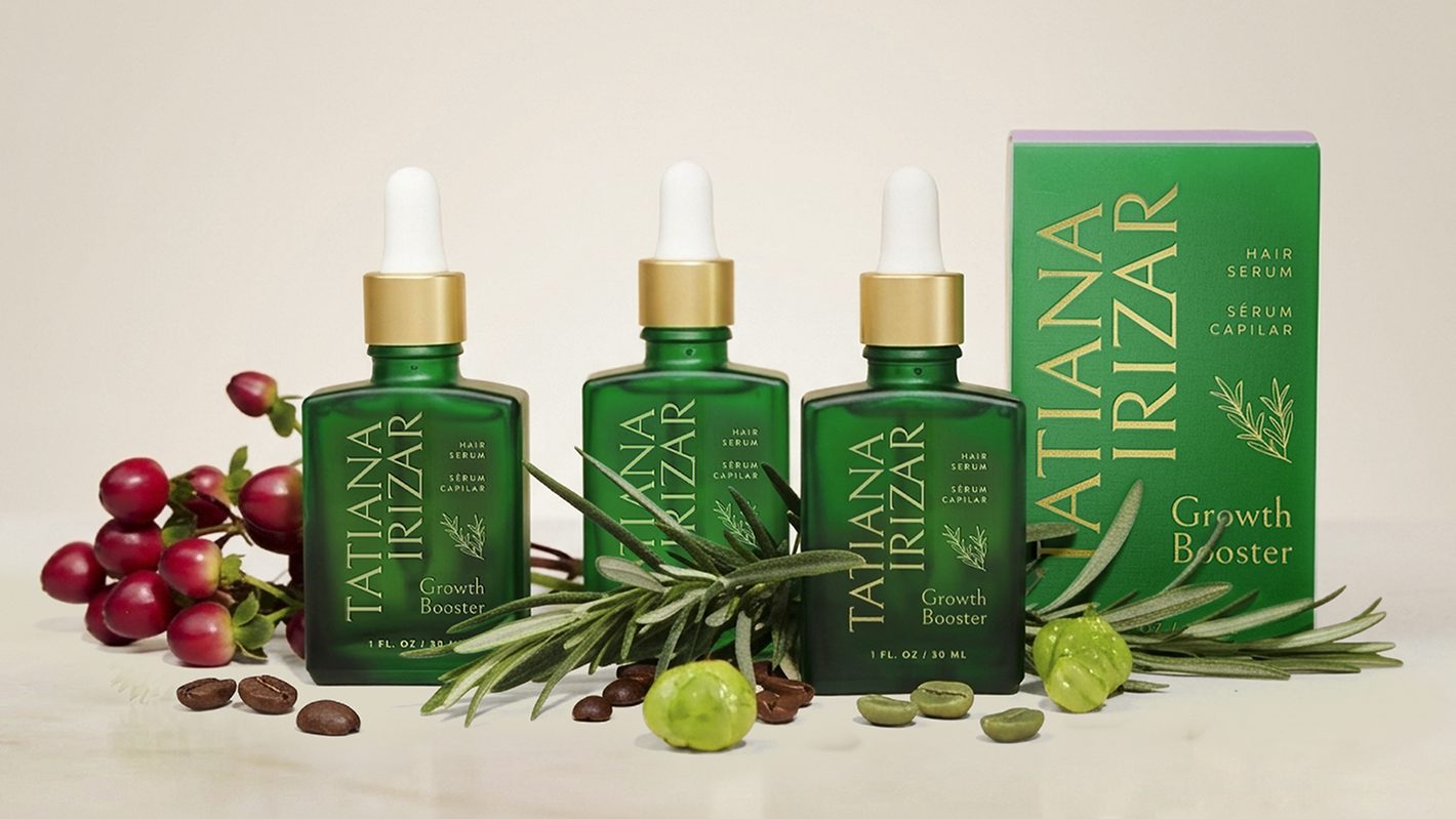
We started with the hero product: the Growth Booster Hair Serum. From there, we built outward into a system that could scale across SKUs and across languages.
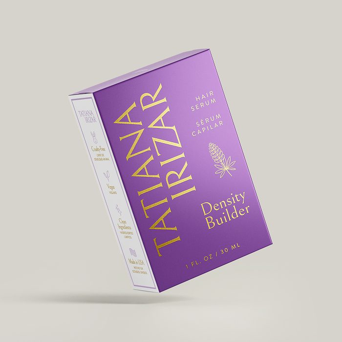
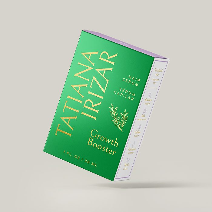
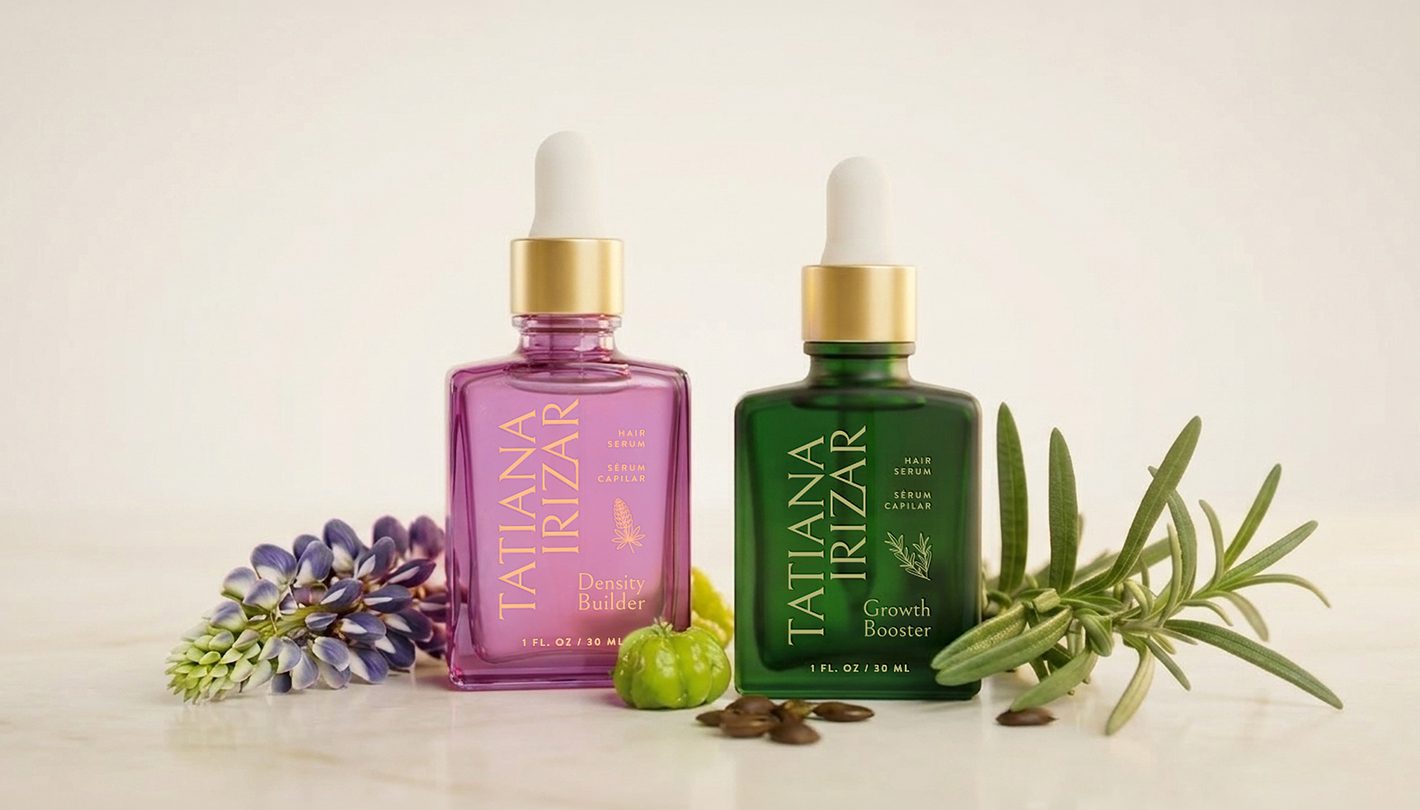
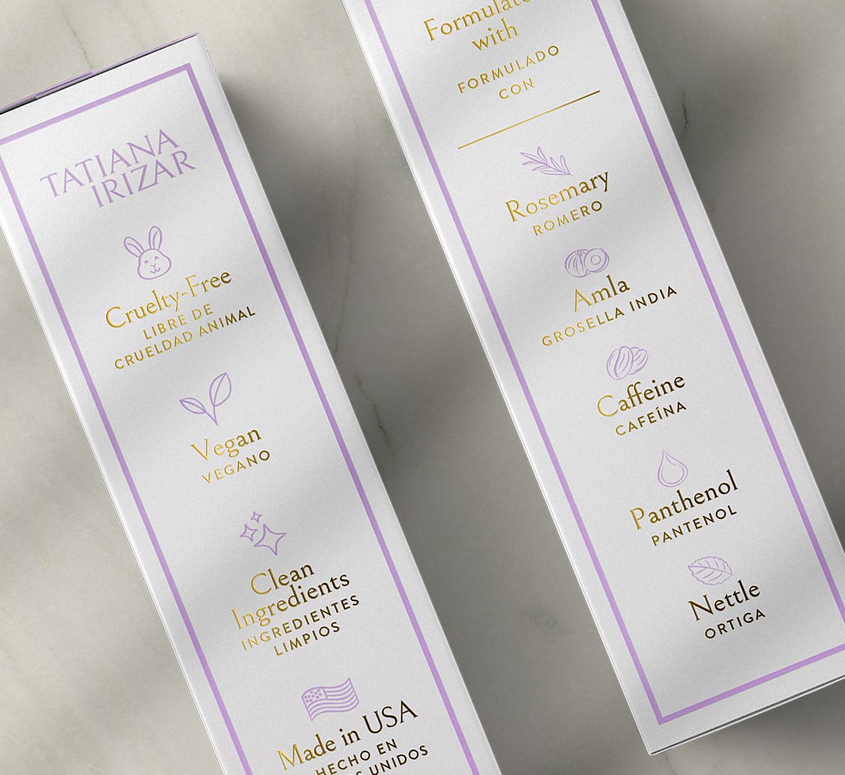
The bottle: The glass is colored: emerald green for Growth Booster, purple for Density Builder. Two products, two colors, immediately distinct on a shelf or in a photo. The logotype runs vertically in gold foil, giving the bottle a fashion-forward presence on a shelf full of horizontal labels. A fine-line botanical illustration sits beneath the product name: each one drawn from the key ingredients in that formula, so even the drawing on the bottle tells you what is inside.
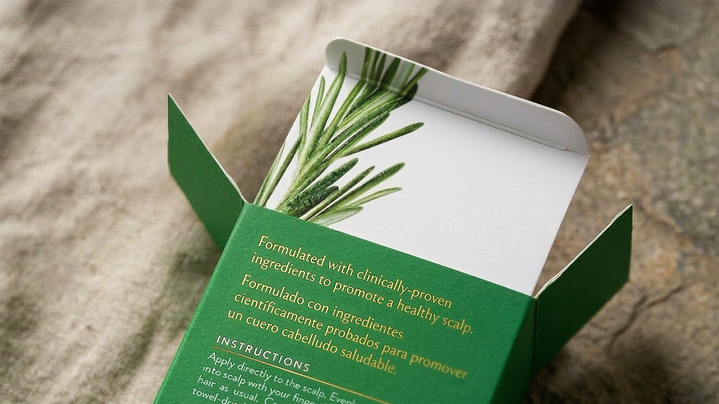
The bilingual details: English and Spanish sit together on every surface, but with intentional hierarchy. “Hair Serum” in English, “Sérum Capilar” in Spanish. Neither language is smaller. Neither feels like a translation added after the fact. For a brand whose audience reads in both languages without thinking about it, getting that balance right matters more than most design decisions on the box. And it goes deeper than layout. During the production review for a later SKU, we caught a translation error — “Biotín” where it should have read “Biotina” — before more than 10,000 boxes went to print. A Latin American customer would notice it immediately. It is the kind of detail that erodes trust in ways a brand cannot afford when the audience is fluent in both languages.
Ongoing work: As the brand expands, we continue to provide creative direction and design for new SKUs, along with updates to dielines and materials, strategic input on maintaining the brand system across new products, and art direction for retail and e-commerce visuals. We work closely with the Tatiana Irizar team through our ongoing relationship with Miami Growth Machine.
Tatiana’s packaging does not just need to look premium. It needs to be correct — in English and in Spanish — across every surface. Ingredient names, directions, regulatory text, marketing copy. Two languages on one label, and both have to read as native.
This is a challenge that applies to a growing number of beauty founders. Latin American entrepreneurs building brands in the US. US-based founders selling into Latin American markets. Brands with bilingual communities where the audience switches between languages without thinking about it. In every case, the packaging is the surface that has to get it right, because it is the one thing the customer holds in their hand and reads.
The Copper Portico works with founders navigating this space. We handle the design, the production coordination, and the manufacturer communication. And for bilingual packaging, we work with specialized translators for Spanish-language markets to ensure the copy is accurate, culturally appropriate, and consistent across every SKU.
Tatiana Irizar now has a signature packaging system that mirrors the brand’s identity: elevated, feminine, botanical, and polished. From the gold-detailed box to the jewel-toned bottle, the customer experiences the brand from the first moment, whether they are reading in English or Spanish.
The products are on Amazon, on her DTC site, and reaching customers across the US and beyond. The brand has grown from one serum to two, with more SKUs in development. And every new product enters the market with the same level of care, the same visual language, and the same bilingual precision.
The Copper Portico brings together professionals whose work spans brands like Estée Lauder, Natura, and L’Occitane. Our team includes senior designers with deep experience in beauty packaging production, a developer with 15 years in prestige beauty, and relationships with manufacturers and specialized translators for the beauty and wellness markets. When packaging needs to work across languages and borders, we make sure nothing gets lost between the design file and the printed surface.
The brands we work with are growing into new retail doors, new markets, and new product lines. Getting it right the first time is what fractional creative leadership is for.
If any of this sounds familiar, it probably is. And if you are building something and want someone who thinks at this level, we would like to hear from you.