SALTO is an education-first furniture company based in Chicago that believes better classrooms lead to brighter futures. Their flexible, multi-purpose furniture empowers teachers and students to create dynamic learning spaces — from STEM labs to Maker rooms.
As they prepared to launch nationally, SALTO needed a brand identity and sales materials that matched the boldness and clarity of their mission.
SALTO’s team wanted to break away from the cold, corporate feel of typical school furniture catalogs. They needed a brand that felt:
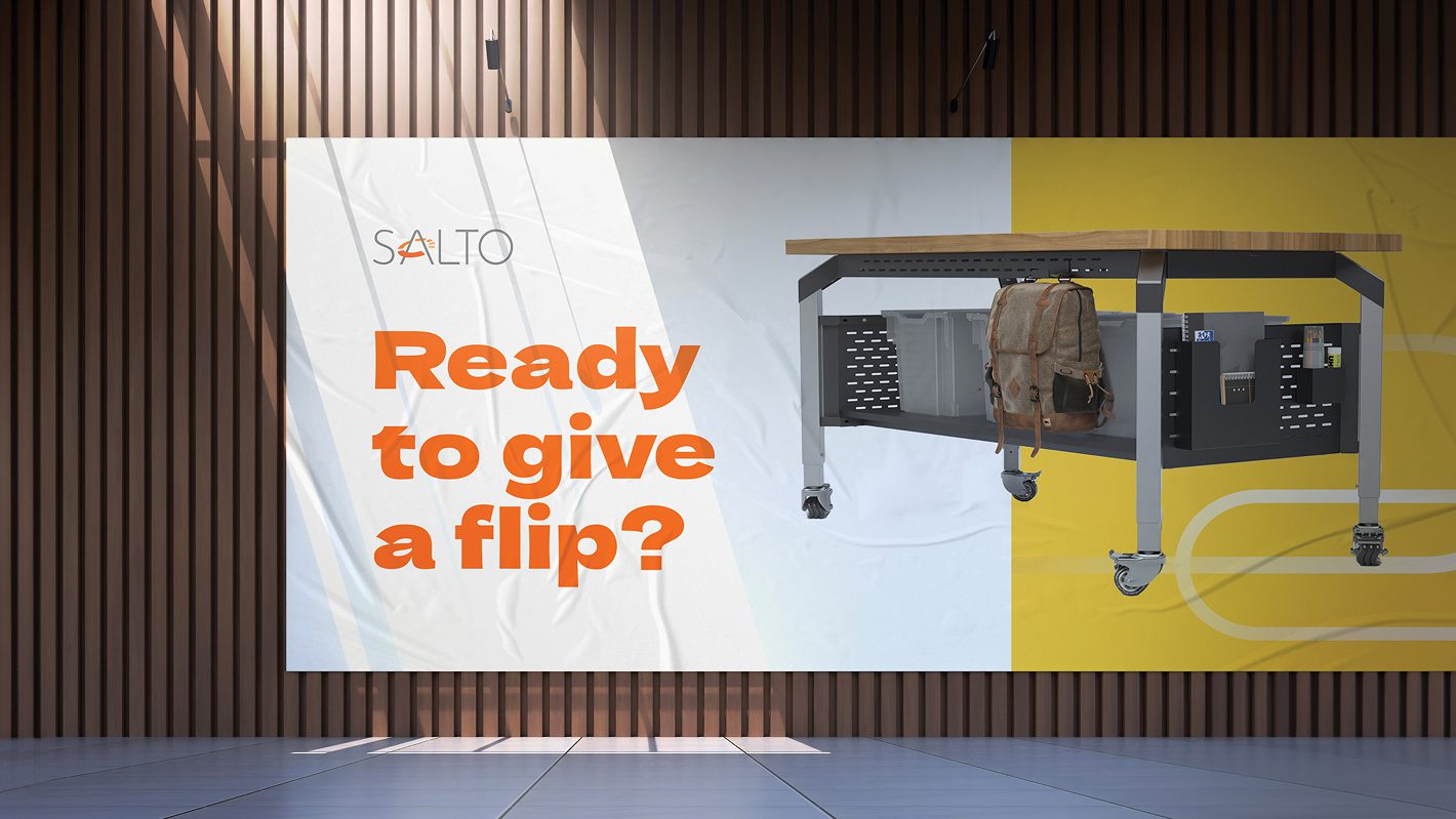
They also needed a high-impact sales brochure that could serve as a leave-behind for schools, contractors, and design firms — something visually striking and strategically sound.
The Copper Portico came in to build SALTO’s visual identity from the ground up and bring it to life across brand materials. From strategy to final files, we made sure the design matched the mission.
We developed a full visual system including logo usage, color palette, typography — all captured in a comprehensive Brandbook to guide future use.
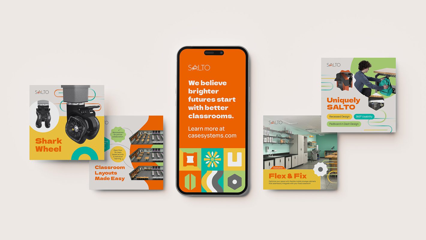
We created a bold, modular pattern system inspired by SALTO’s own furniture shapes and classroom tools. These visual elements appear throughout their materials, giving everything a unique, consistent personality.
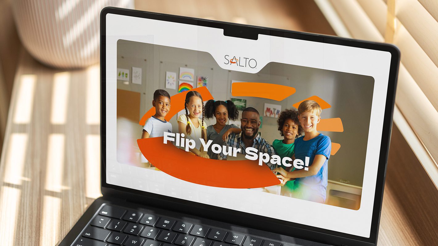
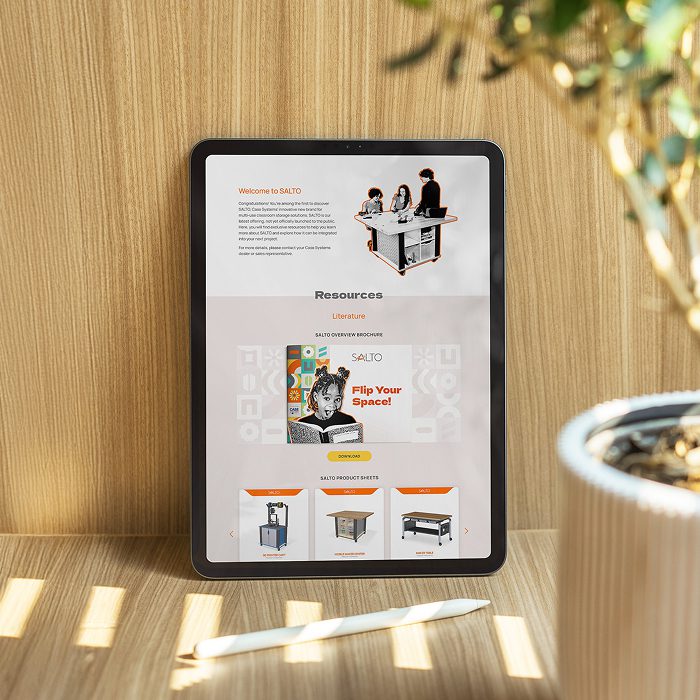
We designed SALTO’s website to reflect their bold visual identity and make product information easy to explore. The site balances clean design with playful elements, aligning with the brand’s energy and educational mission.
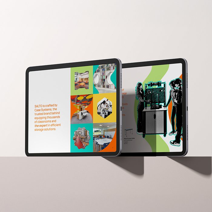
We designed a vibrant, photo-rich brochure to help SALTO present its value in a clear, compelling way. It included:
We designed product packaging sleeves that reflect the brand’s joyful tone — clean, modern, and visually connected to the rest of the brand. The sleeves help create a cohesive unboxing experience that feels polished and thoughtful.
We directed the overall visual tone: cutout halftone photo treatments, bold iconography, and classroom-centric layouts that keep the focus on people and movement, not just the furniture.
The updated brand and sales materials gave SALTO a cohesive, exciting presence that feels both professional and personal. Their team now has the tools to confidently share their message with schools and partners across the country — and stand out in a crowded market.
When a brand’s values come through in every detail — from packaging to sales materials — it builds trust, momentum, and lasting impact. Our work with SALTO shows how thoughtful design can energize a growing company and support real-world change.