"I was talking to someone and said, 'We're a small brand. We've only been around for five months.' They said, 'I thought you guys were like a 10-year-old brand.'"
— Sean Finney, Founder, Tano Skincare
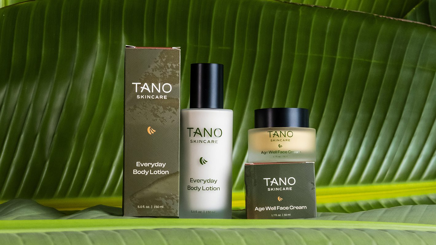
Brand: Tano Skincare Founders: Annie and Sean Finney Category: Premium skincare (DTC + retail-ready) Partnership: March 2024 – Present (ongoing) Scope: Full brand identity, packaging design, investor pitch deck, marketing collateral, premium gift sets
Sean had a product he believed in—but no way to show it.
“When I hand someone my product in an amber glass jar with a label taped over the front, it felt really unsophisticated. It felt like I was asking somebody for a favor.“
He knew the formula was good. But without professional branding, he couldn’t charge what it was worth. He couldn’t approach retailers. He couldn’t show up at investor meetings with confidence.
And he’d already tried working with other designers—experiences that left him frustrated.
“With other designers, everything was behind a curtain. They’d pop a design out and I’d go, ‘That missed the mark. I wish you would have talked to me before you put all this time in.’“
Sean needed more than a designer. He needed a partner who understood skincare, worked fast, and got the vision right the first time.
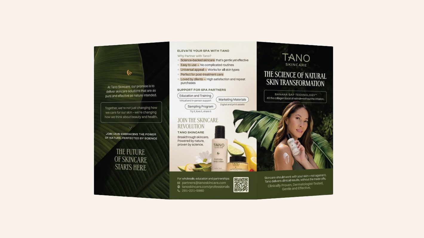
We now continue to support the Tano team with ongoing design needs, including new packaging formats, product booklets, email templates, and investor-facing materials that keep the brand aligned, polished, and ready for growth.
The Copper Portico became Tano’s integrated creative partner—handling brand identity, packaging, and investor materials under one roof.
Sean noticed the difference immediately:
“You guys did a really good job of explaining, ‘Hey, here’s what we’re thinking we’re going to do. Does that align?’ That saved a ton of time and rework because I knew what I was going to get before I ever saw it.“
“You guys felt like you were two to three times faster.“
No guessing. No surprises. No endless revision cycles.

Professional branding changed everything for Tano—and for Sean as a founder.
Perceived as an Established Brand
“The branding made our brand feel like it had been around for a long time, that it was sophisticated. Customers went, ‘Wow, this is really legit.’ Even though we had only existed for three weeks.”
Unlocked Premium Pricing
“I don’t think we could charge the pricing we’re at if we didn’t have as good a packaging.“
Sales Confidence Transformed
“Once I had the professional packaging, that’s when it really unlocked for me. This is something I can stand behind and be proud. People absolutely should pay me for this because this is a really good product in really good packaging.“
Retail-Ready Presence
“I would be very comfortable dropping it on a shelf next to any other skincare brand. I don’t think anybody can say anything negative about our packaging. It’s extremely professional.“
Faster Time to Market
Digital renders allowed Tano to launch their website, run social media teasers, and build pre-launch momentum—before product photography was even possible. When the products arrived, the brand was already in motion.
Since March 2024, Sean has returned for every new product launch, every investor presentation, and every expansion of the Tano line. When asked why:
“From day one, you guys seemed to get exactly what we were doing. It resonated with you immediately. And it made everything super simple.“
“Combining branding and packaging under one roof is really valuable. There’s a continuity you get that otherwise you have to communicate. And none of us are actually good communicators.“
“The cost of redoing something—both from a time and money perspective—is pretty high. I see that as a significant cost savings to just get things right the first time.“
Today, Sean is one of The Copper Portico’s referral sources—connecting other founders who need the same transformation.
“I am typically someone who is very stingy with recommendations. You are one of the few partners that I will without a doubt recommend every single time.“
When asked what he’d tell a founder considering investing in professional branding:
“If you’re direct to consumer, it’s not really a choice. You have to do it or you’re kind of relegated to selling at farmers markets.“
“People accept when you sell at a farmer’s market that your packaging isn’t going to be great. If you go anything outside of that, you better be on point or you’re not going to sell.“
| BEFORE | AFTER |
|---|---|
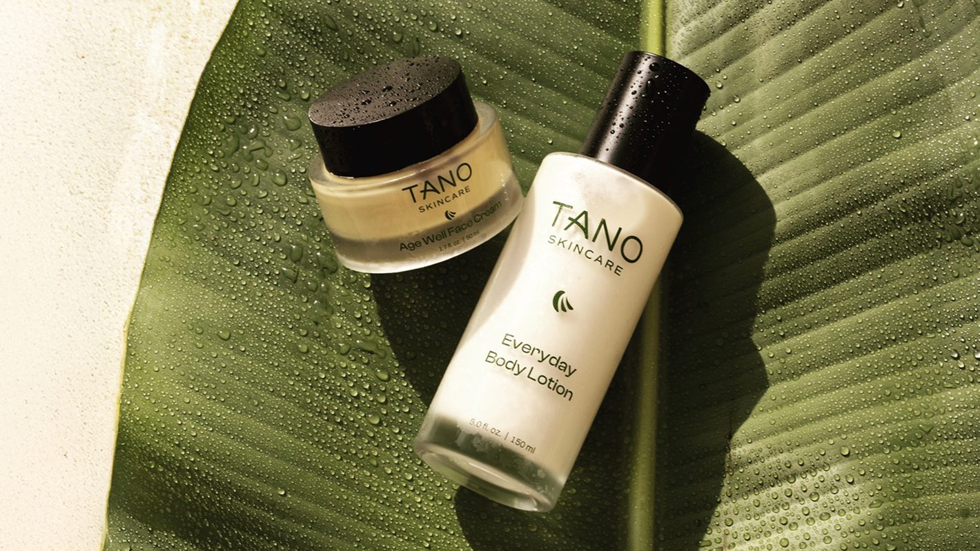
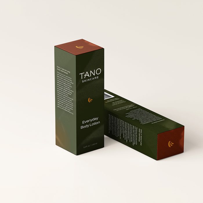
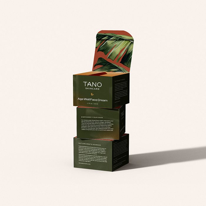
| Amber jars with taped labels | Premium packaging with custom textures and foil details |
| Selling felt like asking a favor | Selling with pride and confidence |
| Perceived as a scrappy startup | Perceived as a 10-year-old established brand |
| Couldn’t justify premium pricing | Premium pricing unlocked |
| Frustrating vendor experiences | “One of the few partners I recommend every single time” |
| Not retail-ready | “Comfortable on a shelf next to any skincare brand” |
The Copper Portico is a fractional creative studio for beauty, wellness, and skincare brands. Brand strategy, packaging design, and Shopify development — one team, one direction, no vendor chaos.