By Lilian Santini
Fractional Creative Director
The Copper Portico
Herbivore Botanicals is not a client of The Copper Portico. This is an independent creative exercise: a demonstration of how I approach a brand at this stage of growth. All observations are based on publicly available information, products purchased directly, and an independent website audit conducted by my team.
Herbivore has spent over a decade building a brand that people genuinely care about: one with integrity in its formulations and consistency in its aesthetic. When a brand moves into a new phase of growth, with new leadership and a sharper product story, it is worth paying close attention.
I leaned in because I admire what they have built. What I found were specific areas where the brand has an opportunity to work harder for the customer: a back label legibility issue on a hero product, a typographic hierarchy that can be streamlined for retail scale, and a digital experience that could better reflect the brand’s commitment to its community through inclusive design.
Herbivore Botanicals launched in 2011 in a Seattle kitchen, built on the belief that skincare could be beautiful and effective without compromise. Over the years, the brand grew into something significant: a loyal following, a presence that helped define clean beauty before the industry had a name for it, and products that people displayed on their shelves with genuine pride.
The brand is now in a new chapter. In 2024, Herbivore brought in former Supergoop! CMO Britany LeBlanc as CEO. The signal was clear: a shift from the aesthetic-first identity that built the community toward clinical efficacy powered by plant actives. In late 2025, they launched an exclusive partnership with Ulta Beauty across more than 850 doors and debuted a 15-piece body care collection—their largest category expansion in years.
Meanwhile, the broader industry is asking hard questions about whether the clean beauty brands of the 2010s can stay relevant. The Business of Fashion published a piece in December 2025 examining this tension across Herbivore, Glossier, and Drunk Elephant. The timing is not lost on me.
I admire all of it. And admiration, for a creative director, tends to come with questions. Growth asks new things of a brand, and the most interesting work happens when you look closely at whether every surface is keeping up.
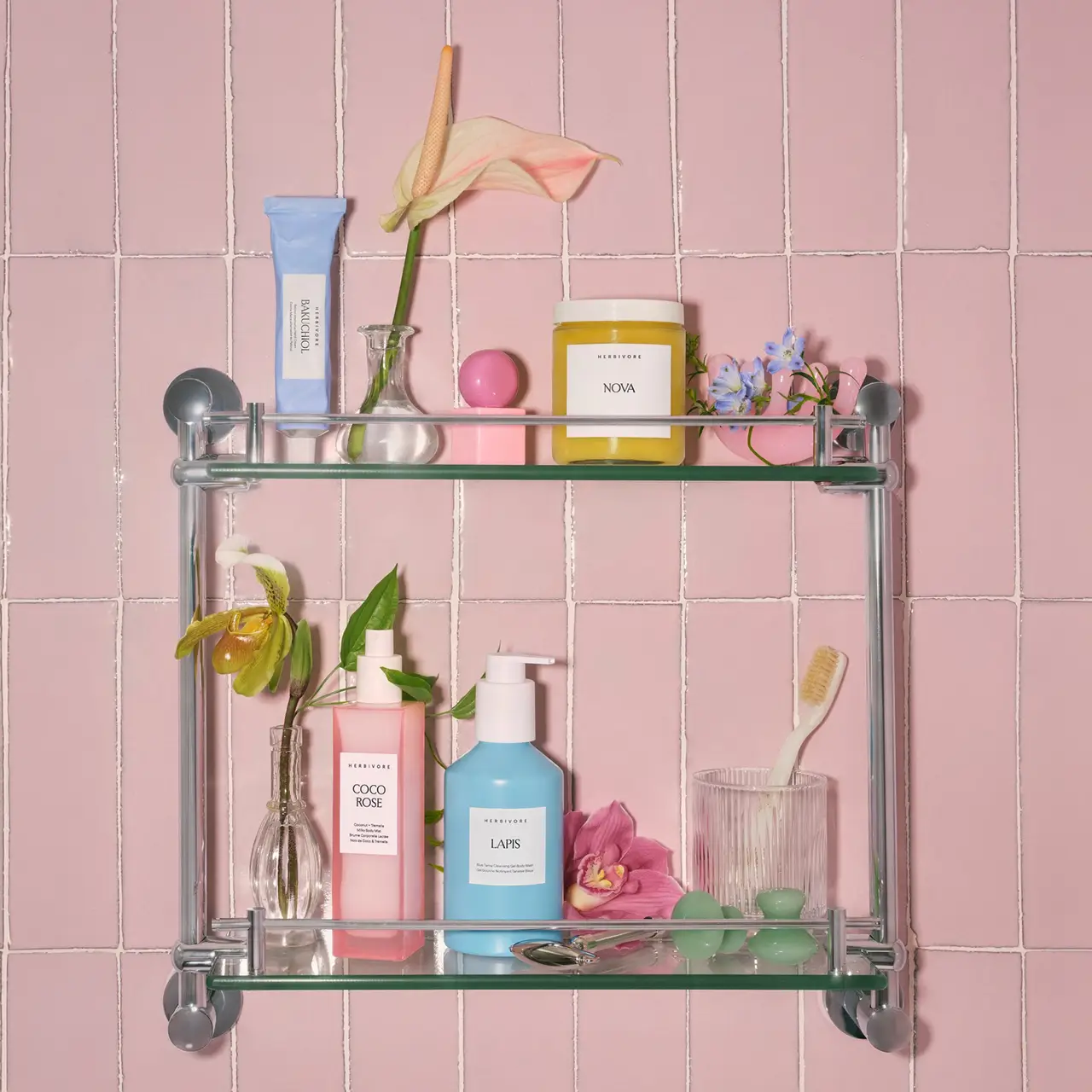
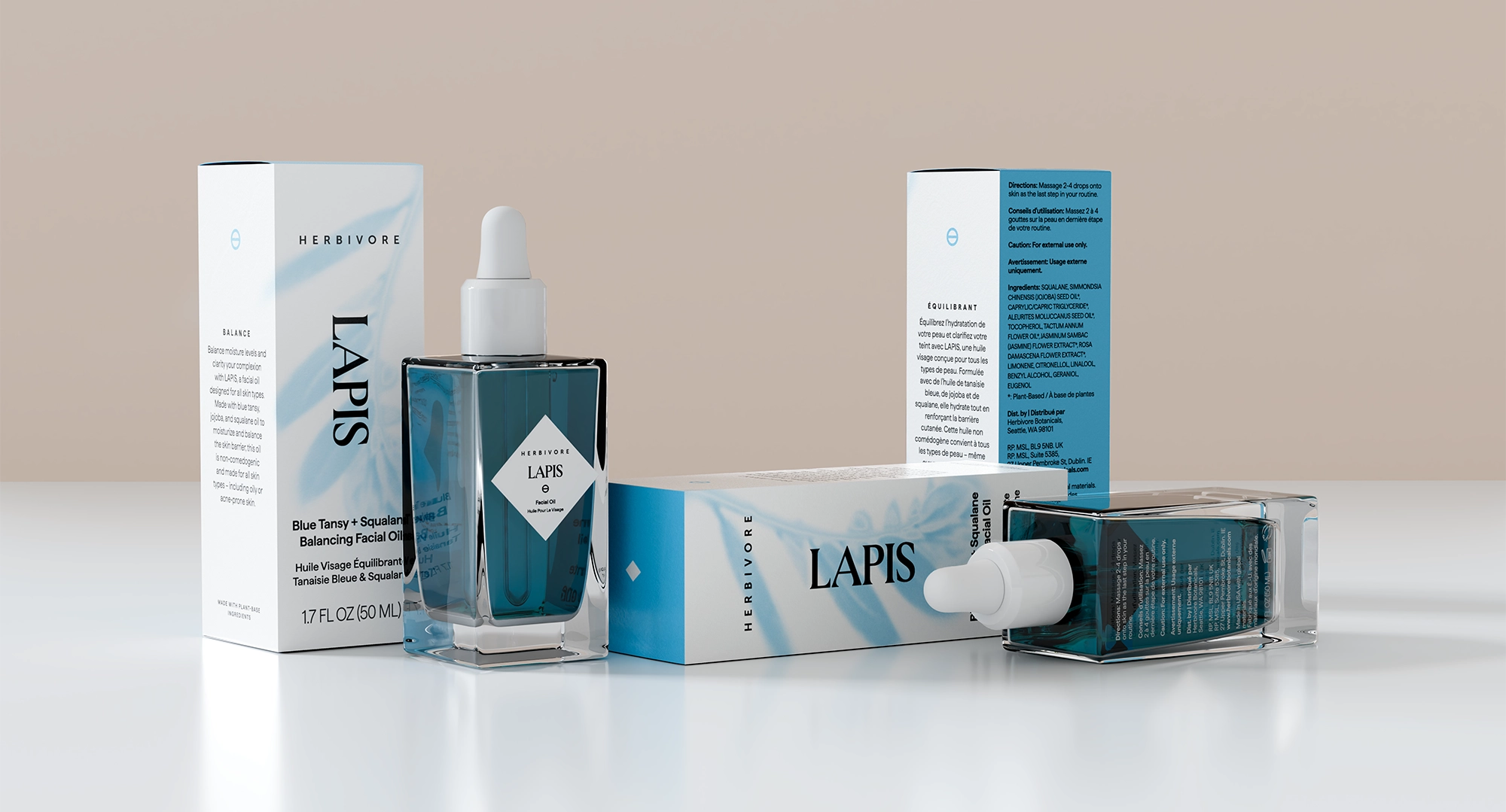
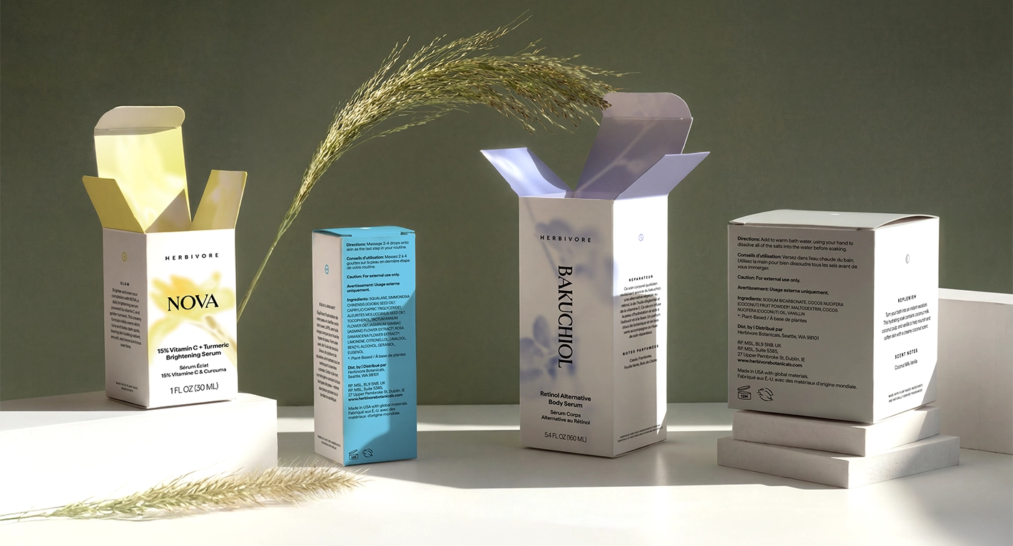
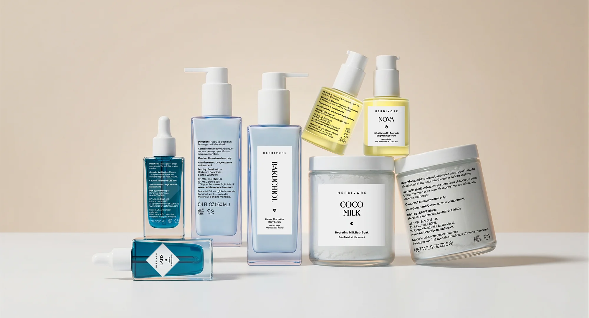
I ordered four products across the collections Herbivore launched at Ulta: Bakuchiol, Nova, Coco Milk, and Lapis.
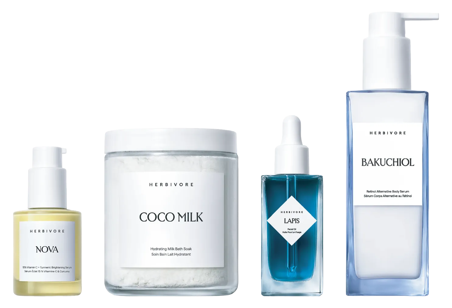
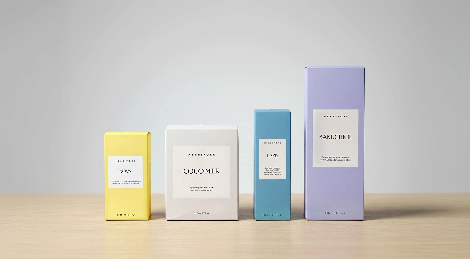
The product quality is immediately apparent. The boxes are bold and confident, fully saturated in each collection’s color. The color system is also immediately legible: purple for Bakuchiol, yellow for Nova, white for Coco Milk, blue for Lapis. At a glance, on a shelf, you can navigate the collection without reading a word.
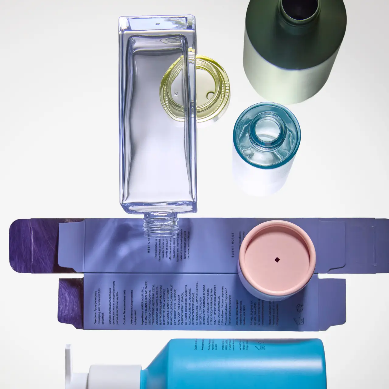
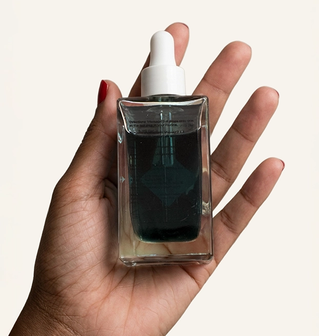
The Lapis bottle is where I stopped. The back label is a transparent sticker, which means the text sits directly over the dark teal liquid. The required information is difficult to read even in good light. A brand deepening its commitment to transparency deserves packaging that lets people read the ingredients.
We addressed this by switching to white text on the label: a straightforward change that restores legibility without altering the bottle’s appearance. We also made an adjustment to the bilingual text hierarchy. Setting English in bold and French in regular weight gives the eye a clear entry point without removing information.
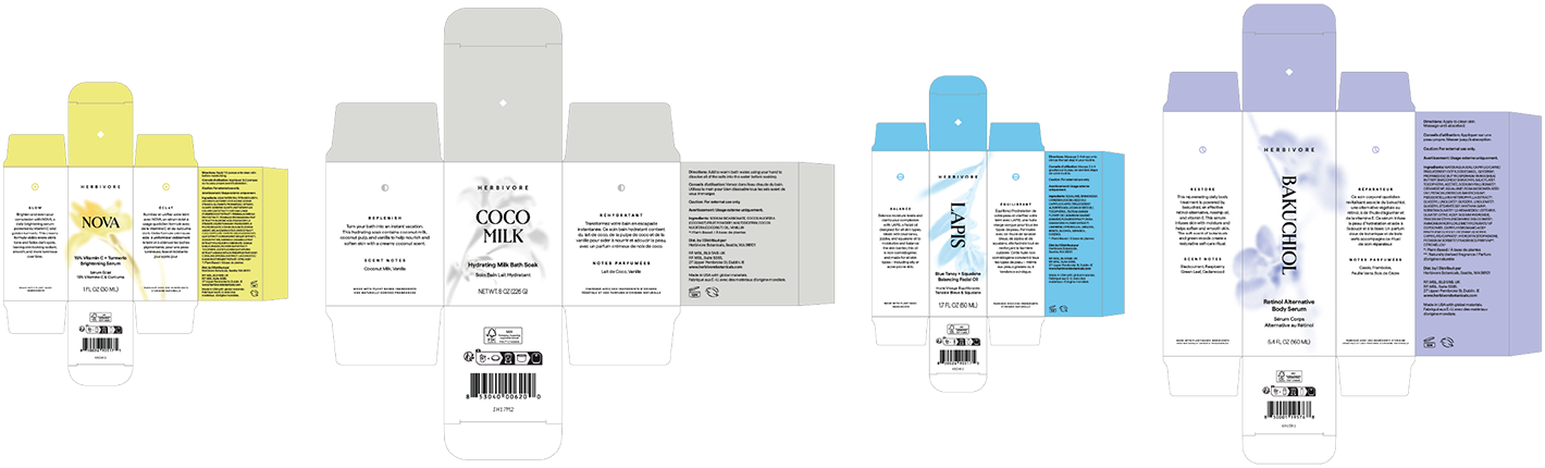
The original boxes are bold, fully saturated in each collection’s color with a white label panel on the front. That approach is strong at first glance, but when you look at the full surface (the sides, the back, the top) the color is doing all the work and the box is not saying much else. Solid-color boxes on a shelf tell you these products belong together. They do not tell you why each one is different.
The team explored how to give the boxes another layer of meaning without losing what made them work in the first place. Our direction reorganizes the relationship between color and white across the entire box.
The front and side panels shift to white, with botanical illustrations rendered in the collection’s own color. Each illustration is drawn from the plant actives inside the formula. Line the four boxes up together and you see four different stories told in four different tones. The system is being more specific now. The back panel keeps the full collection color with the text in black, same as the originals.
Then there is the inside. When you open the box, the collection color is there, but inverted. Full saturated background with the botanical illustrations rendered in white. It is the exterior logic of the box, flipped. Most brands leave the inside of the box blank because by then, the sale is already made. But that is the moment where a customer decides how they feel about what they just bought. The inside of this box tells the them the brand was thinking about them even after checkout. One more surface where the brand is paying attention.
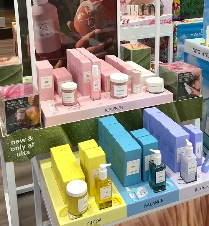
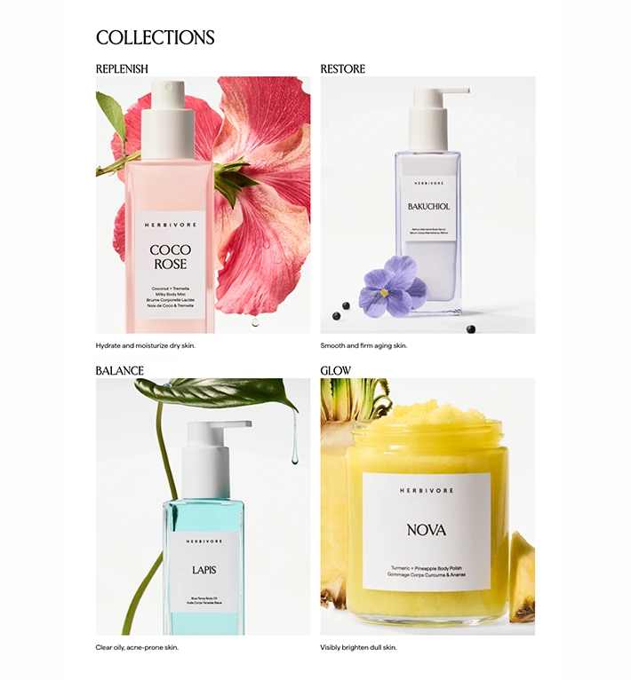
One of the clearest opportunities I identified was giving each collection a visual mark of its own. Right now, navigating between Restore, Glow, Replenish, and Balance requires reading. The Copper Portico team developed a set of minimal icons built from circular forms. Restore gets a clock-hand circle, inferring the idea of recovering what time takes from skin. Glow gets concentric rings expanding outward. Replenish gets a crescent arc nestled inside a circle, like a vessel being filled back up. Balance gets a circle bisected cleanly at center. These marks make navigation immediate and intuitive.
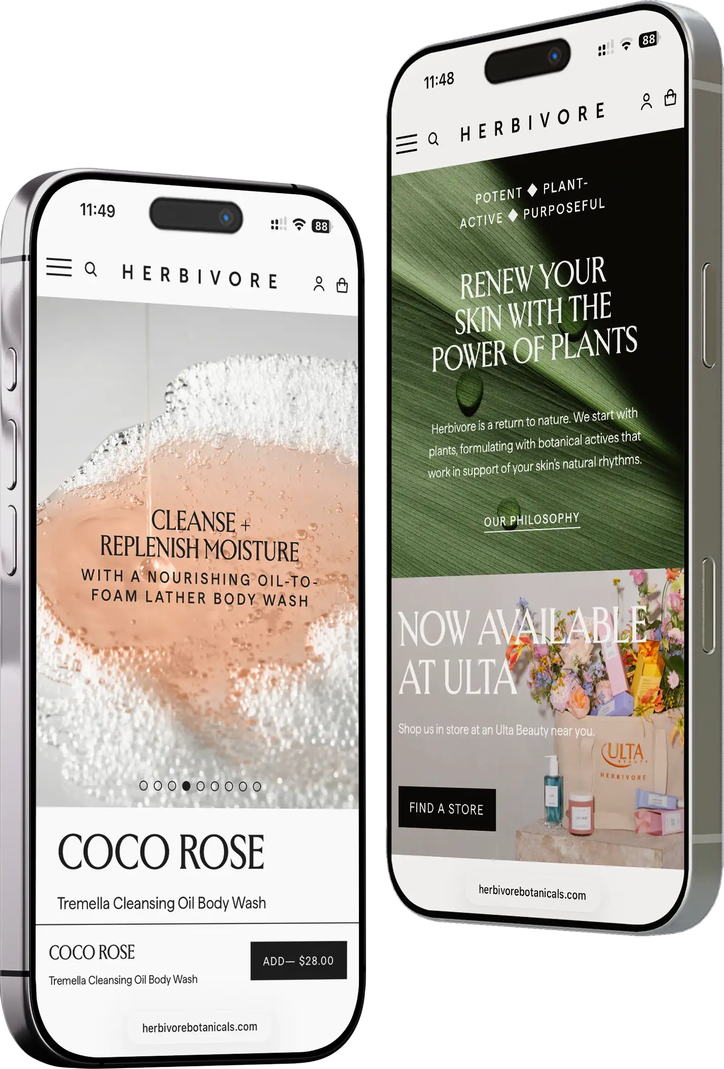
When a brand masters its physical presence, the digital experience must keep pace. I looked at the Herbivore website through the same lens I used for the packaging: asking where the surface could work harder for the person encountering it now.
The Lapis back label taught me something about this brand: Herbivore makes aesthetic choices that are genuinely beautiful, and sometimes those choices create friction for the person trying to use the product. The same pattern showed up on the website.
The current homepage is doing too much at once. Sections sit close together, the type is small, and the imagery competes with itself rather than guiding you through the page. The same hero photo appears twice. A product feature section displays two statistics with identical copy where the numbers should be telling two different stories. When I scroll the page as a whole, I do not always know where to look next, and that is a problem for a brand with this much range.
The Copper Portico team developed a homepage redesign built around four ideas.
It is worth noting that what a mockup can show is the visual layer. A fully inclusive digital experience also requires structural work in the code: ARIA labels, image descriptions, heading logic that lives beneath the surface. The redesign we present here is the creative direction; the engineering is a deeper engagement.
These observations reflect the homepage as it appeared during the week our team conducted this review. Herbivore updates their site regularly, and some of these details may have already changed.
Independent Creative Study. Not affiliated with Herbivore Botanicals.
High-level creative leadership means accounting for the friction of change. These refinements are designed for a rolling update strategy, allowing new secondary packaging and label adjustments to phase in as current inventory depletes, minimizing waste while maximizing impact. By prioritizing the hero SKUs first, the brand can signal its evolution to retail partners and customers immediately, ensuring the visual “glow-up” is as sustainable as the formulations themselves.
Everything I have described shares a common thread: they are all surfaces where the brand has an opportunity to work harder for the customer who is encountering it now. A creative director’s job at this stage is not to reimagine a brand but to ask whether every surface is doing its job as well as it could.
The Copper Portico brings together professionals whose work spans brands like Estée Lauder, Natura, and L’Occitane. I work with growing beauty and wellness brands that need that level of thinking: strategy, packaging, and digital development under one direction, so the work stays coherent across every surface.
The brands I work with are growing into new retail doors, new markets, and new product lines. Getting it right the first time is what fractional creative leadership is for.
If any of this sounds familiar, it probably is. And if you are building something and want someone who thinks at this level, I would like to hear from you.
Kummerow, A. Interview with Beautylish. “How Herbivore Went from Indie Brand to Global Bestseller.” November 12, 2021.
LeBlanc, B. Interview with WWD. “Exclusive: Herbivore Botanicals Names Britany LeBlanc CEO.” June 24, 2024.
LeBlanc, B. Interview with Glossy. “With a new C-suite and updated products, Herbivore is priming itself for a comeback.” July 29, 2025.
LeBlanc, B. Interview with Global Cosmetic Industry. “Herbivore Botanicals Revamps Its Bakuchiol Serum for an Evolving Millennial Consumer.” September 17, 2025.
LeBlanc, B. Interview with Glossy. “Exclusive: Herbivore bets big on body care with a 15-piece collection and arrival at Ulta Beauty.” December 15, 2025.
Herbivore Botanicals press release via PR Newswire. “Herbivore Debuts Exclusive Bodycare Collection and Partnership with Ulta Beauty.” December 15, 2025.
Kummerow, A. Interview with NewBeauty. “Herbivore Launches Body-Care Collection, Enters Ulta Beauty.” December 16, 2025.
The Business of Fashion. “How a Beauty Brand Loses Its Cool — and Gets It Back.” December 18, 2025.