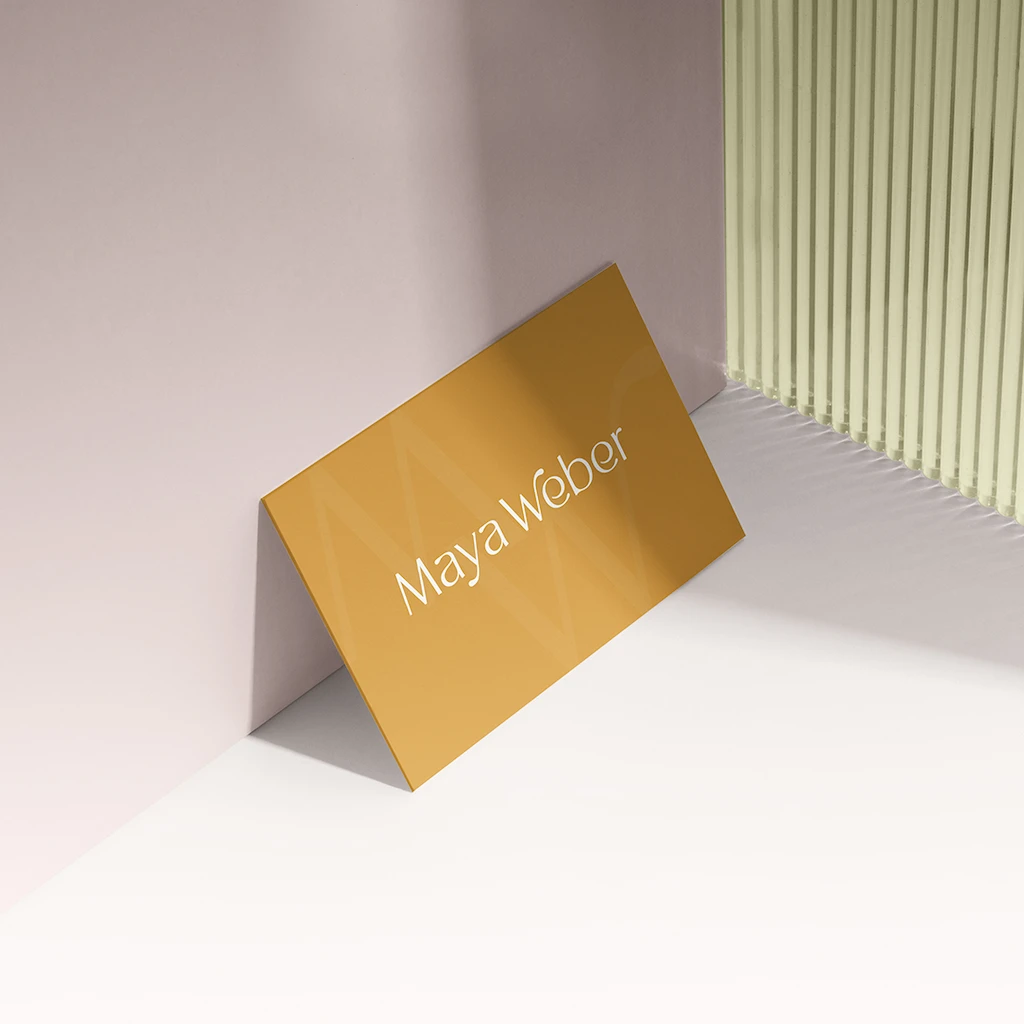
Skip to content

Women-Led

Women-Led

miami, US | 2021 | women-led community

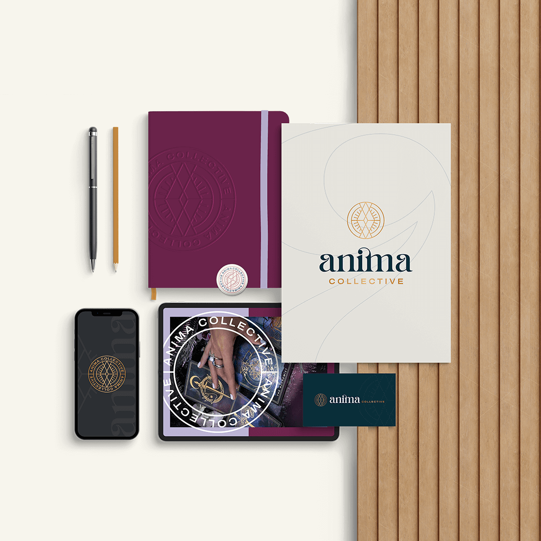
When the Anima Collective set out to reinvent themselves, they turned to The Copper Portico. The task was clear: revamp the brand to better reflect its mission and energy. Together, we brainstormed their new name and infused their values into a brand image that would resonate with their audience.

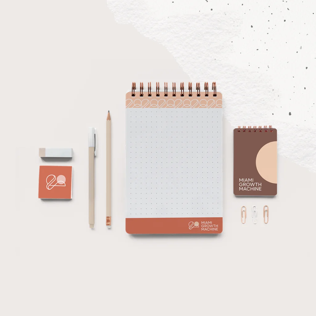
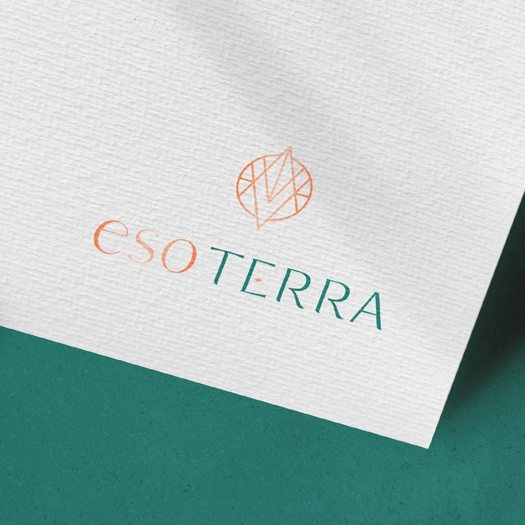
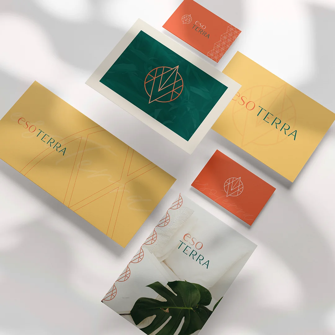
The Brand Reimagined

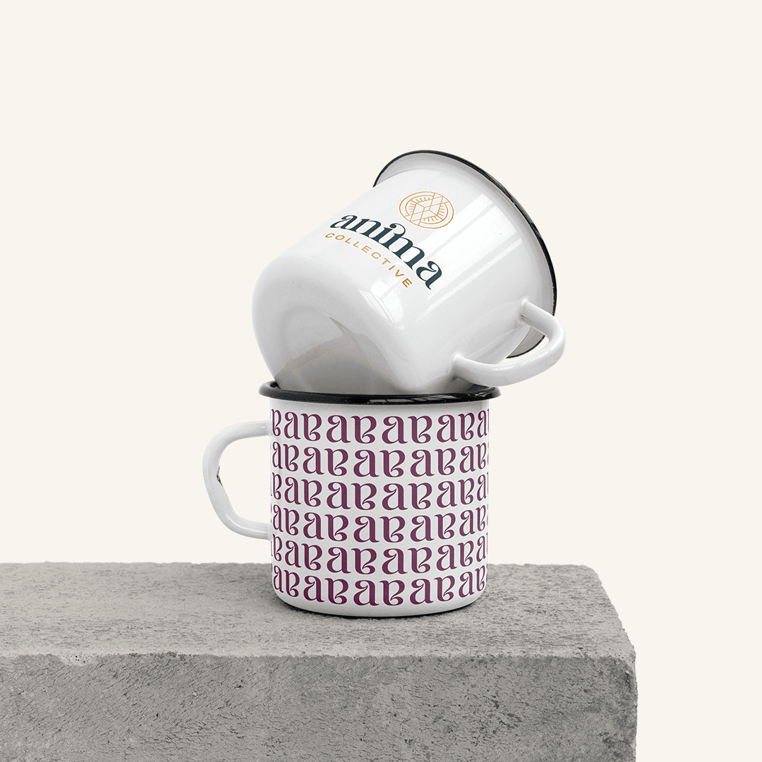
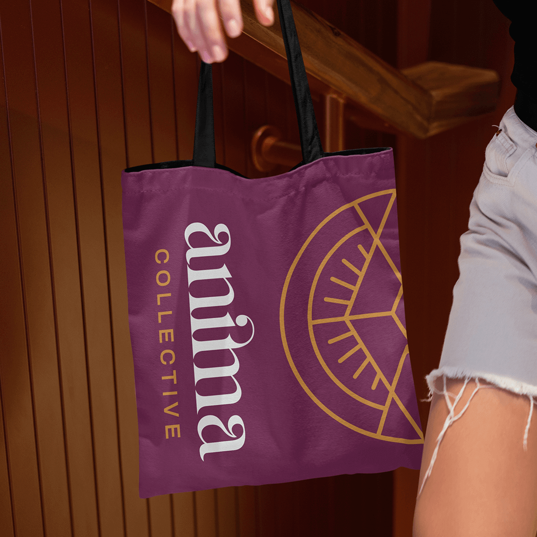
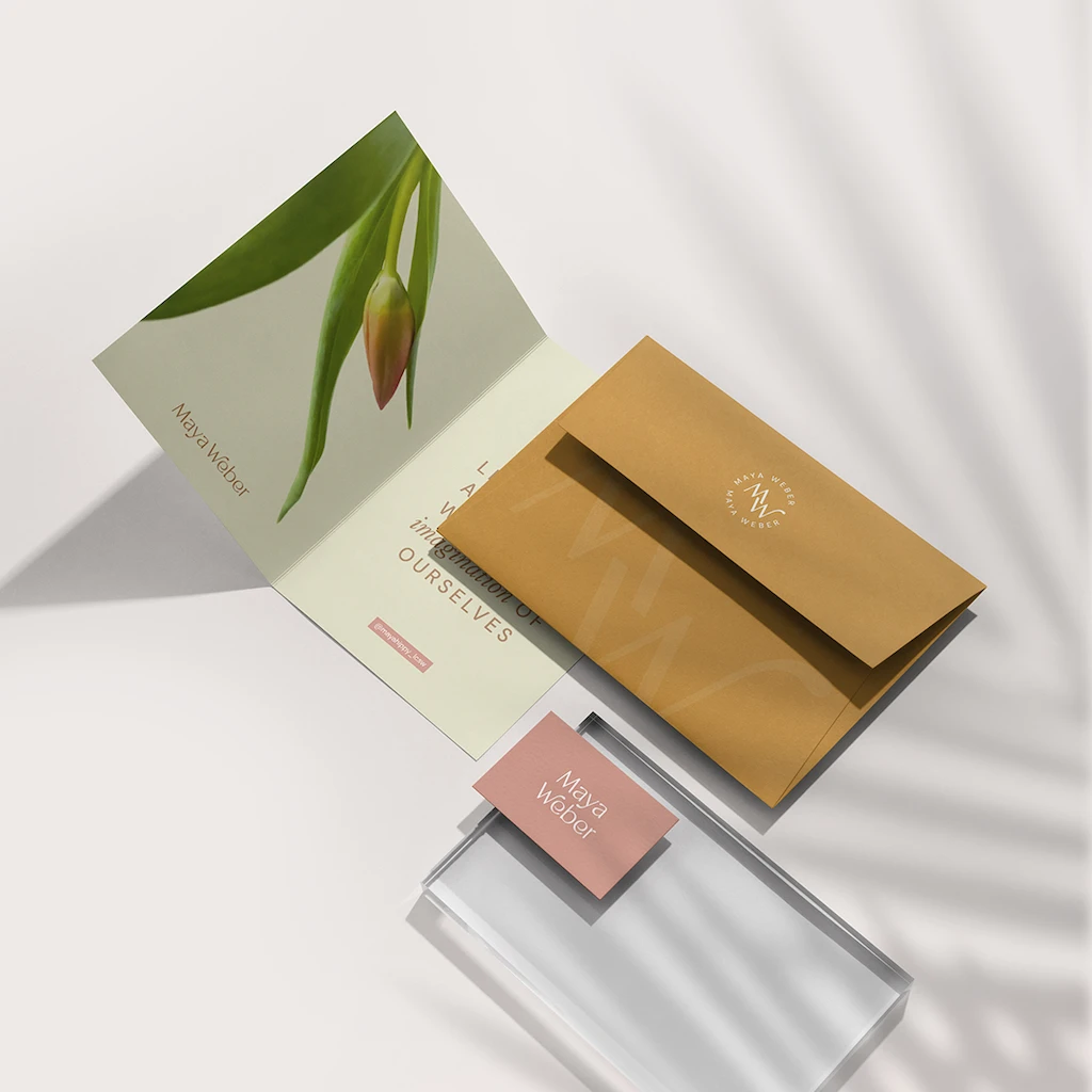
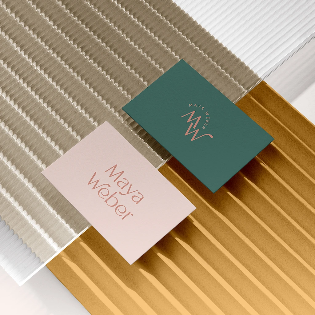
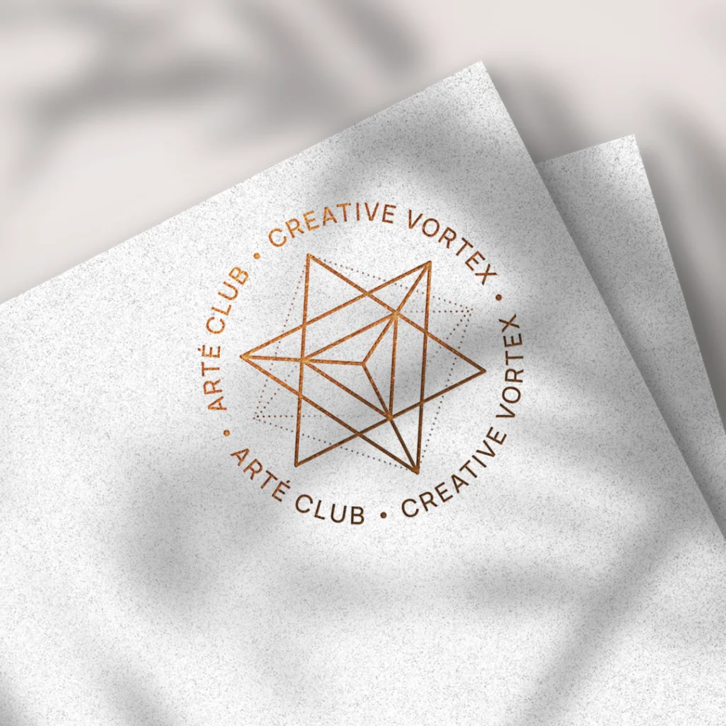
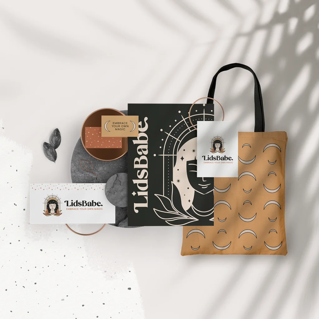
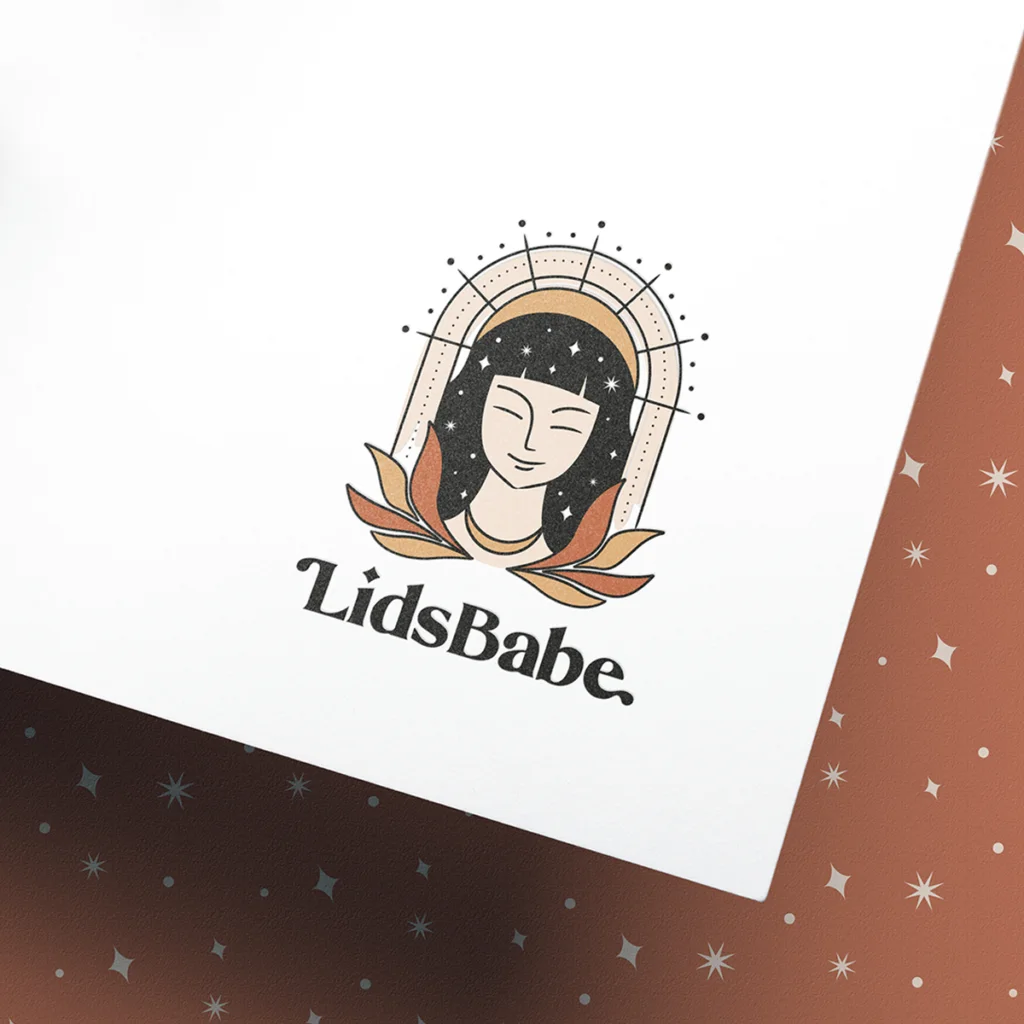
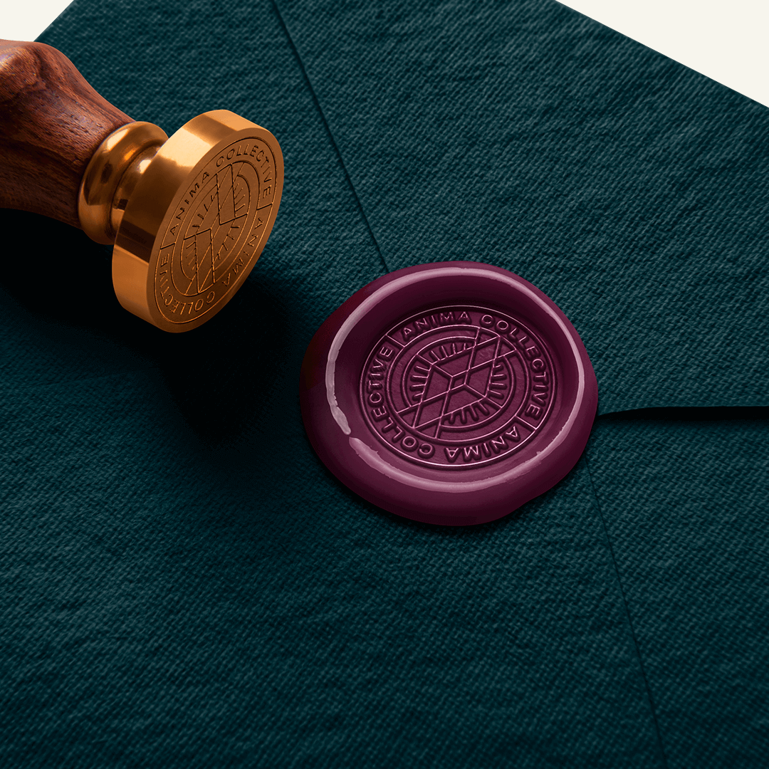
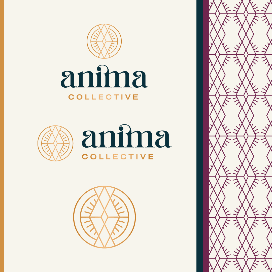
The Anima Collective’s new logo needed to be more than just aesthetically pleasing—it had to tell a story. We delivered with a design that captured both mystique and clarity, blending art deco flair with bold, modern shapes. The logo’s interlocking ‘A’s form a diamond, symbolizing growth and strength, with a subtle nod to the collective’s feminine roots.

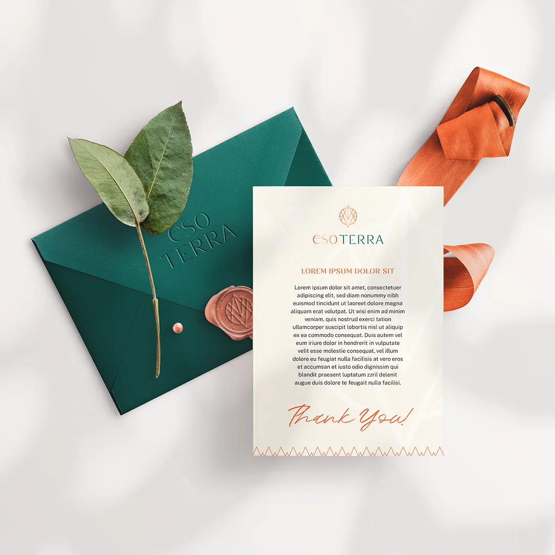
A Colorful Conversation

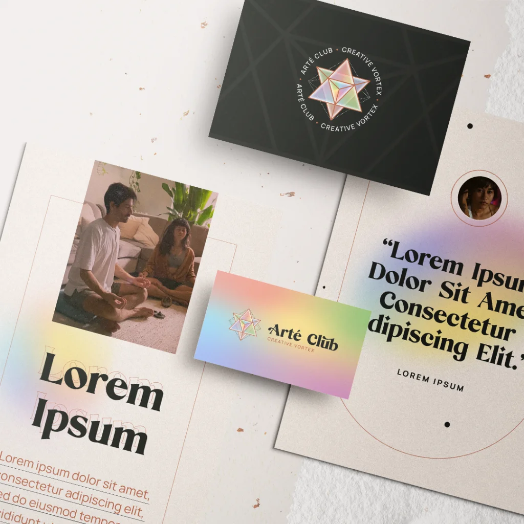
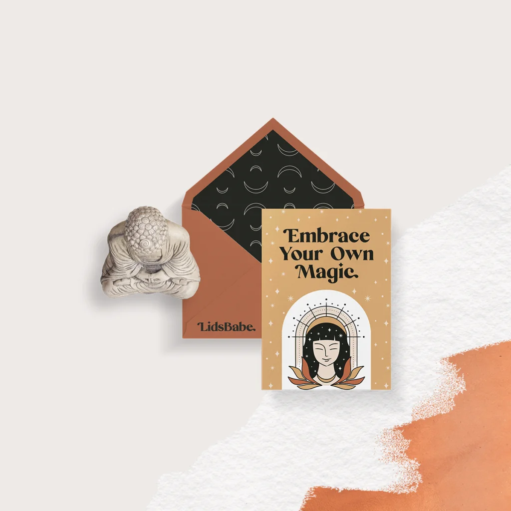
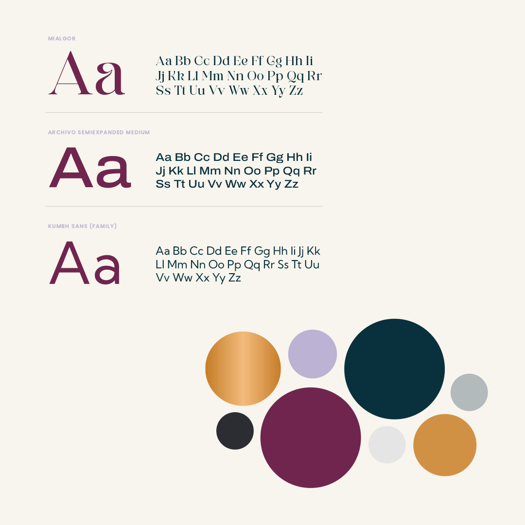
Our chosen color palette wasn’t just about looking good—it was about feeling right. Dark greens and golds mixed with deep magentas and lilacs give the Anima Collective a distinct energy that’s inviting and powerful.

Speaking through Typography

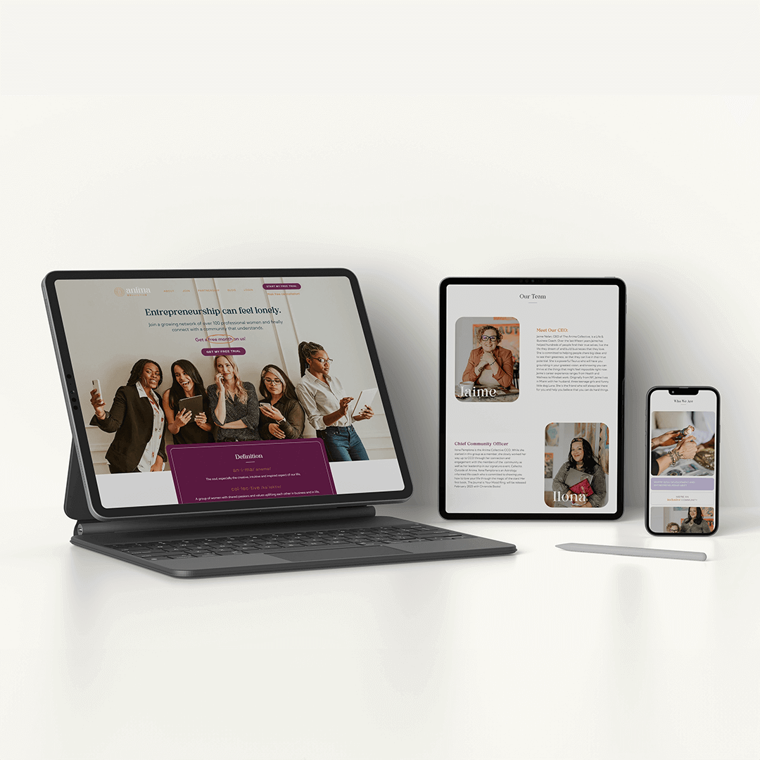
We selected Mialgor for its modern edge, bringing a sense of stability and confidence to headings and key messages. For the finer details, we picked fonts that ensured every word on their website and printed materials was easy to read and impactful.

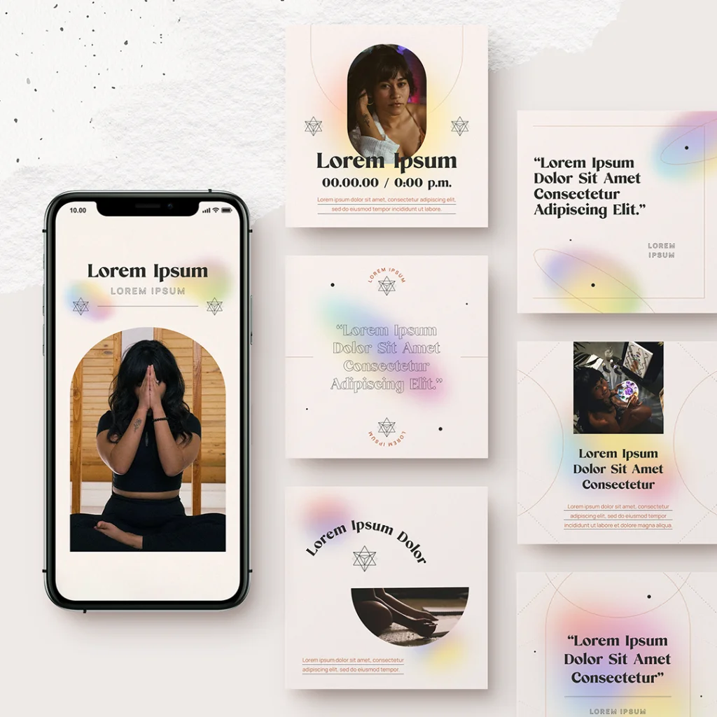
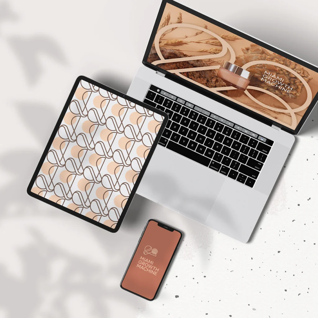
Designing an Online Home

Our work extended into the digital realm, where we crafted the web pages for The Anima Collective. Every page reflects their renewed brand, with intuitive navigation and engaging layouts that draw visitors into the Anima experience.

Imagery that Connects

The images we selected for Anima’s brand and website aren’t just placeholders—they’re an invitation. We focused on real, relatable visuals that showcase the diversity and vibrancy of The Anima Collective community.

What's Next for The Anima Collective

As The Anima Collective steps forward with their new brand, we’re right there with them, fine-tuning a digital presence that matches their offline identity. Our journey together is about keeping the brand as dynamic and engaging as the community they foster.

Interested in evolving your brand with a team that gets it? The Copper Portico isn’t just about delivering a project—we’re about delivering your brand’s potential. Let’s start the conversation and see where we can take your brand together.

Women-Led

Fort Lauderdale, US | 2022 | Body & Bath products

lani.xo is a self care brand that encourages a balanced lifestyle for busy women.

about

lani.xo is a self care brand that encourages a balanced lifestyle for busy women. Inspired by the founder’s personal story, lani.xo helps people focus on the brighter version of themselves and hope for better days.

We’re invited to collaborate with lani.xo on the creation of the brand’s packaging: a line of products featuring soaps, body butters, bath teas and sugar scrubs.

design strategy

In order to achieve the results the founder was looking for, our team chose to focus on the brand’s mission. We used lani.xo’s purpose as our main guide to design elevated labels that anchors the brand in simplicity, self care, and gentleness.

The end-product is a line that appeals to the consumers both visually and emotionally by using a combination of calming colors, clean fonts and concise messaging.

We also supported lani.xo with a set of social media graphics and custom icons that helps them to showcase the benefits of their products in an elegant and friendly way.

Women-Led

Catspring is a woman-owned Texan brand offering their customers high-quality tea, producing in-house various blends from a southern plant called Yaupon. The brand is positioned at the crossroads of trendy beverages and classic traditions and promotes an organic and sustainable line.

PACKAGING

We worked with Catspring’s team on the revamp of their tea collection packaging. An important design task was creating a clean and informative label that aligned with Catspring’s stylistic concept and kept consistency across a variety of packaging options. The box design carefully arranges the information about each tea blend to make it readable and elegant. The goal was to keep the essence of Catspring, elevating the brand and making it desirable in upscale markets throughout the US.

The end result looks original and trendy, carrying a typeface choice that enhances the brand with organic and clear elements.

WEBSITE DESIGN

We also worked with Catspring to refresh the company’s website. 

The website theme was carefully built with minimalism in mind, effectively highlighting the products in different packaging colors and telling their story with beautiful typography and a custom-made layout.

To keep up with the external consistency and recognizable patterns of the homepage, the website uses a stylish and minimalist sticky header, with the brand element in the center, a shopping bag button in the right corner and links to core navigation below.

Custom icons were design to showcase Catspring’s highlighted features, such as organic, kosher, sustainable and non-gmo.


Women-Led

miami, us | 2022 | wellness

Maya Weber is a Trauma & Somatic Release Therapist based in Miami. We worked with Maya to revamp her logo and design key collateral materials for her brand.

about

Maya Weber is a Trauma & Somatic Release Therapist based in Miami, Florida.

We worked with Maya to revamp her brand and create key collateral materials to promote her services online.

design strategy

In our VIP Design Day with Maya, we outlined the plan: the creation of a typographic logo, a basic brand sheet with the brand’s main information, a business card design and templates for social media graphics. 

For the logo, we looked for a typography that was elegant and conveyed movement through organic curves and strokes. The main font was paired with a clean secondary font, combined with a serif for keywords to convey lightness, creativity and proximity.

Mustard and green were chosen as main color choices, as they inspire nature and give a sense of welcome. We selected brown and pink as secondary colors, following the same idea of coziness, to add more possibilities in the design of Maya’s brand materials.

Women-Led

miami, us | 2021 | education

Arté Club is an experience curated by Lidia Pineda for her art students. All classes begin with a mindfulness exercise to bring students into the present moment and connect them to their inner child through art.

about

Arté Club is an experience curated by Lidia Pineda for her art students. All classes begin with a mindfulness exercise to bring students into the present moment and connect them to their inner child through art.

We’ve worked with Lidia before on the creation of LidsBabe and were excited to collaborate on this special project. 

design strategy

Arté Club’s brand was based on the concept of a prism, a kaleidoscope and the sacred geometry of a Merkaba. Thinking about the Club’s goal of empowering people to express themselves creatively through art, we saw this process as a prism. It separates a beam of light into a spectrum of colors, so it would be like a person transforming and materializing all their ideas and feelings into art.

Also thinking about the individuality of each person and the different ways of seeing the world, we thought of the kaleidoscope, which has three mirrors that form a triangle, and when moving the tube, it presents various visual arrangements, as each individual expresses himself creatively differently from each other.

Since Lidia uses mindfulness tools, we wanted to bring to the logo something that gave the idea of ​​expansion and balance, as well as the mindfulness symbol, which looks like a droplet falling into water and spreading. We incorporated the concept of the Merkaba (the name literally translates to light, spirit, body), a symbol made of two pyramids that intersect and rotate in opposite directions, creating a three-dimensional energy field. It is considered to be one of the highest vibrating geometric shapes designed by the universe and reminds us of the power we can wield when we join our own energies for connection and growth. It combines opposing energies in perfect balance: masculine and feminine, earth and cosmos, matter and spirit…resulting in an activation of light and protection, also reminding us of our power as we find balance and raise our vibration.

For the colors, we used a gradient with transparency to create a light/holographic effect and add more dimension to the logo. We also used black and terracota, which are already part of your brand, as well as typography.

Women-Led

MIAMI, us | 2021 | brand strategy

Lidia Pineda is an artist, creative director and storyteller. She offers curated experiences to clients willing to experience their own divinity through creativity.

about

As an artist, creative director and storyteller, Lidia Pineda offers curated experiences to those willing to experience their own divinity through creativity. We had the honor of working with Lids on her brand identity, and it was very rewarding to see her vision expand and take form.

design strategy

Our goal was to create a feminine and organic logo with a mystical vibe, showing Lid’s aesthetics as well as her spiritual and creative side. Her figure was represented in the logo as the creative muse, intermediating the portal of creativity. The rounded frame around her represents this portal, and the crown symbolizes sacred energy and connection with divinity.

Lid’s hair has a starry sky, alluding to the infinity of the universe, and the moon was incorporated symbolizing the emotions and the subconscious; an inverted version was used as a necklace to represent the balance of mind and body.

Highlights

This project won MUSE Creative Awards: Season 1, Gold, in 2022.

Women-Led

MIAMI, us | 2021 | MANUFACTURING INCUBATOR

Miami Growth Machine is a community platform that offers start-ups the capabilities and industry knowledge necessary to develop cosmetics and other consumer packaged goods.

about

Miami Growth Machine is a community platform that offers start-ups the capabilities and industry knowledge necessary to develop cosmetics and other consumer packaged goods. lt taps into the broader Miami entrepreneur ecosystem, but is focused specifically on manufacturing expertise.

design strategy

We worked with the founder Andrea Cid to create a minimalist and modem brand inspired by the city of Miami, its diversity, beauty and architecture. The logo was developed based on fluid and organic shapes, as they convey lightness, well-being and hospitality, and it was also based on three concepts that resemble Miami: the ocean, the skyline and the sun. 

All these elements were gathered in a way that the overall logo would resemble a profile view of a flamingo, a tropical bird that has great abilities to live in groups, representing social nature and the desire to create community bonds.

Women-Led

DELRAY BEACH, us | 2022 | consulting services

EsoTerra believes that patriarchy is on its way out, and it's now time for the divine feminine to lead and for the divine masculine to support. We worked with the founders to create a brand identity that represents their vision and values.

about

EsoTerra believes that patriarchy is on its way out. There is a new way emerging, and it’s now time for the divine feminine to lead and for the divine masculine to support.

Led by Sage and Maya, EsoTerra gives conscious women resources to do their best work. They offer deep leadership workshops, coaching, speaking engagements, funding and more. 

design strategy

Our goal was to bring Maya and Sage’s personalities to their brand identity. Based on our discovery process, we designed the symbol for EsoTerra based on two triangles that are integrated from an overlap, creating two poles (which can symbolize feminine/masculine, divine self/three-dimensional self, esoteric/grounded practical). 

The vertices extrapolate the circle in allusion to the expansion of consciousness, and the upper pole has a greater emphasis to convey the idea of ​​something growing, shining, evolving. The inverted overlapping triangles generate a diamond icon that represents the focus and goal to find the balance within yourself (the yin and yang energy).

The typography was a combination of two fonts. Eso is very organic, starting with a feeling of abstraction, while Terra is more objective. However, we chose a much lighter font, with some curves, to convey a certain lightness even though it is all capitalized. 

For the colors, we chose a vibrant orange, perfect for conveying a welcoming vibe, enthusiasm and security, and the dark green brings the necessary formality.