Skip to content

Blog

Web Design

Minas Gerais, Brazil | 2024 | family-owned company

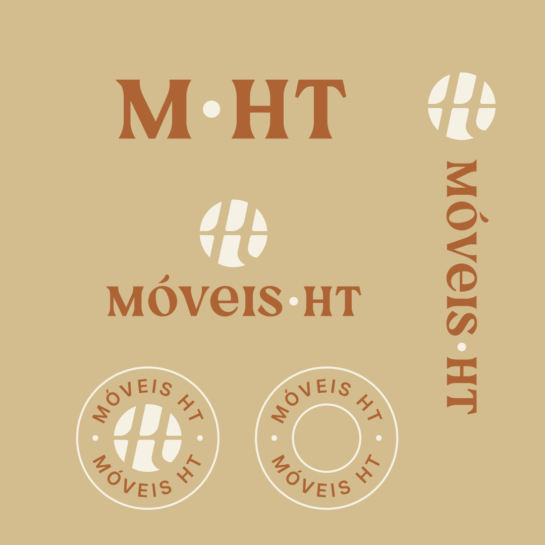
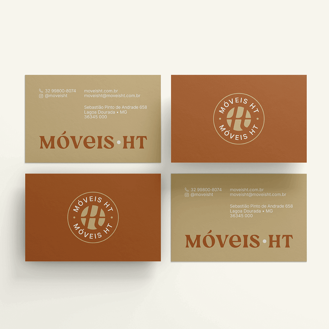
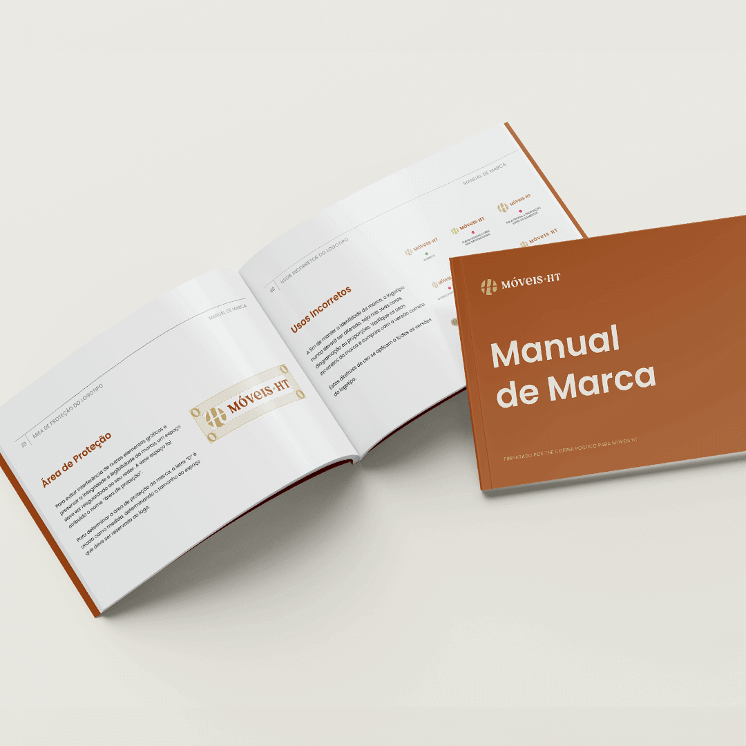
When Móveis HT approached The Copper Portico, they presented us with a unique challenge: to elevate a brand rich in tradition and craftsmanship to resonate with a modern audience. Our task was not just to refresh a logo or tweak a color palette, but to weave the story of a family legacy into a brand identity that would speak across continents.

Understanding the Heart of Móveis HT

Our journey with Móveis HT began not with sketches and color swatches, but with listening. We delved deep into the essence of Móveis HT – their roots in the rich soil of Minas Gerais, the legacy of Luiz José de Resende, and their commitment to quality and sustainability. This understanding was crucial in shaping our strategy.

The Copper Portico’s Creative Alchemy

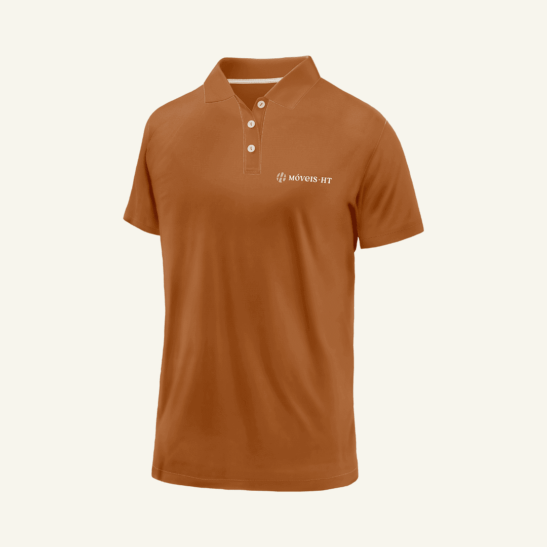
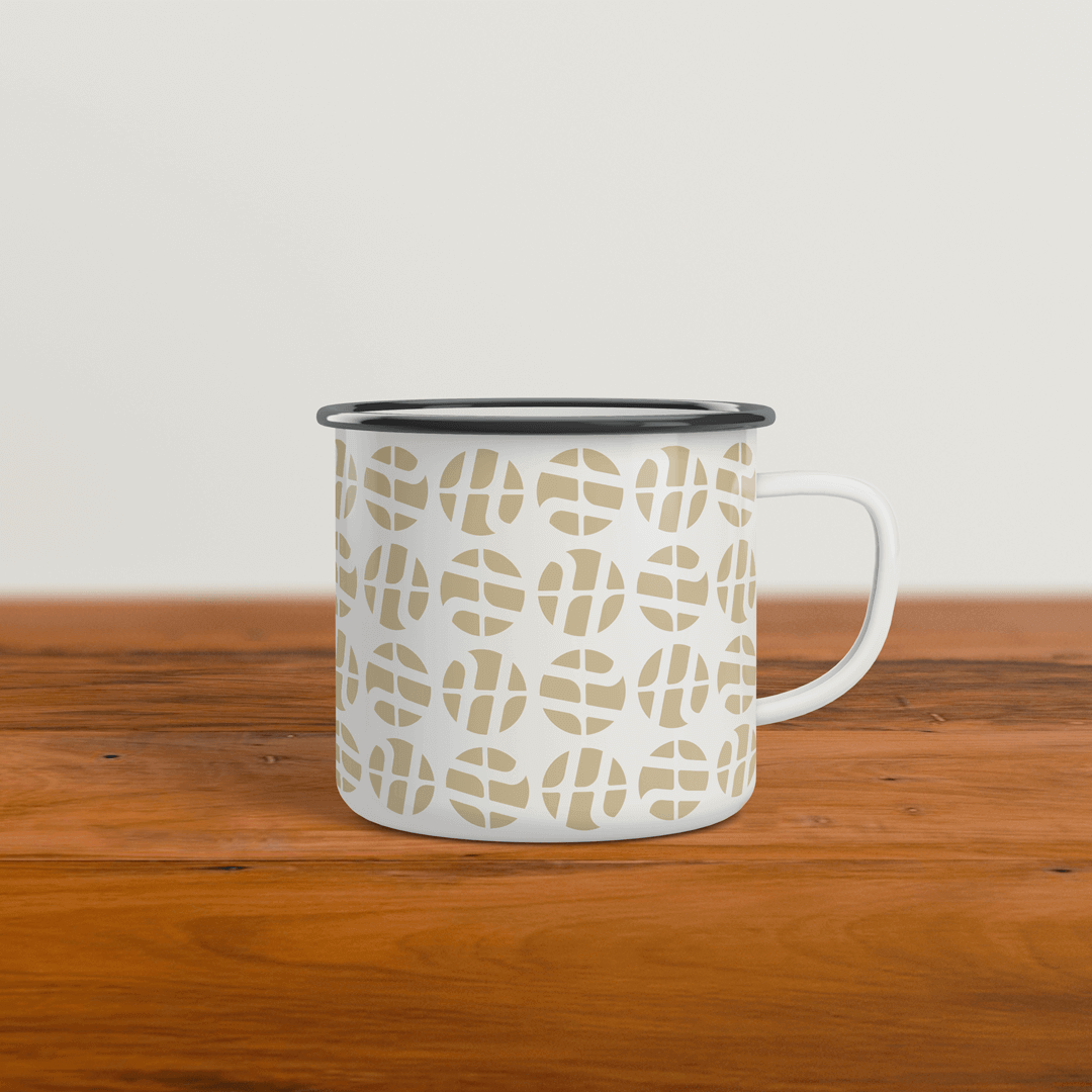
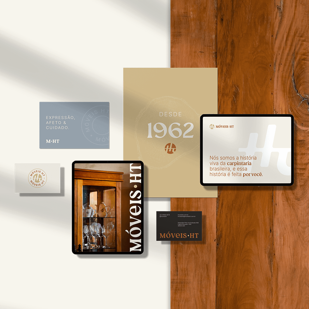
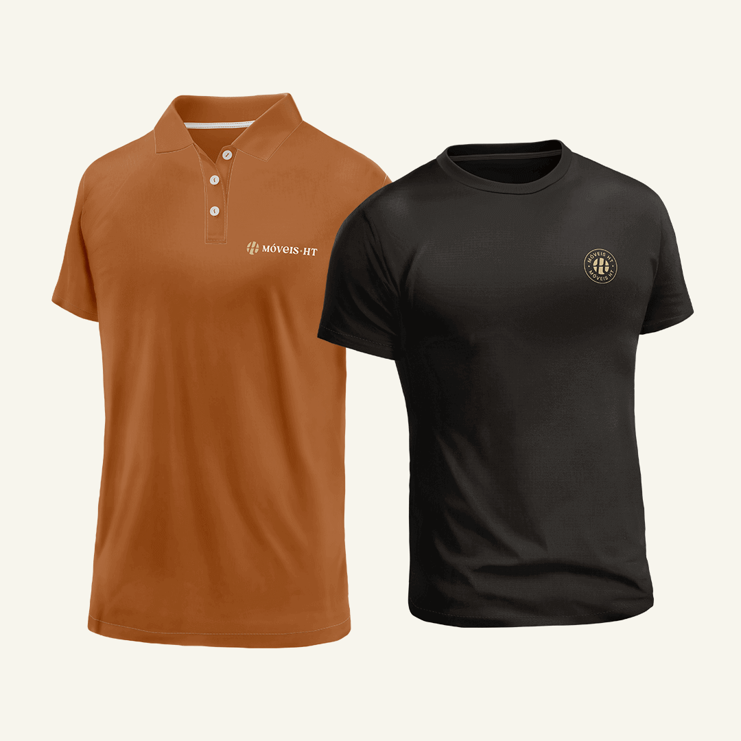
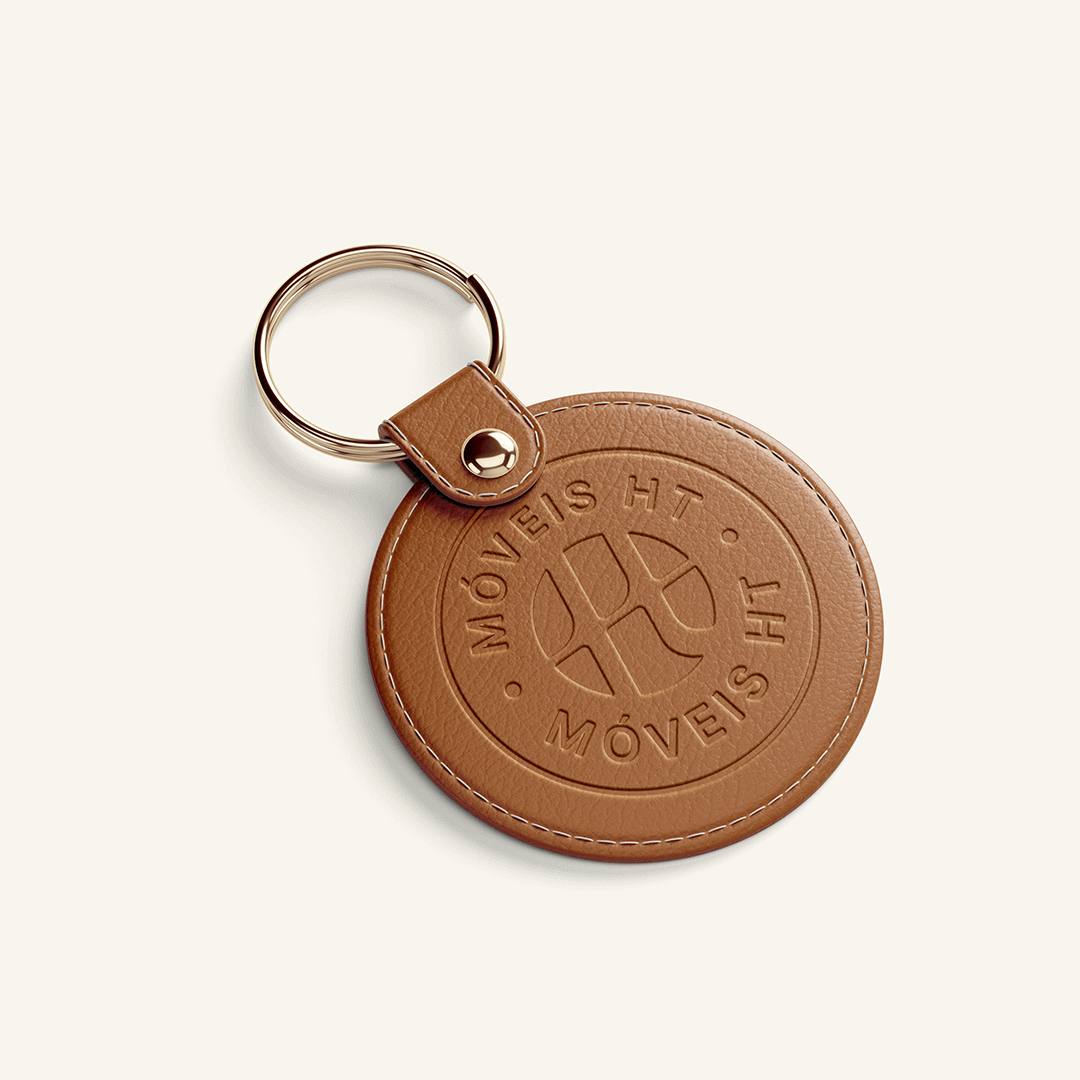
The transformation required a delicate balance. Our design team envisioned a logo that was a modern nod to the past – a sleek, abstract interpretation of the initials “HT,” infused with the warmth and tradition of Minas Gerais. It wasn’t just a logo; it was a symbol of evolution.

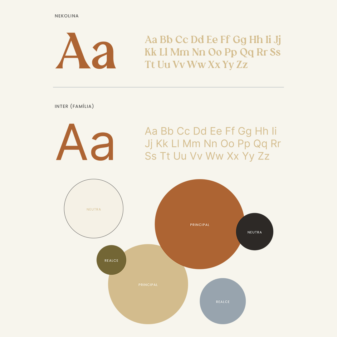
In choosing the color palette, we sought to encapsulate the essence of Móveis HT’s heritage. The earthy browns and vibrant greens and blues were more than just colors – they were a narrative in themselves, telling a story of warmth, trust, and nature.

Typography was another critical element. We selected fonts that were clear and legible yet carried the weight of tradition. This choice ensured that Móveis HT’s message was not lost in translation, whether in print or digital.

Addressing Customer Pain Points

Our strategy extended beyond aesthetics. We knew Móveis HT’s audience faced dilemmas – from the high cost of quality furniture to concerns about sustainability. Our marketing strategy addressed these pain points head-on, showcasing Móveis HT’s commitment to quality, durability, and environmental responsibility.
The Result: A Brand Reborn

The transformation of Móveis HT by The Copper Portico was more than a rebranding; it was a renaissance. The new brand identity resonated with customers, old and new, as a symbol of both tradition and innovation. It wasn’t just about selling furniture; it was about selling a story – a story of a home, heritage, and heart.

Why The Copper Portico?

This case study isn’t just about Móveis HT’s journey; it’s a testament to what The Copper Portico can achieve. We don’t just see a brand; we see a legacy waiting to be unveiled. Our approach is meticulous, our creativity boundless, and our strategies tailored to echo the voices of the brands we elevate.

When you partner with us, you’re not just getting a branding agency; you’re gaining a collaborator in crafting your legacy. Whether it’s reimagining a logo or redefining a brand’s narrative, our mission is to tell your story in a way that resonates with the world.
Web Design

miami, US | 2021 | women-led community

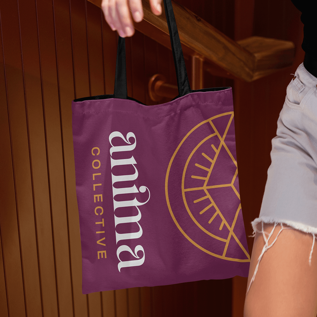
When the Anima Collective set out to reinvent themselves, they turned to The Copper Portico. The task was clear: revamp the brand to better reflect its mission and energy. Together, we brainstormed their new name and infused their values into a brand image that would resonate with their audience.

The Brand Reimagined

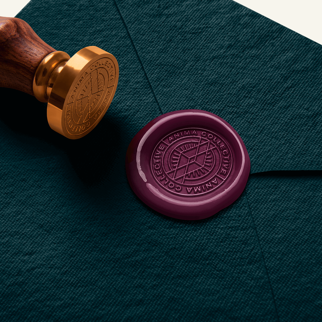
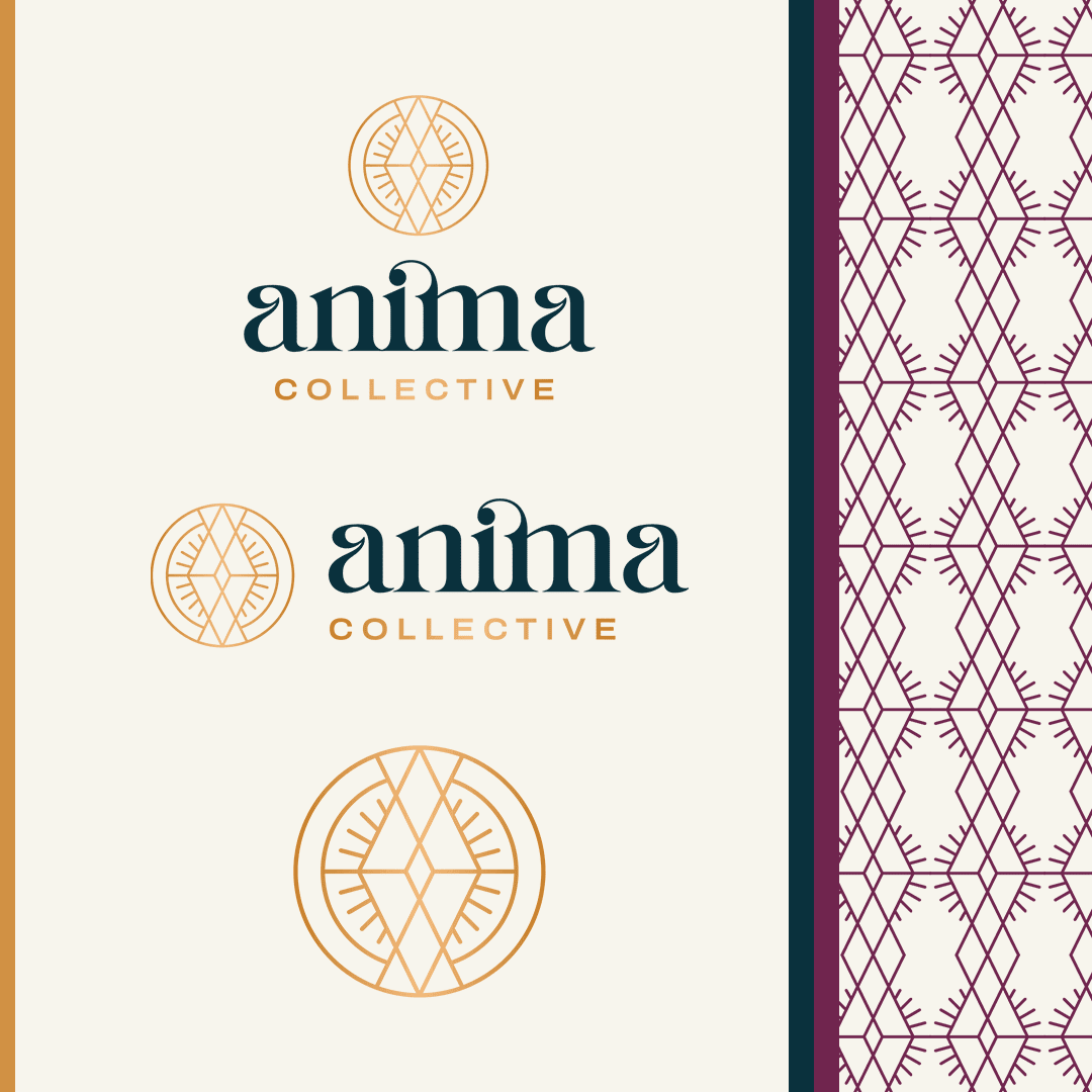
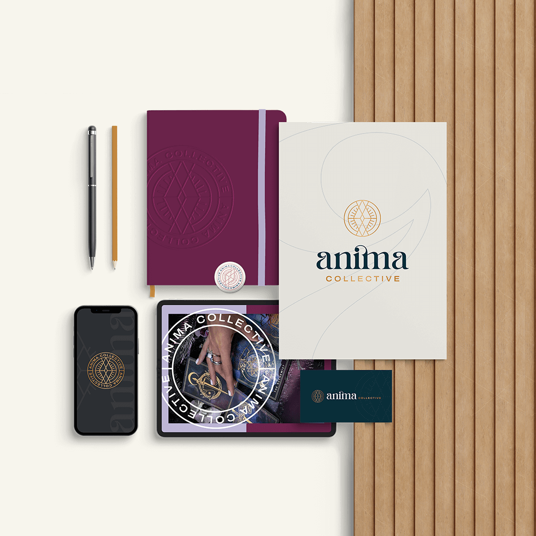
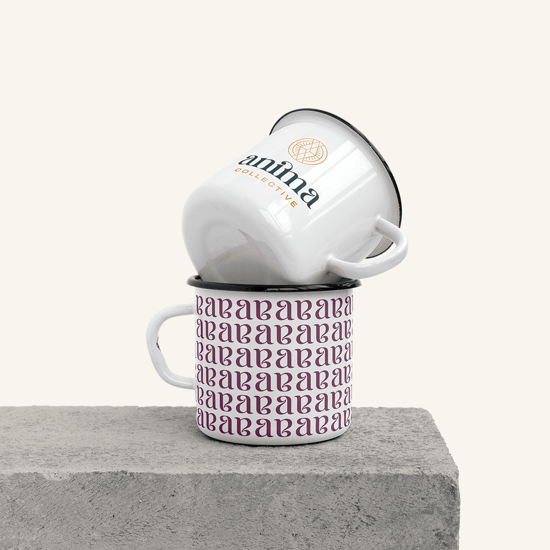
The Anima Collective’s new logo needed to be more than just aesthetically pleasing—it had to tell a story. We delivered with a design that captured both mystique and clarity, blending art deco flair with bold, modern shapes. The logo’s interlocking ‘A’s form a diamond, symbolizing growth and strength, with a subtle nod to the collective’s feminine roots.

A Colorful Conversation

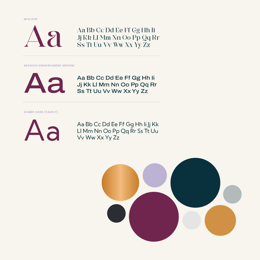
Our chosen color palette wasn’t just about looking good—it was about feeling right. Dark greens and golds mixed with deep magentas and lilacs give the Anima Collective a distinct energy that’s inviting and powerful.

Speaking through Typography

We selected Mialgor for its modern edge, bringing a sense of stability and confidence to headings and key messages. For the finer details, we picked fonts that ensured every word on their website and printed materials was easy to read and impactful.

Designing an Online Home

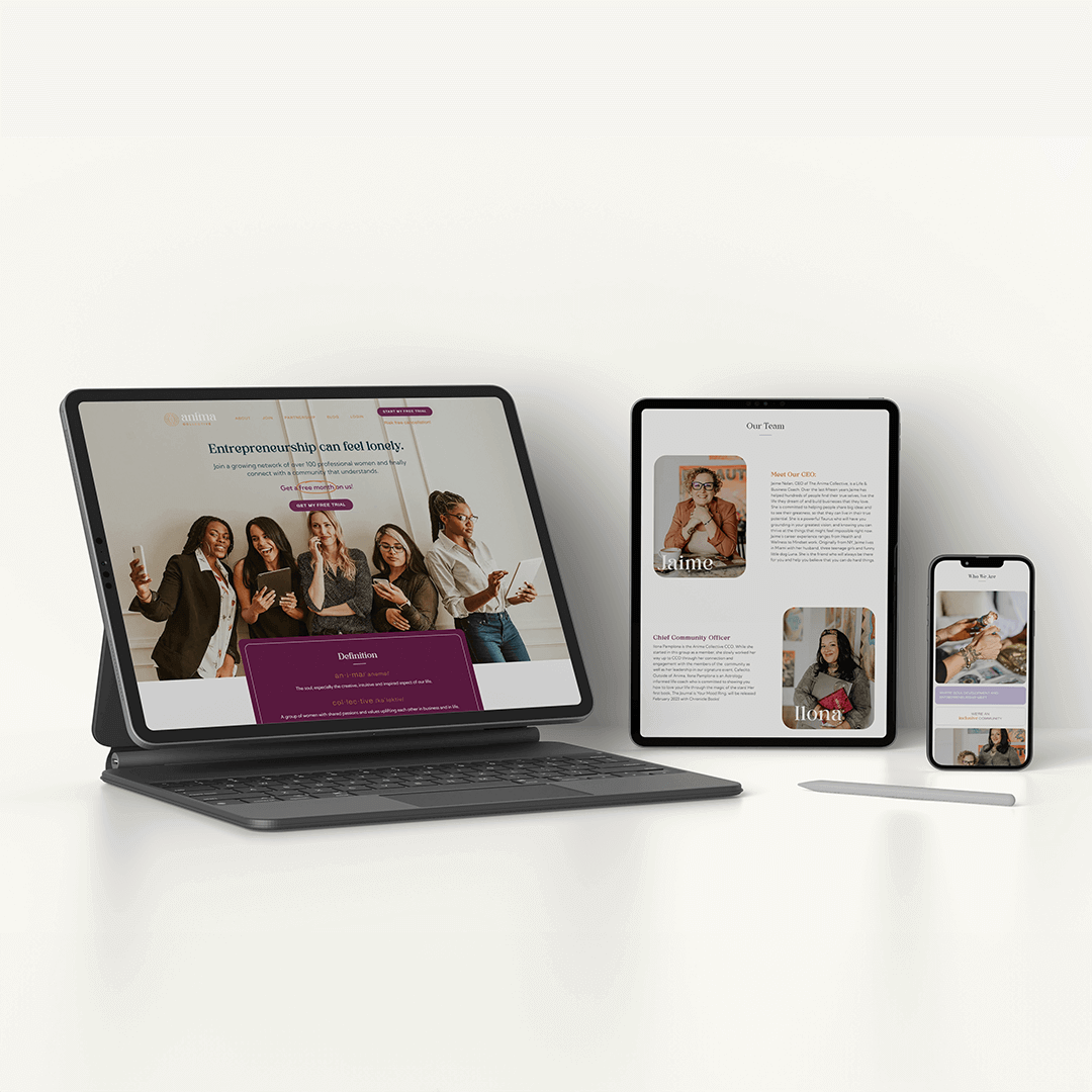
Our work extended into the digital realm, where we crafted the web pages for The Anima Collective. Every page reflects their renewed brand, with intuitive navigation and engaging layouts that draw visitors into the Anima experience.

Imagery that Connects

The images we selected for Anima’s brand and website aren’t just placeholders—they’re an invitation. We focused on real, relatable visuals that showcase the diversity and vibrancy of The Anima Collective community.

What's Next for The Anima Collective

As The Anima Collective steps forward with their new brand, we’re right there with them, fine-tuning a digital presence that matches their offline identity. Our journey together is about keeping the brand as dynamic and engaging as the community they foster.

Interested in evolving your brand with a team that gets it? The Copper Portico isn’t just about delivering a project—we’re about delivering your brand’s potential. Let’s start the conversation and see where we can take your brand together.

Web Design

Catspring is a woman-owned Texan brand offering their customers high-quality tea, producing in-house various blends from a southern plant called Yaupon. The brand is positioned at the crossroads of trendy beverages and classic traditions and promotes an organic and sustainable line.

PACKAGING

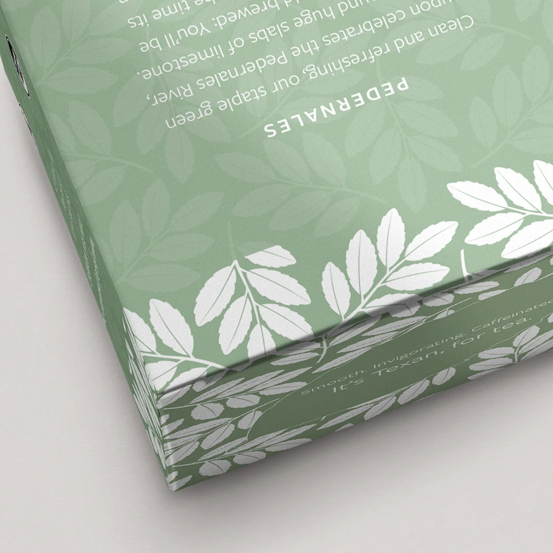
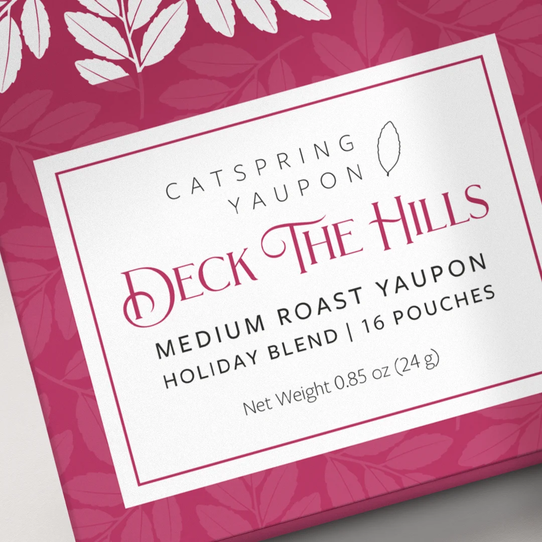
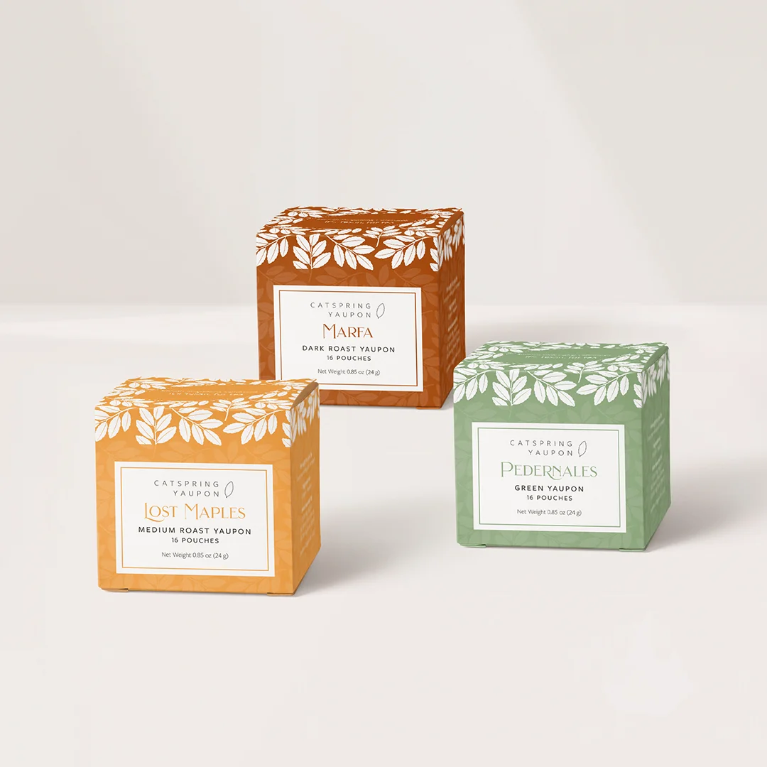
We worked with Catspring’s team on the revamp of their tea collection packaging. An important design task was creating a clean and informative label that aligned with Catspring’s stylistic concept and kept consistency across a variety of packaging options. The box design carefully arranges the information about each tea blend to make it readable and elegant. The goal was to keep the essence of Catspring, elevating the brand and making it desirable in upscale markets throughout the US.

The end result looks original and trendy, carrying a typeface choice that enhances the brand with organic and clear elements.

WEBSITE DESIGN

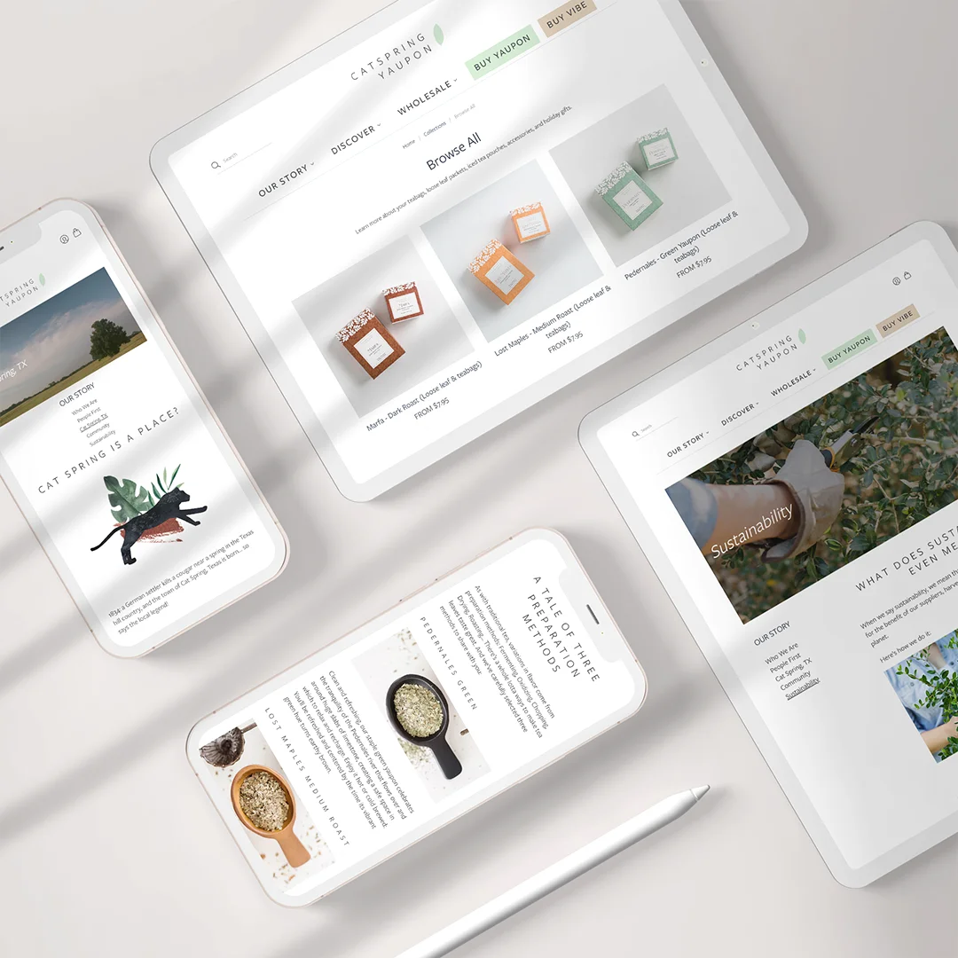
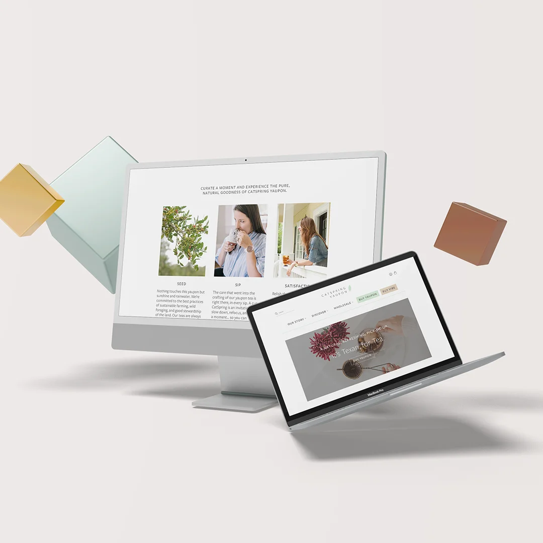
We also worked with Catspring to refresh the company’s website. 

The website theme was carefully built with minimalism in mind, effectively highlighting the products in different packaging colors and telling their story with beautiful typography and a custom-made layout.

To keep up with the external consistency and recognizable patterns of the homepage, the website uses a stylish and minimalist sticky header, with the brand element in the center, a shopping bag button in the right corner and links to core navigation below.

Custom icons were design to showcase Catspring’s highlighted features, such as organic, kosher, sustainable and non-gmo.


Web Design

Miami, US | 2021 | investment firm

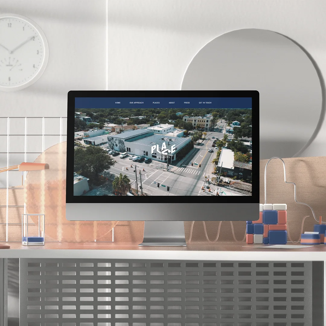
Place Projects is a Miami-based Real Estate investment firm with an impressive portfolio in Wynwood, Doral and Brickell neighborhoods.

about

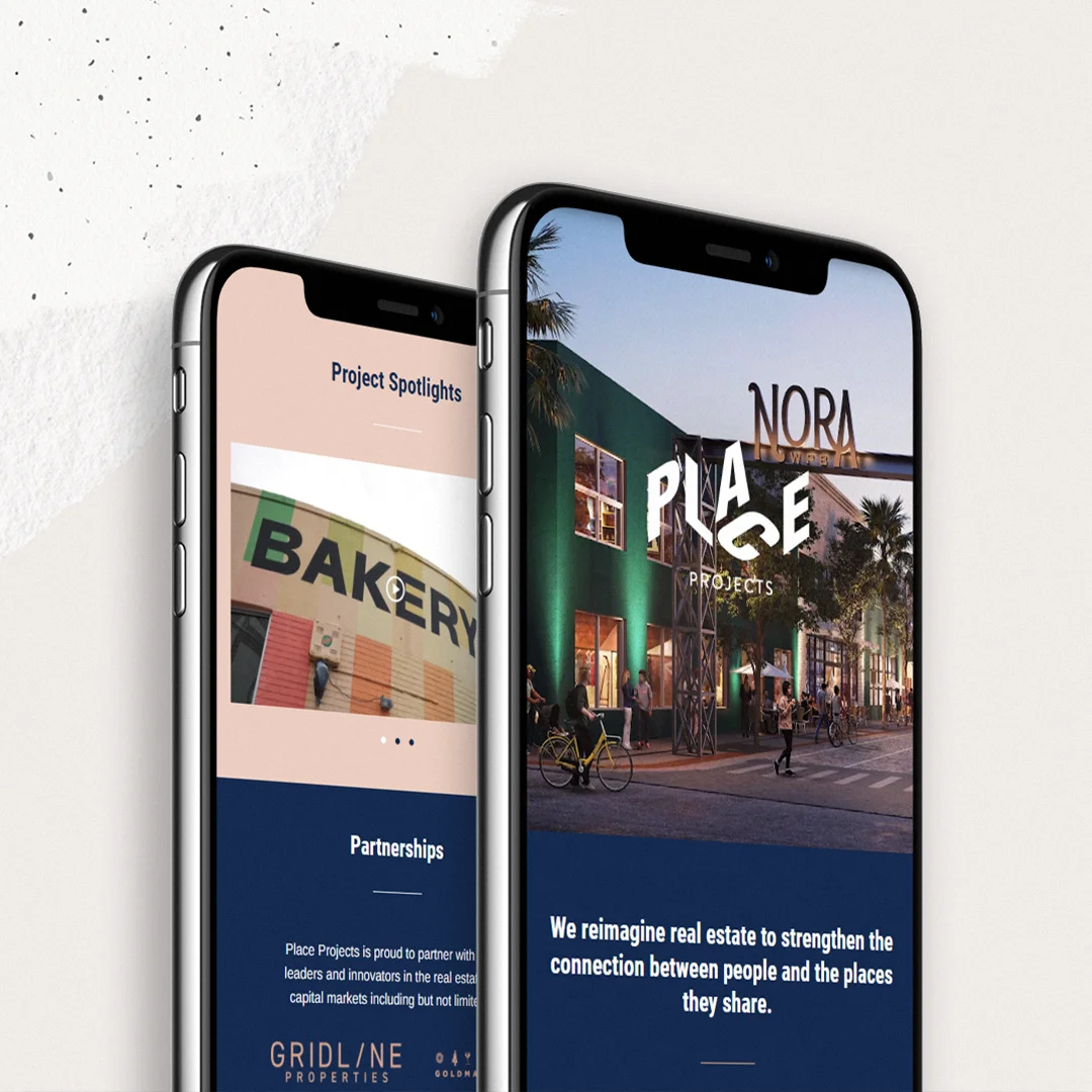
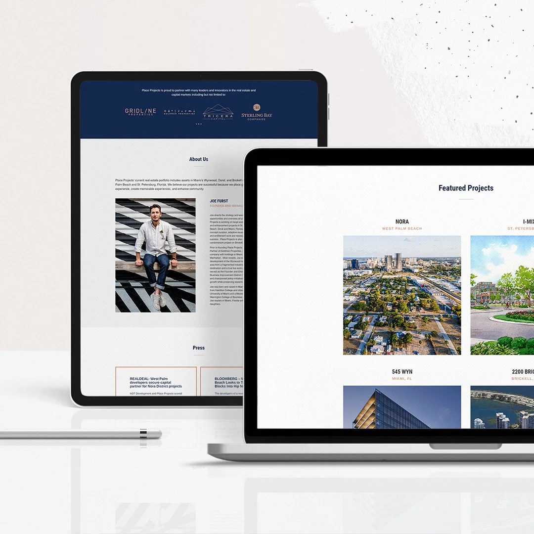
Place Projects is a Miami-based Real Estate investment firm with an impressive portfolio in Wynwood, Doral and Brickell neighborhoods. Founder and owner Joe Furst reached out to the Copper Portico to design a website who would showcase their projects and expertise.

design strategy

We worked with Place Projects‘ team to create an elegant website that would appeal to their clientele, organizing and optimizing the structure in a way that would help potential clients to find and process the information they needed.

Web Design

dallas, us | 2021 | apparel

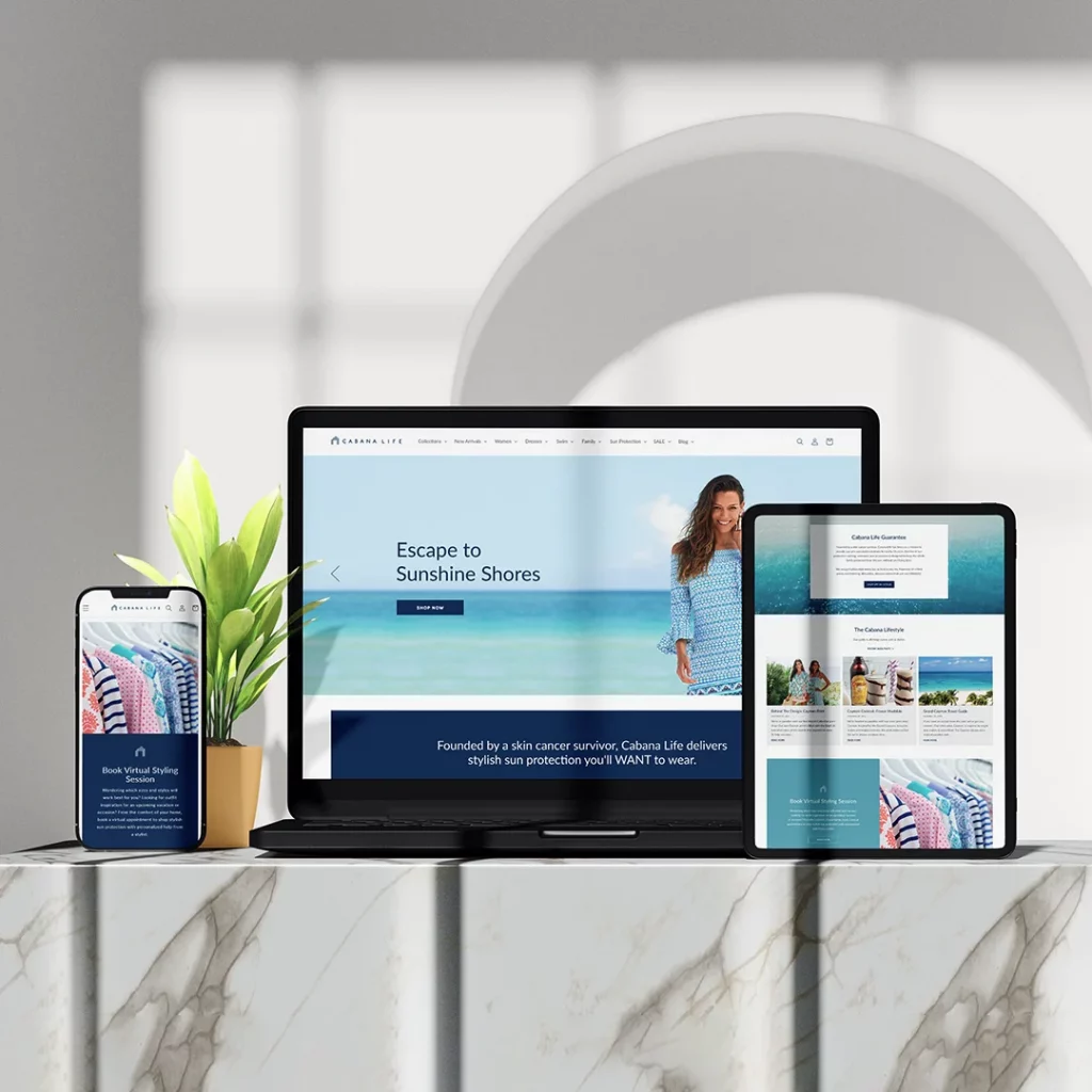
Cabana Life has been on a mission to provide sun protective swimwear, dresses and cover-ups for 15 years. We collaborated with Swiftkick Web to refresh Cabana Life’s website look and improve user experience performance.

about

Founded by a skin cancer survivor, Cabana Life has been on a mission to provide sun safe and stylish apparel for 15 years. They offer a line of sun protective swimwear, dresses and cover-ups.

Cabana Life website revamp was a collaboration with Swiftkick Web, a website development agency. We worked with them to identify inconsistencies and refresh Cabana Life’s look.

design strategy

We also created brand guidelines that proved essential to make the website consistent, modern and easy to navigate.

Our redesign focused on formatting consistency, typography choices, color scheme and overall layout, which highly improved ADA scores, white space consistency, among other benefits.

highlights

Since the revamp, Cabana Life has increased their website performance by 30%.

Cabana Life Responsive Website Layout