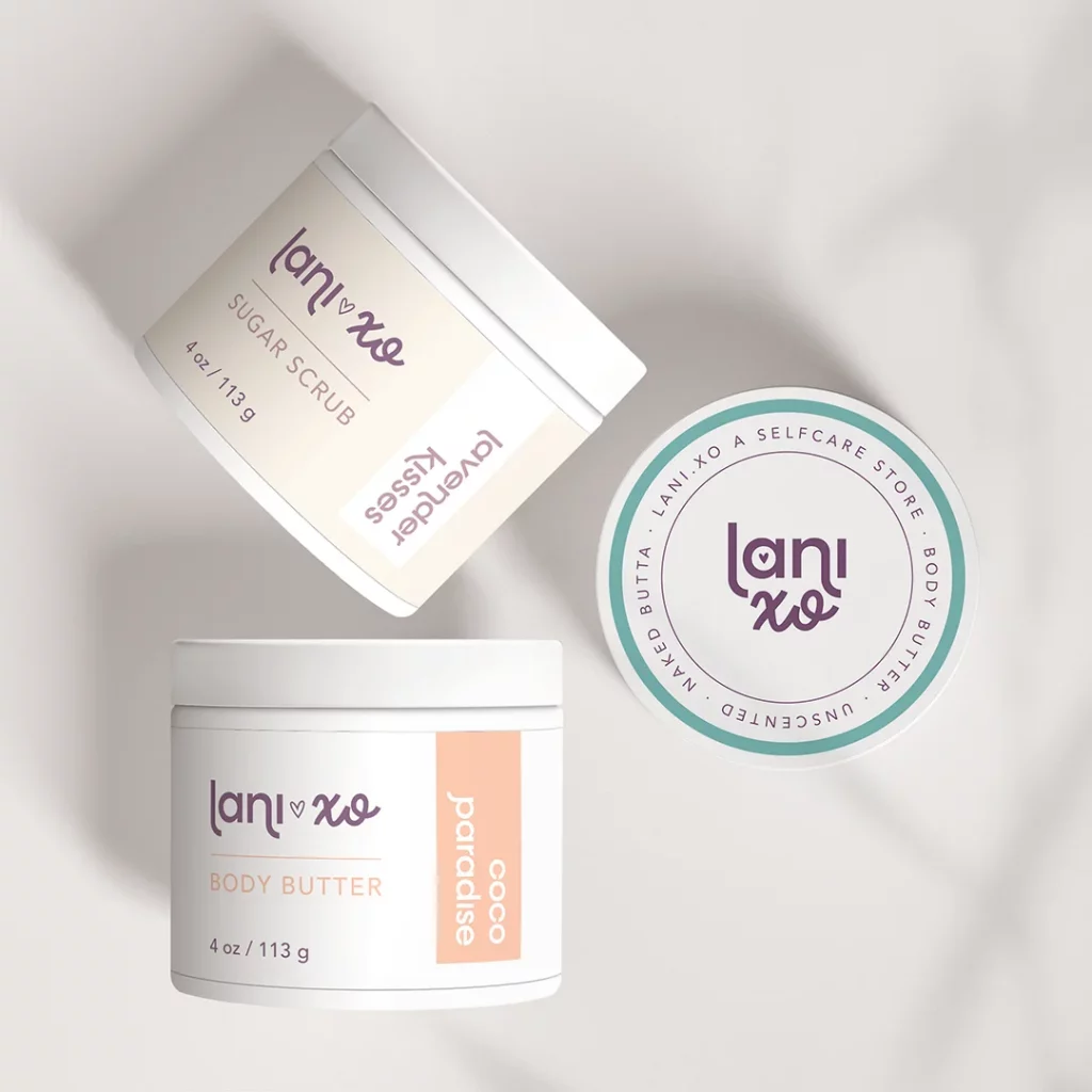
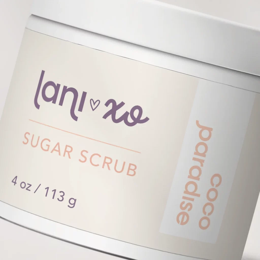
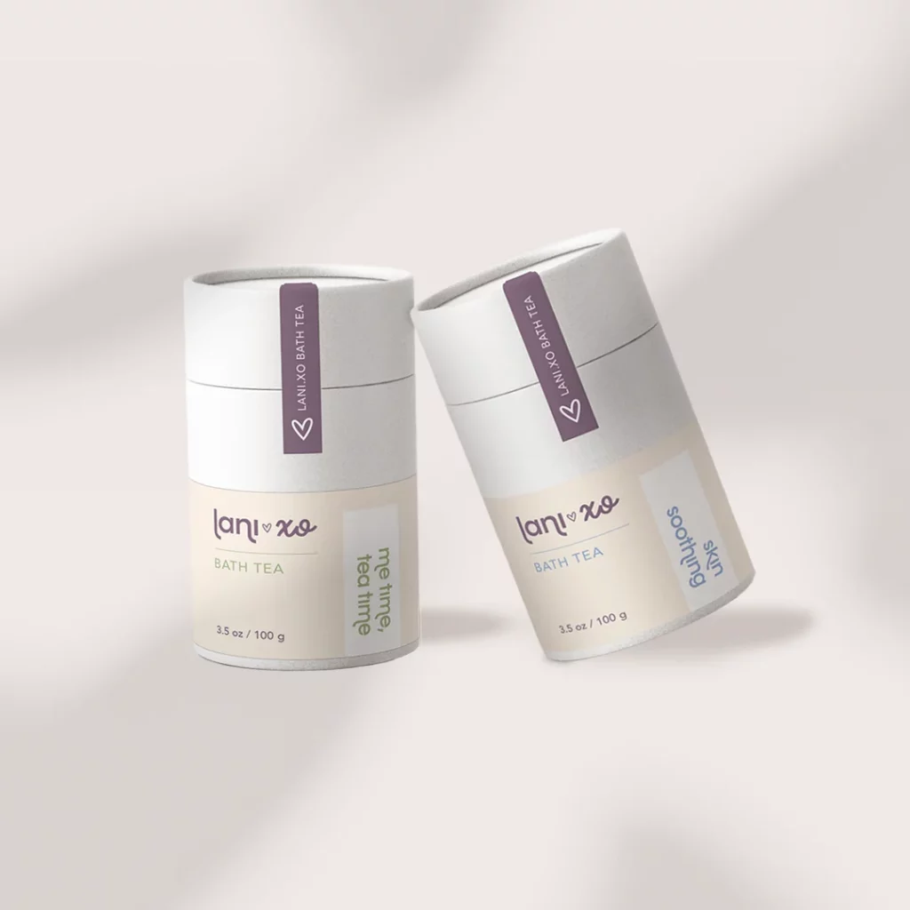
Skip to content

Brand Strategy

Fort Lauderdale, US | 2022 | Body & Bath products

lani.xo is a self care brand that encourages a balanced lifestyle for busy women.

about

lani.xo is a self care brand that encourages a balanced lifestyle for busy women. Inspired by the founder’s personal story, lani.xo helps people focus on the brighter version of themselves and hope for better days.

We’re invited to collaborate with lani.xo on the creation of the brand’s packaging: a line of products featuring soaps, body butters, bath teas and sugar scrubs.

design strategy

In order to achieve the results the founder was looking for, our team chose to focus on the brand’s mission. We used lani.xo’s purpose as our main guide to design elevated labels that anchors the brand in simplicity, self care, and gentleness.

The end-product is a line that appeals to the consumers both visually and emotionally by using a combination of calming colors, clean fonts and concise messaging.

We also supported lani.xo with a set of social media graphics and custom icons that helps them to showcase the benefits of their products in an elegant and friendly way.

Brand Strategy

miami, us | 2021 | education

Arté Club is an experience curated by Lidia Pineda for her art students. All classes begin with a mindfulness exercise to bring students into the present moment and connect them to their inner child through art.

about

Arté Club is an experience curated by Lidia Pineda for her art students. All classes begin with a mindfulness exercise to bring students into the present moment and connect them to their inner child through art.

We’ve worked with Lidia before on the creation of LidsBabe and were excited to collaborate on this special project. 

design strategy

Arté Club’s brand was based on the concept of a prism, a kaleidoscope and the sacred geometry of a Merkaba. Thinking about the Club’s goal of empowering people to express themselves creatively through art, we saw this process as a prism. It separates a beam of light into a spectrum of colors, so it would be like a person transforming and materializing all their ideas and feelings into art.

Also thinking about the individuality of each person and the different ways of seeing the world, we thought of the kaleidoscope, which has three mirrors that form a triangle, and when moving the tube, it presents various visual arrangements, as each individual expresses himself creatively differently from each other.

Since Lidia uses mindfulness tools, we wanted to bring to the logo something that gave the idea of ​​expansion and balance, as well as the mindfulness symbol, which looks like a droplet falling into water and spreading. We incorporated the concept of the Merkaba (the name literally translates to light, spirit, body), a symbol made of two pyramids that intersect and rotate in opposite directions, creating a three-dimensional energy field. It is considered to be one of the highest vibrating geometric shapes designed by the universe and reminds us of the power we can wield when we join our own energies for connection and growth. It combines opposing energies in perfect balance: masculine and feminine, earth and cosmos, matter and spirit…resulting in an activation of light and protection, also reminding us of our power as we find balance and raise our vibration.

For the colors, we used a gradient with transparency to create a light/holographic effect and add more dimension to the logo. We also used black and terracota, which are already part of your brand, as well as typography.

Brand Strategy

Texas, US | 2021 | non-profit

We collaborated with Common Threads, a national nonprofit committed to celebrating different cultures through food, while also promoting the importance of health and wellness.

about

We collaborated with Common Threads, a national non-profit committed to celebrating different cultures through food, while also promoting the importance of health and wellness. Common Threads aspires to build communities that embrace healthy cooking, healthy eating and celebration of culture.

The organization’s logo is a patchwork heart, which suggests a multicultural world. Their team wanted to revamp the brand creating a friendly, modern look that would show Common Thread’s evolution, but that was still connected with its original identity.

design strategy

Staying aligned with the heart of Common Threads’ mission, we recreated the logo squares with rounded corners, with two sizes interspersed to create a patchwork effect in a modern way.

The new color palette reflects vibrant and friendly tones. The fonts chosen are clear and modern and the variety of font weights ensures flexibility and consistency for the future growth of Common Threads identity.

We paid special attention to the project’s photography, as it speaks louder than words. Effective branding includes a mix of premium stock photos and real, candid photos depicting the heart of an organization’s goal. Common Threads’ photography is positive, inspiring and eye-catching, leaving the viewer with an emotional connection to the campaign and what it stands for.

Brand Strategy

MIAMI, us | 2021 | MANUFACTURING INCUBATOR

Miami Growth Machine is a community platform that offers start-ups the capabilities and industry knowledge necessary to develop cosmetics and other consumer packaged goods.

about

Miami Growth Machine is a community platform that offers start-ups the capabilities and industry knowledge necessary to develop cosmetics and other consumer packaged goods. lt taps into the broader Miami entrepreneur ecosystem, but is focused specifically on manufacturing expertise.

design strategy

We worked with the founder Andrea Cid to create a minimalist and modem brand inspired by the city of Miami, its diversity, beauty and architecture. The logo was developed based on fluid and organic shapes, as they convey lightness, well-being and hospitality, and it was also based on three concepts that resemble Miami: the ocean, the skyline and the sun. 

All these elements were gathered in a way that the overall logo would resemble a profile view of a flamingo, a tropical bird that has great abilities to live in groups, representing social nature and the desire to create community bonds.