Vizcaya Museum
When the Relationship Is the Strategy
Vizcaya Museum & Gardens
By Lilian Santini
Fractional Creative Director
The Copper Portico
Client: Vizcaya Museum & Gardens, Miami, Florida Category: National Historic Landmark / Cultural Institution Partnership: 2020 — 2026 Annual Visitors: 400,000+ Scope: Brand system, events, fundraising, capital campaigns, signage, community programs, print, digital
At A Glance
Institutional stewardship. Not a project.
Most creative engagements have a defined end. A brand book is delivered, a campaign launches, and the agency moves on. What Vizcaya Museum & Gardens needed — and what The Copper Portico provided from 2020 to 2026 — was something that does not appear in most agency proposals: a creative director who stays.
Someone who learned the institution so thoroughly that recommendations arrived already aligned with the brand’s history, its mission, and the standards it holds itself to. Someone who carried the institutional memory when staff turned over, when leadership changed, when a global crisis closed the doors. Someone whose presence was, itself, a form of brand protection.
This is fractional creative leadership. Continuity earned.
In practical terms: The Copper Portico functioned as Vizcaya’s external creative department. There was no full-time Creative Director on staff. The internal team focused on what they do best — programming, fundraising, operations, community engagement — and the creative function ran through a partner who already knew the brand, had earned the institution’s trust, and showed up with the same standards every time. That is what fractional means. Not a vendor on call; a creative lead who works across multiple organizations.
01 — The Institution
A living landmark with a complex creative problem.
Vizcaya Museum & Gardens is a 1916 Italian-style villa on Biscayne Bay: a National Historic Landmark that greets more than 400,000 visitors each year and operates as one of Miami’s most significant cultural institutions. Its ten-acre formal gardens. Its world-class programming. Its role as a gathering place for the city’s civic, philanthropic, and creative communities.
It is also an organization of considerable operational complexity. Marketing. Membership. Fundraising. Community Education. Events. Capital Development.
Each department running on its own timeline, serving its own audiences, producing its own materials; all of which carry the Vizcaya name.
The creative challenge was not that the brand was broken. It was that a brand of this significance, operating at this scale, across this many departments, requires a level of creative continuity that a rotating roster of freelancers and project agencies cannot provide. It requires someone whose understanding of the brand is deep enough to make the right call without being asked.
02 — The Work
Building a living brand system. Then holding it.
The Copper Portico became Vizcaya’s embedded creative partner: the single creative voice that every department calls when design needs to be right. Over the course of the partnership, that meant different things at different moments. Strategic. Executional. Ceremonial. Urgent.
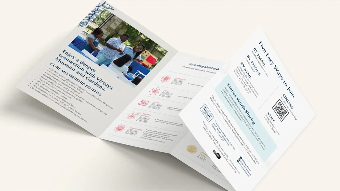
A Living Visual System
Early in the partnership, we refined Vizcaya’s typography, color, and layout standards into a clear, living brand system: one that functions as a single source of truth for internal teams and external vendors alike. Not a static PDF that lives in a drawer. A working document that evolves with the institution and keeps every touchpoint consistent, regardless of who is producing it.
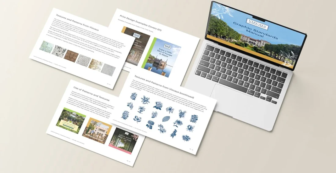
A Proprietary Visual Language
Among the most significant creative contributions of this partnership: a series of custom botanical patterns drawn directly from the flowers of Vizcaya’s own ten-acre gardens. These are not stock assets. They are proprietary visual language — connective tissue that travels across departments, across materials, across years, creating a subconscious “Vizcaya feel” before a visitor reads a single word.
These patterns anchored some of the institution’s most important design work, including the Vizcaya Centennial Gala — a celebration of 100 years of the gardens, designed around the spirit of Truman Capote’s legendary 1966 Masquerade Ball. The brief required holding two things in tension simultaneously: the weight of a century of history and the lightness of a great party. A Baroque-style mask. Botanical patterns from the gardens themselves. Tasteful restraint and quiet ostentation, balanced on the same page.
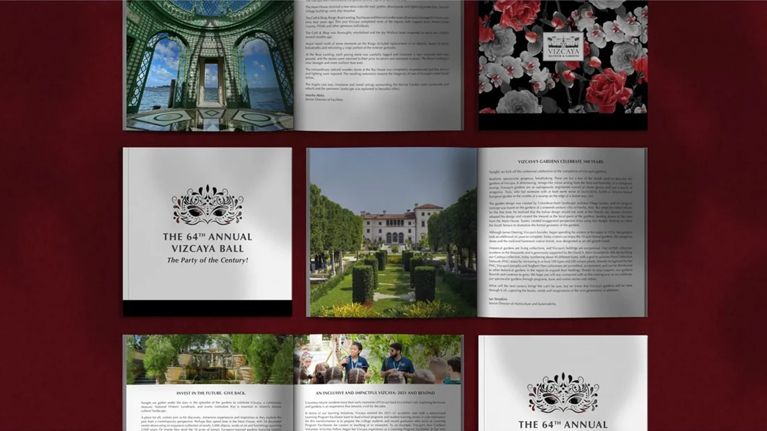
High-Stakes Fundraising
Design is not an aesthetic cost. It is a revenue driver, and nowhere is that more visible than in the materials that represent an institution to its most important stakeholders.
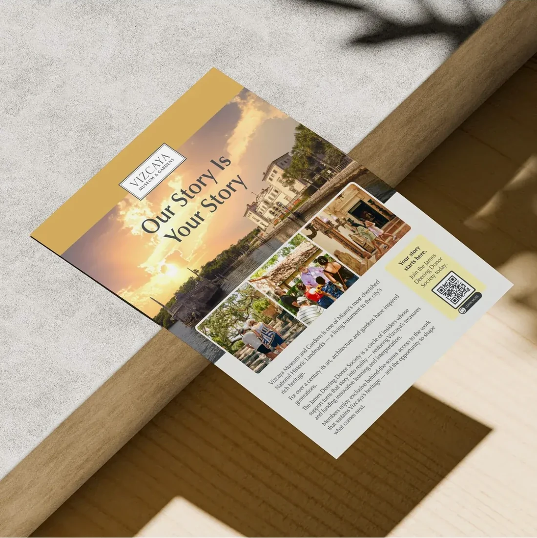
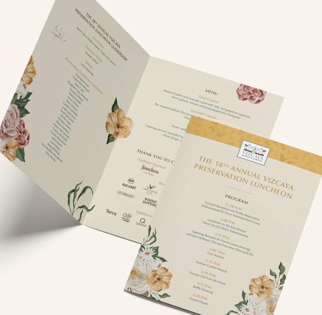
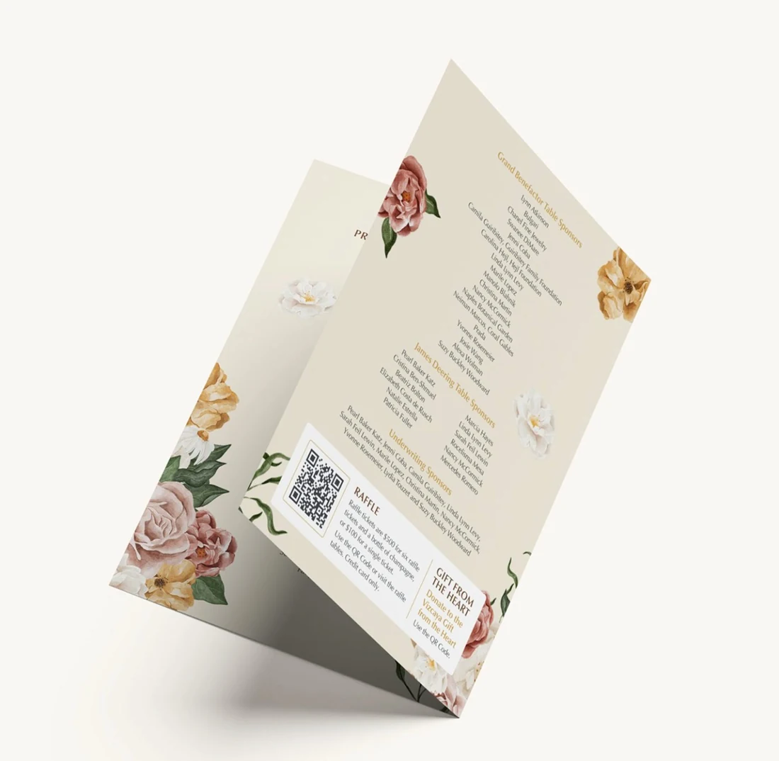
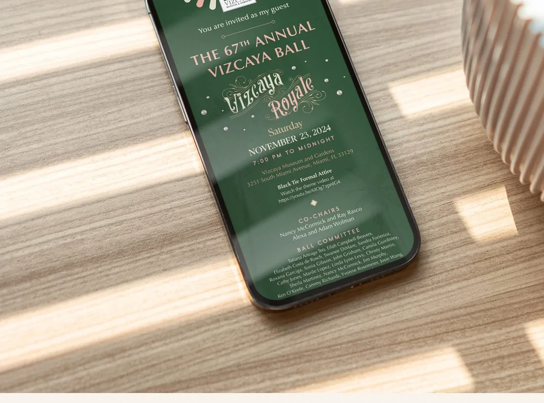
The Copper Portico designed the invitations, donor packets, and event materials for Vizcaya’s highest-profile fundraising occasions, including the Vizcaya Ball and the Preservation Luncheon, which raised $670,000 in 2026. These are documents that a donor holds in their hands before deciding whether to write a check. The difference between design that signals prestige and design that signals effort is not subtle. It is the difference between a gala that feels like a civic occasion and one that feels like a charity ask.
Capital Campaign Support
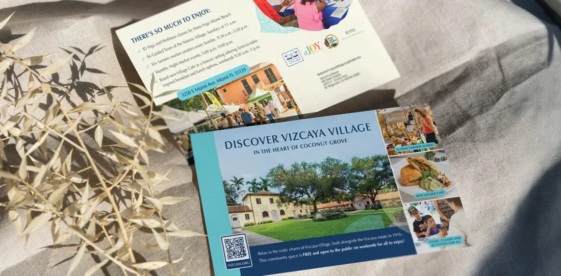
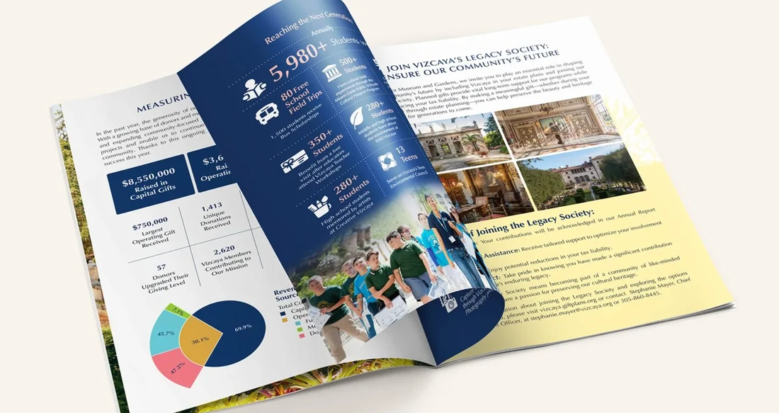
We also supported Vizcaya’s Vizcaya Village expansion: a $20M+ capital development project representing one of the most significant investments in the institution’s recent history. Materials designed to communicate vision and impact at that scale require the same strategic discipline applied to investor-facing work in any sector. The audience is sophisticated. The stakes are real. The design has to carry the weight of the ask.
Community & Education Programs
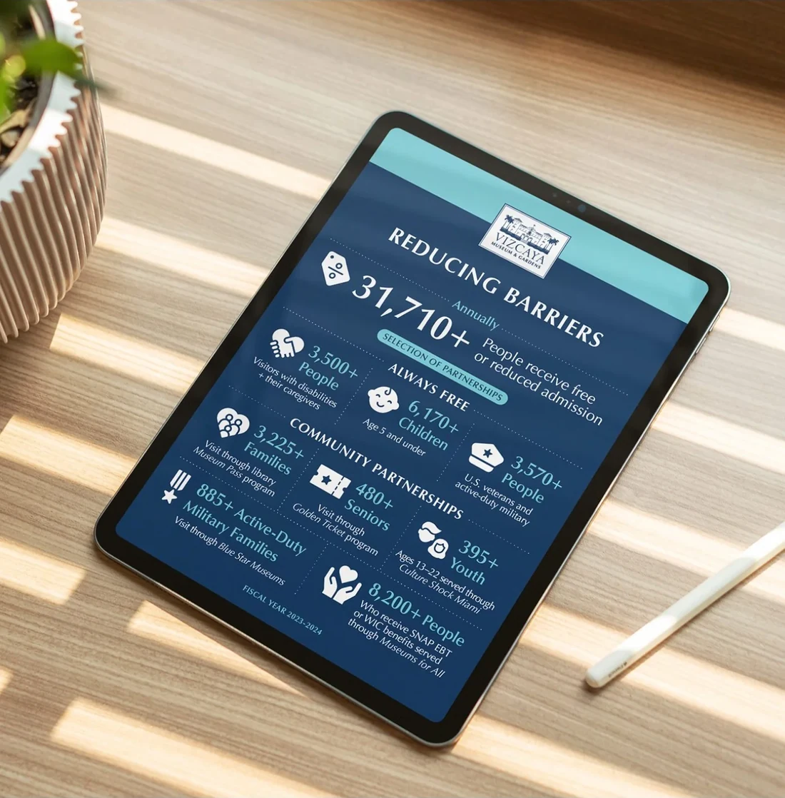
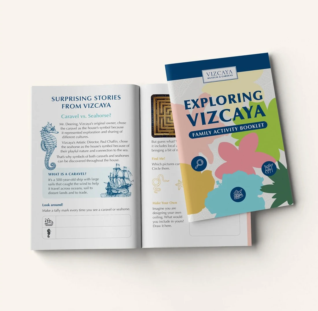
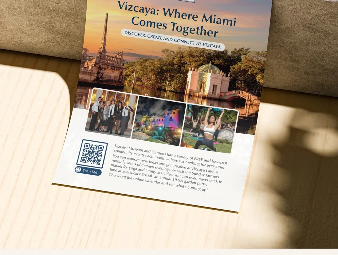
Not all of Vizcaya’s audiences arrive by invitation. Programs like Creative Vizcaya connect high school students with local artists, and the bilingual materials we developed for community education serve audiences who may be encountering the institution for the first time. These materials carry the same standard as the gala invitation. They have to. Consistency is not just a brand principle; it is an expression of how the institution values every person who walks through its doors.
Wayfinding & Visitor Experience
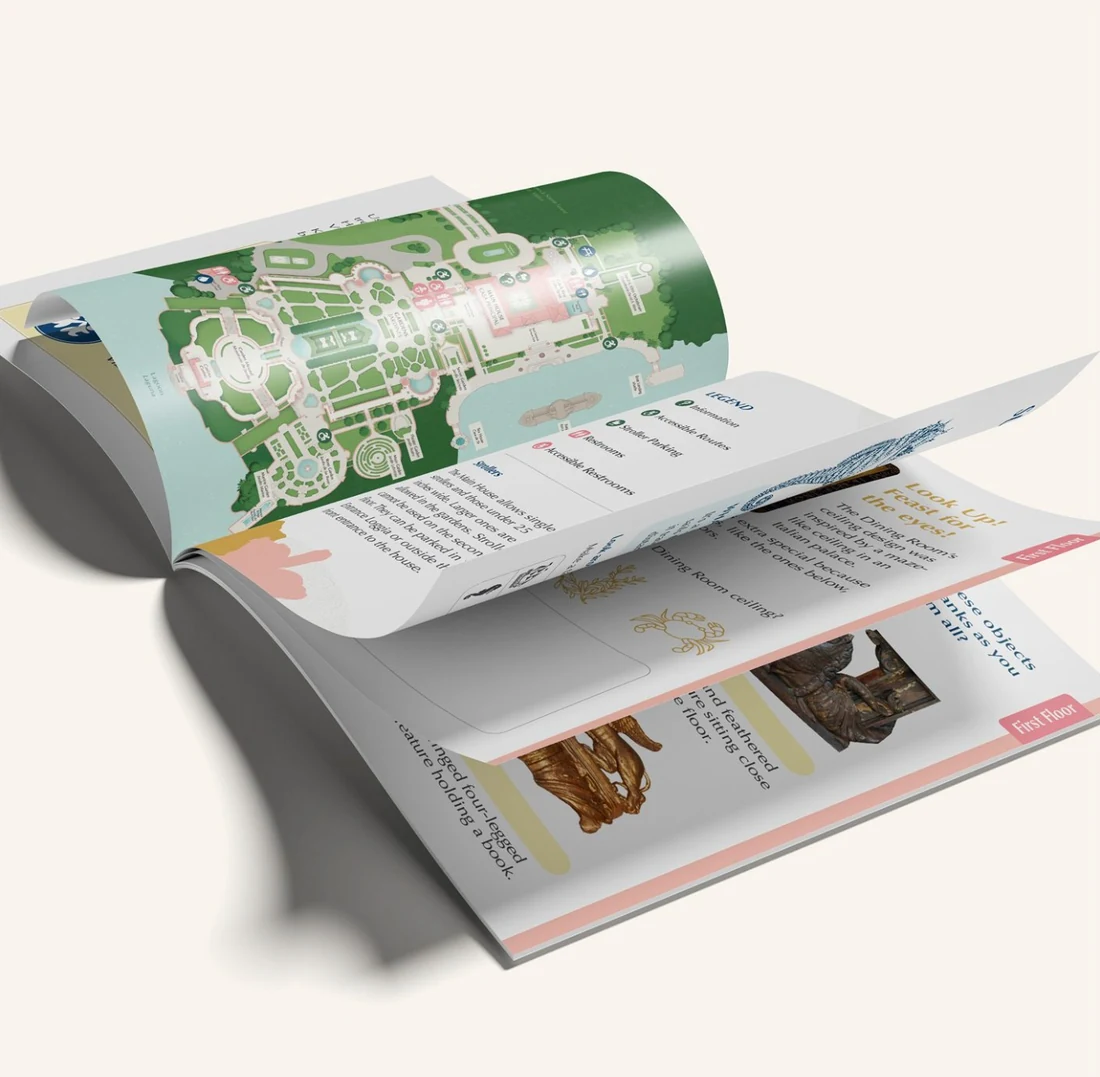
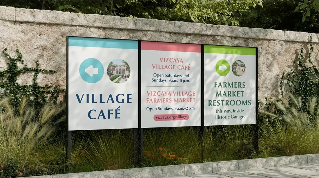
We created a full custom icon set for visitor navigation: clear, welcoming marks that align with the visual identity of the museum and help 400,000 people a year move through the space with ease. When this many visitors interact with a place, the quality of that experience is partly a design problem. We treated it as one.
Directing the Extended Team
Fractional creative leadership means being responsible for the brand even when you’re not the one holding the file. At The Copper Portico, execution ran through our in-house design team, led by Creative Director Mariana de Oliveira, which meant the work that reached Vizcaya’s vendors had already been reviewed, refined, and approved at the creative director level before it ever left our hands. What I brought to the engagement was strategic oversight and creative direction. What the team brought was the craft and precision to execute it. The two were not separable.
At Vizcaya, that integrated model extended to direct coordination with print vendors: reviewing proofs and catching inconsistencies before they go to press at scale. A gala invitation that prints incorrectly, a wayfinding sign with the wrong color value, a donor report on the wrong paper stock — these are not aesthetic problems. They are brand problems, and they are the creative director’s responsibility to prevent. Keeping the entire extended team (internal and external) aligned with the brand standard is part of the work. It always was.
03 — The Results
Four hundred thousand visitors. One brand voice.
Vizcaya came out of the partnership with a visual system that holds across every touchpoint: from a capital campaign deck presented to major donors, to a bilingual flyer for a high school art program, to the invitation a board member receives for the annual gala. Every piece of design, regardless of which department it originates from, reflects the same standard and the same sensibility.
The Director of Marketing & Communications described the partnership directly:
“The Copper Portico consistently delivers creative design that’s both on-brand and on time. What really stood out was their thoughtful guidance during our brand refresh — their idea to introduce new floral patterns based on our gardens was a beautiful way to evolve our identity while staying true to Vizcaya’s spirit. They have a deep understanding of our brand, so their recommendations are spot on with very little back-and-forth needed. Communication is smooth, turnaround is quick, and they’re always flexible — even when we send things last minute. It’s a true partnership we value deeply.”
04 — The Thinking Behind It
A CCO doesn’t manage design. They manage the brand’s future.
The deliverables in this case study — the gala invitations, the brand guidelines, the capital campaign materials, the wayfinding icons — are not the point. They are the evidence. The point is what produced them: a creative director who has been inside this institution long enough to carry its institutional memory, make decisions that align with its values, and protect its reputation across every surface it shows the world.
That is what distinguishes a fractional CCO from a freelance designer. A designer solves the problem in front of them. A CCO sees the problems coming, addresses them before they cost anything, and builds systems that hold up when the next challenge arrives.
The Copper Portico brought together professionals whose work spanned Estée Lauder, Natura, and L’Occitane. The strategic discipline that makes a prestige beauty brand cohesive across packaging, retail, and digital is the same discipline that makes a cultural institution cohesive across six departments, a $20M capital campaign, and 400,000 annual visitors. The thinking is the same. The standard is the same.
Continuity is not a soft benefit. It is a competitive advantage. The brand that has a steady creative hand at the center grows faster, spends less on corrections, and presents a more coherent face to every audience that matters.