Arté Club
miami, us | 2021 | education
Arté Club is an experience curated by Lidia Pineda for her art students. All classes begin with a mindfulness exercise to bring students into the present moment and connect them to their inner child through art.
about
Arté Club is an experience curated by Lidia Pineda for her art students. All classes begin with a mindfulness exercise to bring students into the present moment and connect them to their inner child through art.
We’ve worked with Lidia before on the creation of LidsBabe and were excited to collaborate on this special project.
design strategy
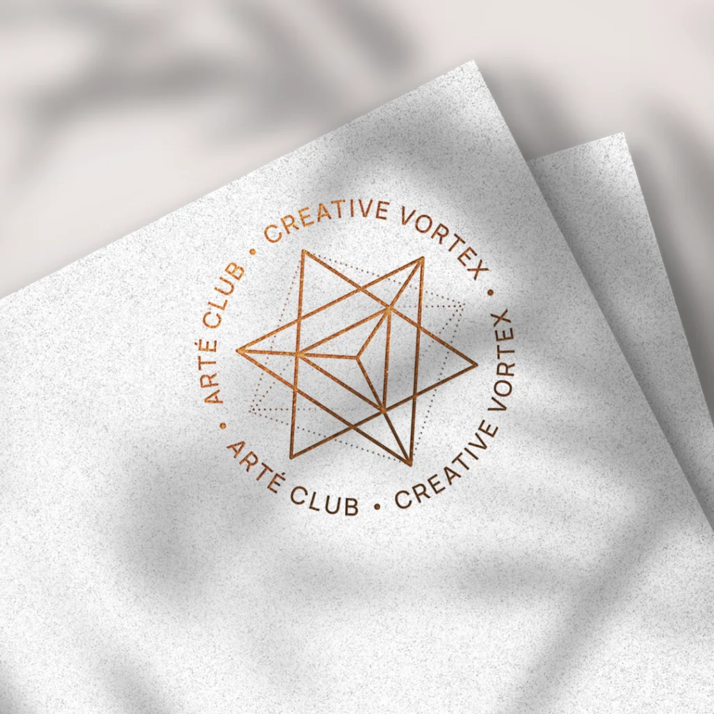
Arté Club’s brand was based on the concept of a prism, a kaleidoscope and the sacred geometry of a Merkaba. Thinking about the Club’s goal of empowering people to express themselves creatively through art, we saw this process as a prism. It separates a beam of light into a spectrum of colors, so it would be like a person transforming and materializing all their ideas and feelings into art.
Also thinking about the individuality of each person and the different ways of seeing the world, we thought of the kaleidoscope, which has three mirrors that form a triangle, and when moving the tube, it presents various visual arrangements, as each individual expresses himself creatively differently from each other.
Since Lidia uses mindfulness tools, we wanted to bring to the logo something that gave the idea of expansion and balance, as well as the mindfulness symbol, which looks like a droplet falling into water and spreading. We incorporated the concept of the Merkaba (the name literally translates to light, spirit, body), a symbol made of two pyramids that intersect and rotate in opposite directions, creating a three-dimensional energy field. It is considered to be one of the highest vibrating geometric shapes designed by the universe and reminds us of the power we can wield when we join our own energies for connection and growth. It combines opposing energies in perfect balance: masculine and feminine, earth and cosmos, matter and spirit…resulting in an activation of light and protection, also reminding us of our power as we find balance and raise our vibration.
For the colors, we used a gradient with transparency to create a light/holographic effect and add more dimension to the logo. We also used black and terracota, which are already part of your brand, as well as typography.