Skip to content

Packaging

Texas, US | 2024 | skincare

Tano is a skincare company based in Texas, founded after a transformative experience on a Brazilian beach in 1999. When Sean Finney was severely injured, a local used banana sap to stop the bleeding, saving Sean's leg and inspiring him to explore nature's healing powers. This led to the creation of Tano Skincare, which leverages the properties of banana sap to offer natural, effective skin solutions.

OVERVIEW

Tano’s founder came to The Copper Portico with a very clear idea in mind: they wanted a brand identity that really showcased the natural purity and powerful benefits of their key ingredient, banana sap. They were looking for a design that not only highlighted the luxurious feel and scientific foundation of their skincare products, but also made them shine through every part of their brand. The ask was a clean, sophisticated look, deeply connected to nature, all while underlining the effectiveness of their carefully formulated products.

the strategy

Our strategy focused on creating a brand experience that felt simple, elegant, and scientifically grounded.

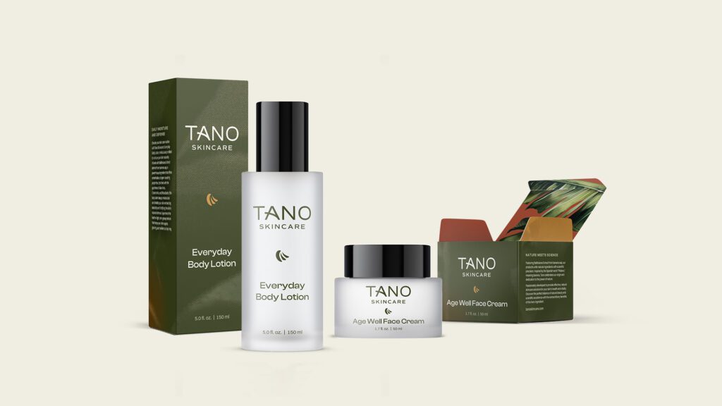
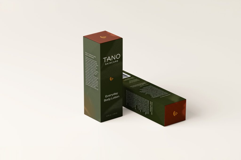
  • Logo and Typography: our team designed a stylized banana leaf icon to represent the natural ingredients, paired with sleek, modern typography to convey luxury.
  • Color Palette: we chose earthy greens and neutral tones to reflect Tano’s natural focus and commitment to sustainability, while also aligning with a high-end aesthetic.
  • Packaging Design: to make Tano stand out, we developed a unique banana leaf texture for the packaging with UV layers. This enhanced the visual appeal and created a satisfying tactile experience in the boxes, while maintained a premium feel.
Tano Skincare | The Copper Portico

results

The branding and packaging design we created for Tano Skin Care played a key role in successfully launching the brand in a crowded and competitive market. Tano’s products quickly gained attention for their unique blend of luxury and natural ingredients. Customers especially appreciated the thoughtful design, noting how the textures and high-quality packaging made using the products feel special.

This project reinforced the value of combining visual appeal with a tactile experience, creating something that customers could connect with on multiple levels. The textured details we incorporated into the packaging added a sense of elegance and engagement, setting Tano apart from other skincare brands. By focusing on a blend of simplicity and sophistication, we helped create a brand experience that stood out. The success of Tano Skin Care shows The Copper Portico’s commitment to delivering designs that go beyond expectations, helping brands thrive in competitive markets.
Tano Skincare | The Copper Portico

Packaging

Michigan, US | 2024 | equipment supplier

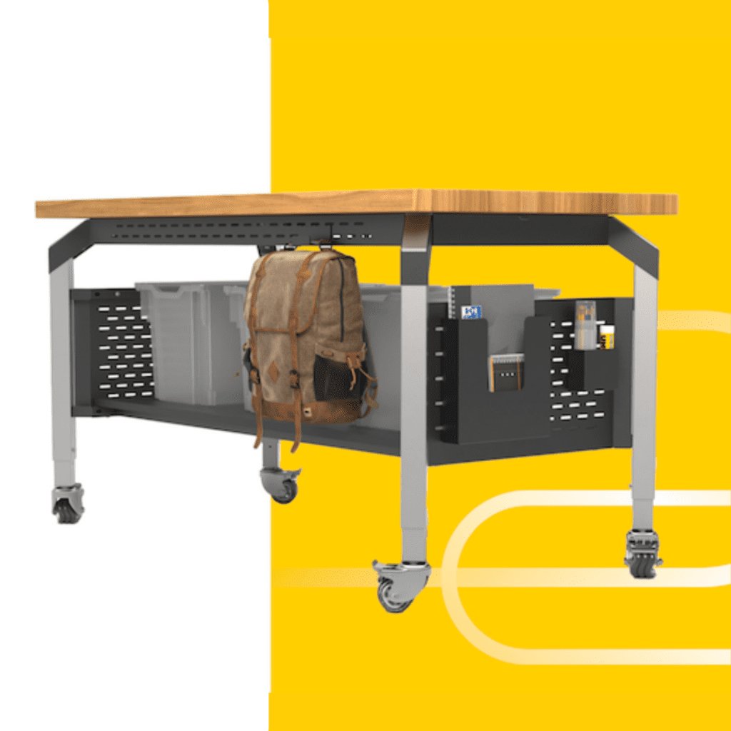
SALTO is an education-first brand based in Michigan. They specialize in designing modern, innovative school furniture that enhances learning environments with flexible, functional solutions. Unlike other brands that prioritize formulas over flexibility, SALTO develops every product based on what teachers and students actually want — leading to more learning, less limits, and better schools for everyone.

Flipping the Script on Classroom Furniture

SALTO, an innovative educational furniture company, needed a complete brand identity that would reflect their playful yet functional approach to modern classrooms. As strategic consultants, we partnered with them to guide their branding journey, offering insights into brand positioning, visual identity, and digital presence. Our collaboration resulted in a cohesive brand strategy that brought Salto’s unique vision to life, ensuring they stand out in a competitive market.

the project

SALTO’s goal was to disrupt the traditional classroom furniture space by creating multi-purpose, playful furniture designed to engage both teachers and students. We’re invited to build a consistent brand identity that truly reflected their innovative spirit. SALTO needed a strategic partner who could not only provide design elements but also shape the overall brand direction to align with their mission of transforming learning environments.

SALTO - branf identity the copper portico

the process

We took a holistic approach to SALTO’s needs, providing both strategic consultation and creative design work. Our goal was to help them establish a brand that not only looked great but also communicated their values clearly to their audience.

1. Brand Elements and Brand Guidelines

We developed comprehensive brand guidelines to serve as the foundation for SALTO’s communications. This included:

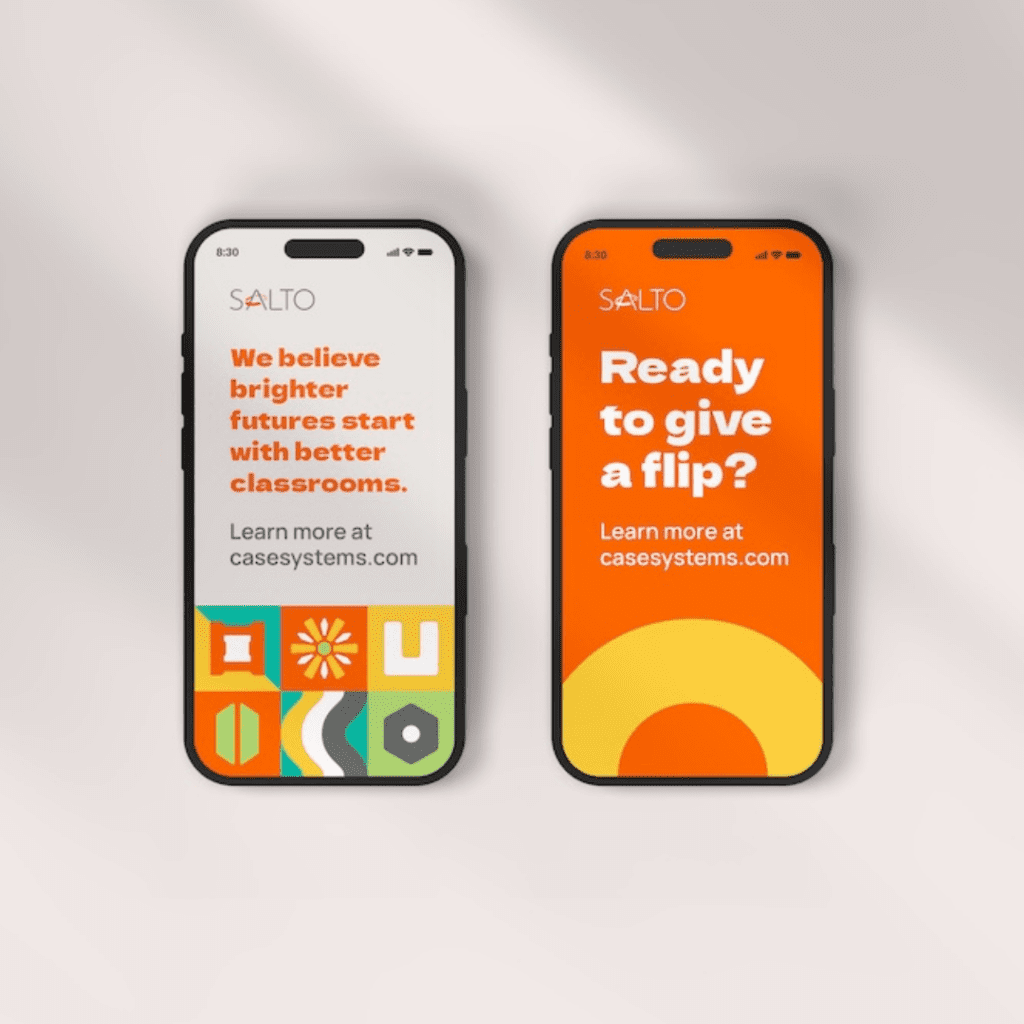
  • Color Palette: A bright, engaging color scheme to reflect SALTO’s energetic approach to education.
  • Typography: Modern, bold fonts to emphasize their commitment to innovation and forward-thinking.
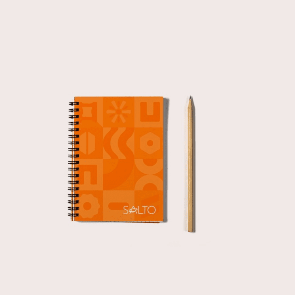
  • Visual Elements: Patterns and design elements inspired by SALTO’s furniture, integrated into all digital and print materials.
  • Photography Curation and Treatment: We curated photography that captured the dynamic, playful nature of SALTO’s products and applied treatments to enhance vibrancy and align with the brand’s energetic identity.


2. Brochure Design

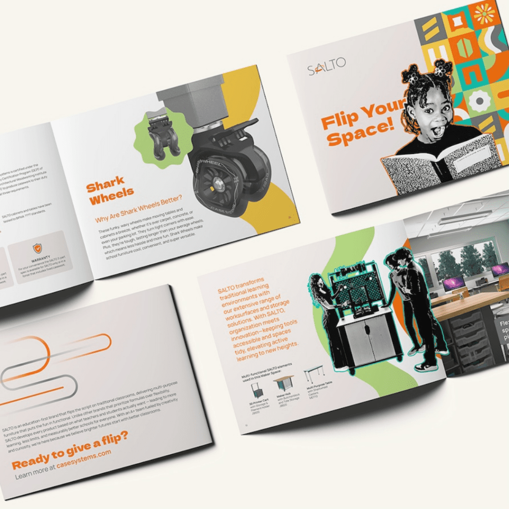
We designed a brochure that showcases SALTO’s wide range of educational furniture solutions, emphasizing their flexibility and innovative spirit. The design focused on creating engaging layouts that reflect SALTO’s mission to transform learning environments with functional, modern designs.

3. Packaging Design

For SALTO’s product sample kit, we developed the packaging design that aligned with their brand identity. The packaging incorporated elements from the SALTO brand guide, ensuring that the design felt cohesive with their existing materials. The kit, which featured a tray with custom foam inserts, was created with practicality and branding in mind, using bold colors and a sleek finish to make an impact when delivered to schools.

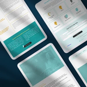
4. Website Design

We created a user-friendly website design that clearly communicates SALTO’s values and product offerings. The site is visually engaging, easy to navigate, and highlights their innovative furniture.

Key features include:

  • Simple Navigation: Ensuring easy access to product details, company values, and customer support.
  • Responsive Design: Optimized for mobile devices to ensure a seamless experience across platforms.


5. Email Templates

We designed a series of email templates to help SALTO communicate effectively with their audience. These templates were created in alignment with their brand guidelines, ensuring consistency across promotional campaigns, updates, and communications with schools.

Blog

Packaging

Fort Lauderdale, US | 2022 | Body & Bath products

lani.xo is a self care brand that encourages a balanced lifestyle for busy women.

about

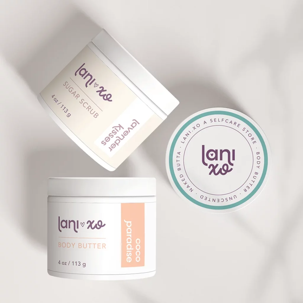
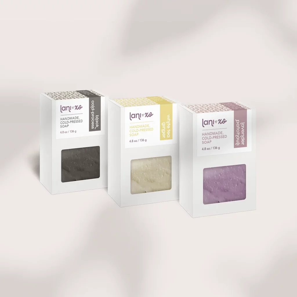
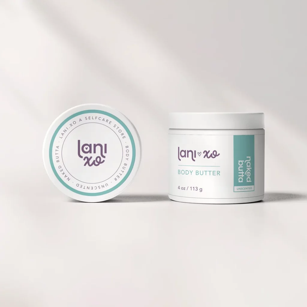
lani.xo is a self care brand that encourages a balanced lifestyle for busy women. Inspired by the founder’s personal story, lani.xo helps people focus on the brighter version of themselves and hope for better days.

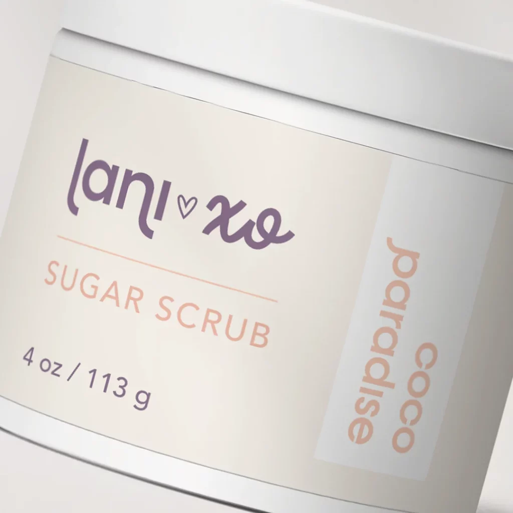
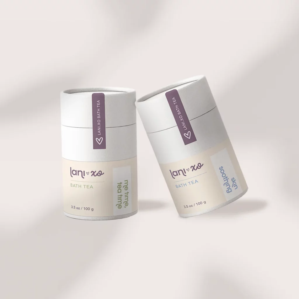
We’re invited to collaborate with lani.xo on the creation of the brand’s packaging: a line of products featuring soaps, body butters, bath teas and sugar scrubs.

design strategy

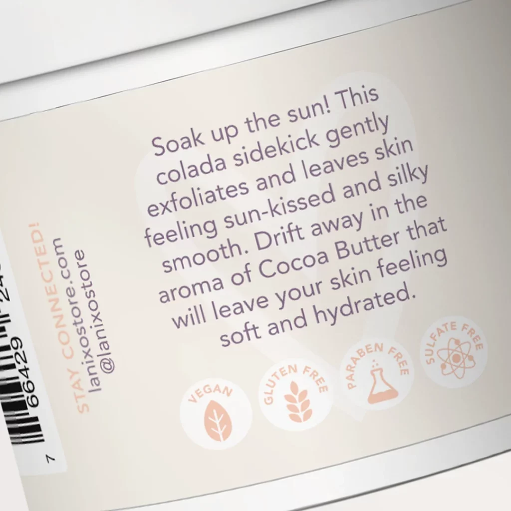
In order to achieve the results the founder was looking for, our team chose to focus on the brand’s mission. We used lani.xo’s purpose as our main guide to design elevated labels that anchors the brand in simplicity, self care, and gentleness.

The end-product is a line that appeals to the consumers both visually and emotionally by using a combination of calming colors, clean fonts and concise messaging.

We also supported lani.xo with a set of social media graphics and custom icons that helps them to showcase the benefits of their products in an elegant and friendly way.

Packaging

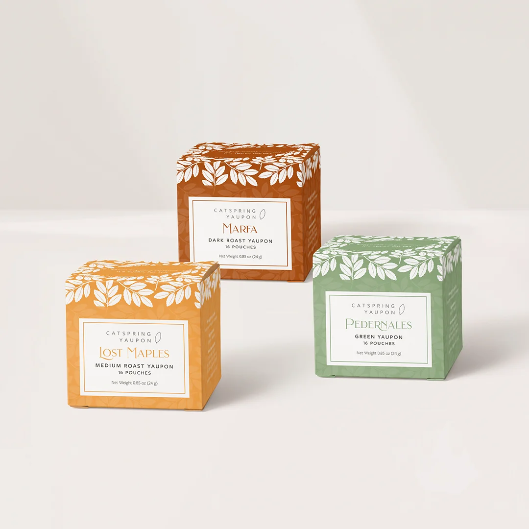
Catspring is a woman-owned Texan brand offering their customers high-quality tea, producing in-house various blends from a southern plant called Yaupon. The brand is positioned at the crossroads of trendy beverages and classic traditions and promotes an organic and sustainable line.

PACKAGING

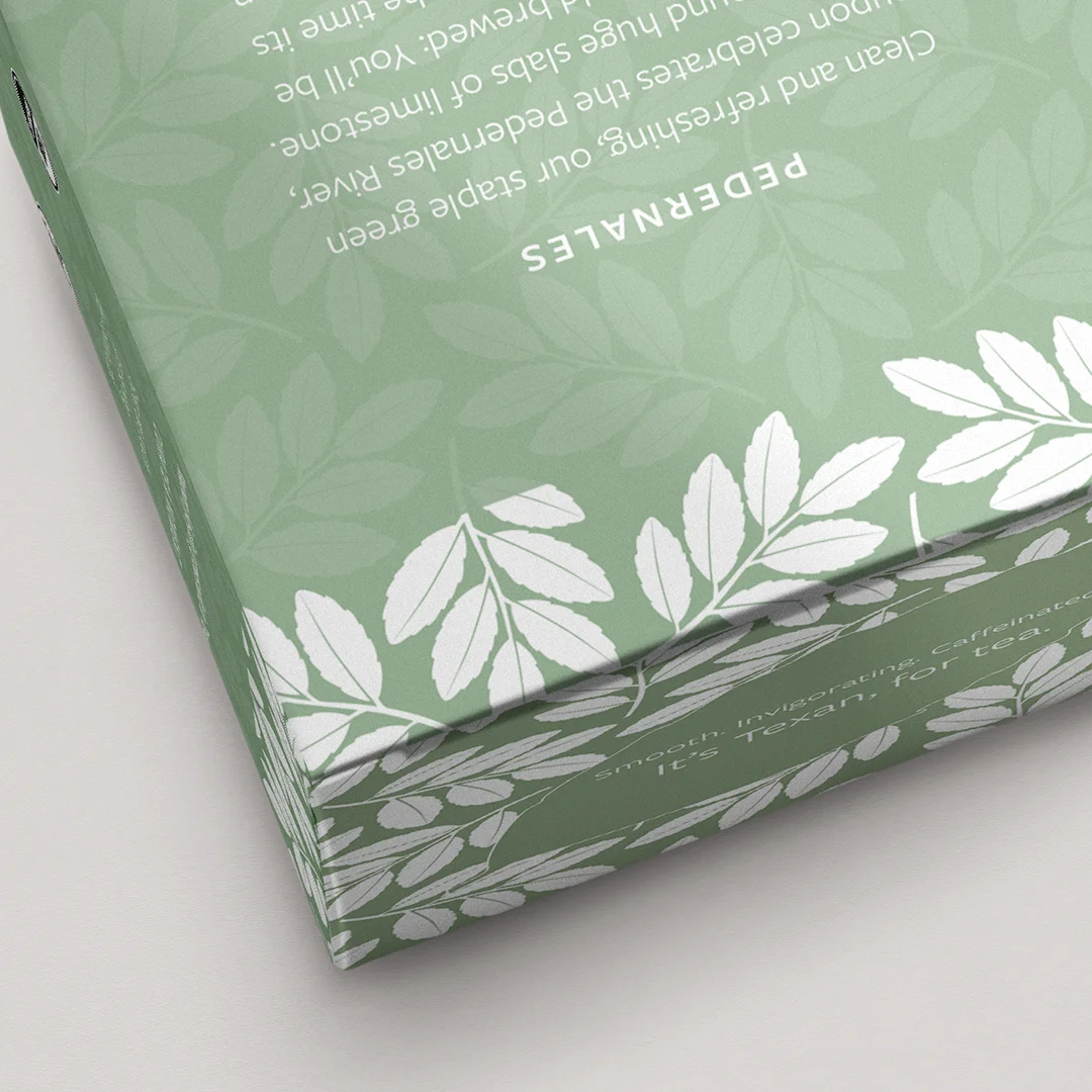
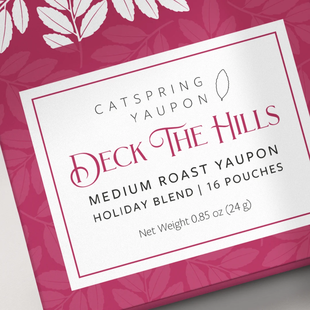
We worked with Catspring’s team on the revamp of their tea collection packaging. An important design task was creating a clean and informative label that aligned with Catspring’s stylistic concept and kept consistency across a variety of packaging options. The box design carefully arranges the information about each tea blend to make it readable and elegant. The goal was to keep the essence of Catspring, elevating the brand and making it desirable in upscale markets throughout the US.

The end result looks original and trendy, carrying a typeface choice that enhances the brand with organic and clear elements.

WEBSITE DESIGN

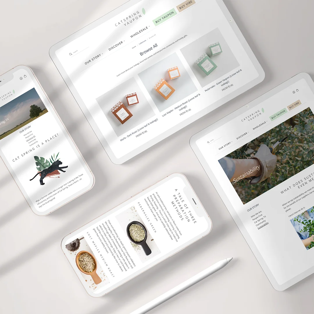
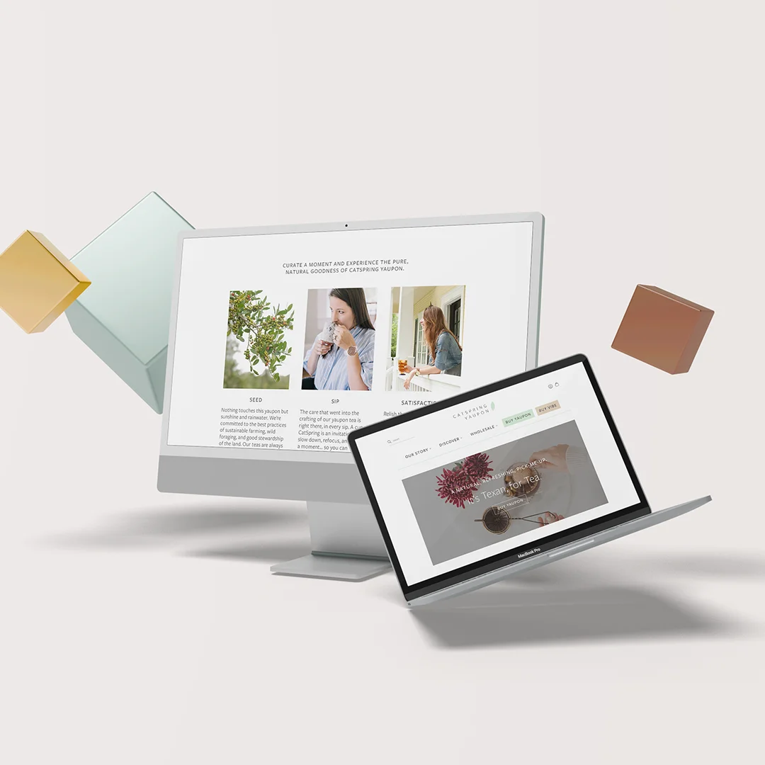
We also worked with Catspring to refresh the company’s website. 

The website theme was carefully built with minimalism in mind, effectively highlighting the products in different packaging colors and telling their story with beautiful typography and a custom-made layout.

To keep up with the external consistency and recognizable patterns of the homepage, the website uses a stylish and minimalist sticky header, with the brand element in the center, a shopping bag button in the right corner and links to core navigation below.

Custom icons were design to showcase Catspring’s highlighted features, such as organic, kosher, sustainable and non-gmo.