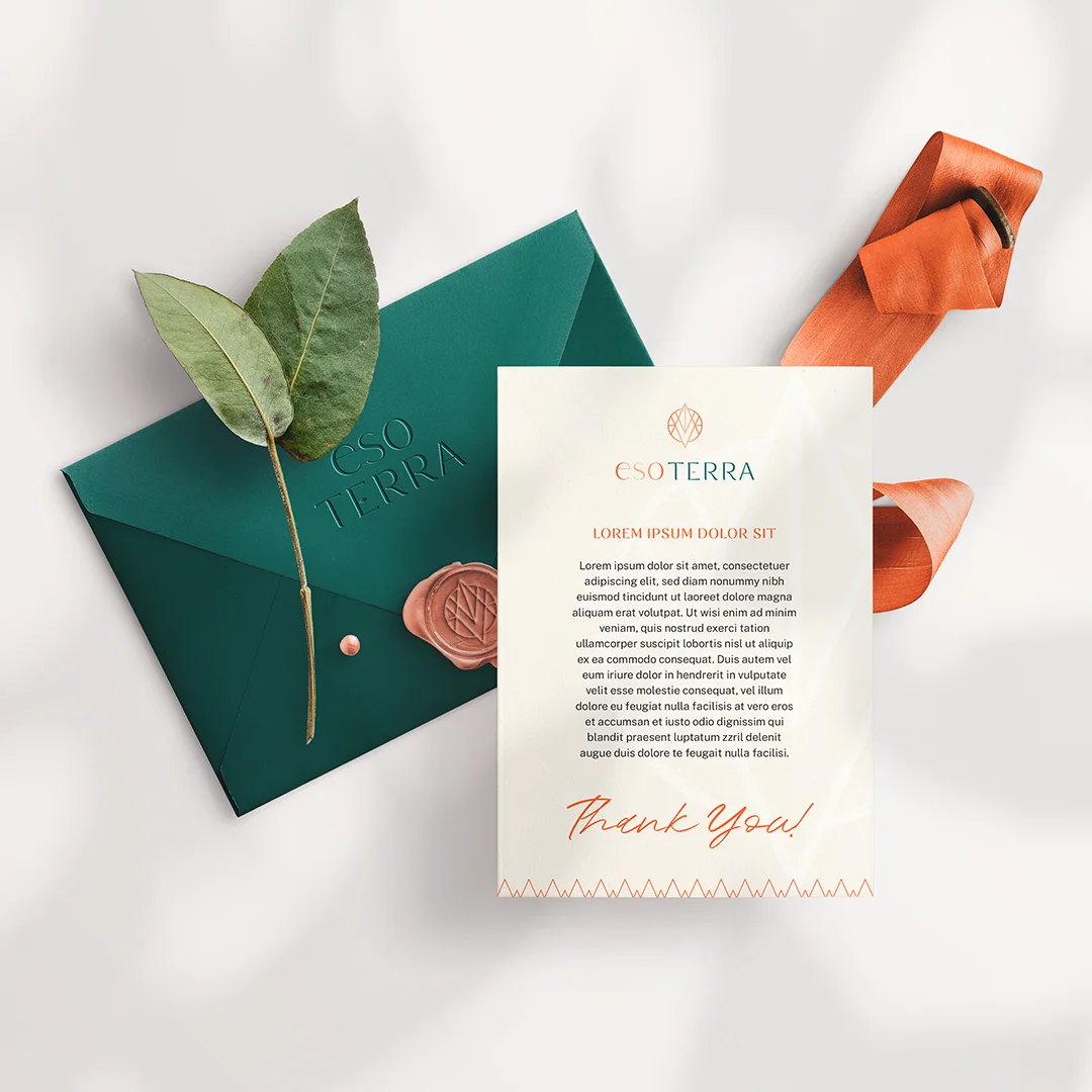
EsoTerra
DELRAY BEACH, us | 2022 | consulting services
EsoTerra believes that patriarchy is on its way out, and it's now time for the divine feminine to lead and for the divine masculine to support. We worked with the founders to create a brand identity that represents their vision and values.
about
EsoTerra believes that patriarchy is on its way out. There is a new way emerging, and it’s now time for the divine feminine to lead and for the divine masculine to support.
Led by Sage and Maya, EsoTerra gives conscious women resources to do their best work. They offer deep leadership workshops, coaching, speaking engagements, funding and more.


design strategy
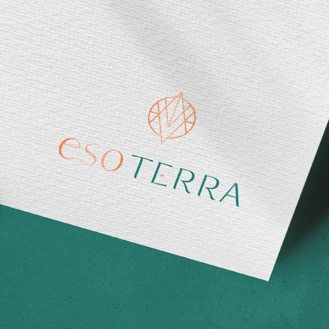
Our goal was to bring Maya and Sage’s personalities to their brand identity. Based on our discovery process, we designed the symbol for EsoTerra based on two triangles that are integrated from an overlap, creating two poles (which can symbolize feminine/masculine, divine self/three-dimensional self, esoteric/grounded practical).
The vertices extrapolate the circle in allusion to the expansion of consciousness, and the upper pole has a greater emphasis to convey the idea of something growing, shining, evolving. The inverted overlapping triangles generate a diamond icon that represents the focus and goal to find the balance within yourself (the yin and yang energy).
The typography was a combination of two fonts. Eso is very organic, starting with a feeling of abstraction, while Terra is more objective. However, we chose a much lighter font, with some curves, to convey a certain lightness even though it is all capitalized.
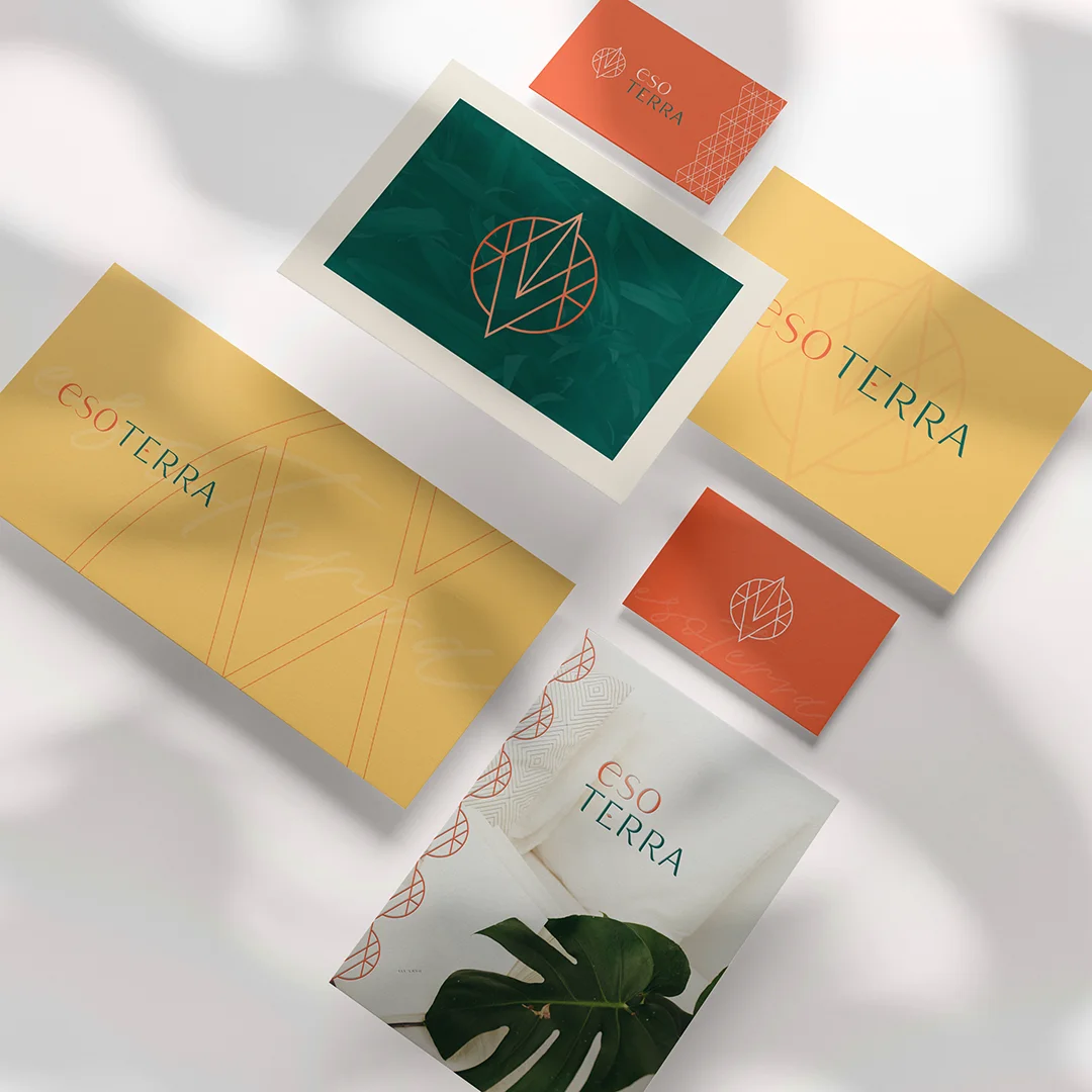
For the colors, we chose a vibrant orange, perfect for conveying a welcoming vibe, enthusiasm and security, and the dark green brings the necessary formality.